Murfies. logo review
4/5
Logo score
Logo review of

Murfies.

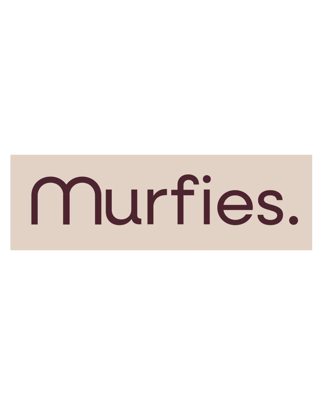
A clean, competent wordmark that communicates trust and quality but would benefit from a distinct typographic touch for stronger memorability.

Wordmark Geometric Sans-serif Bakery
5/5
Legibility
3/5
Originality
5/5
Misread
5/5
Balance
4/5
Scale
Your next steps

What to fix first

Focus on the changes that matter. Keep what makes the logo work.

1

wordmark

Experiment with subtle unique typographic features or a slight custom flourish to strengthen brand distinction.

Visible issue High priority Medium effort
Area to inspectApproximate location

The wordmark, while clean and modern, uses a fairly standard geometric sans-serif type without distinct customizations.

How to check

Ensure customizations remain legible and do not introduce readability issues.

See the category review
2

wordmark

Test color contrast in diverse settings; consider upping darkness or vibrancy slightly for prime use cases.

Optional refinement Medium priority Low effort

The brown on beige palette is warm and culinary-relevant, though subdued; it could risk insufficient contrast in some uses (e.g., small size print, signage).

How to check

Proof contrast with mockups on real-world media.

See the category review
Detailed review

Logo performance breakdown

4/5

Brief & logo match

Based on your brief
Compared with

Artisanal, globally-inspired cloud kitchen and bakery focused on authentic craftsmanship and thoughtful indulgence.

The wordmark is professional and welcoming, but lacks the distinctive crafted detail that would fully express the brand's artisanal ambitions.

  • Craftsmanship & Quality

    The refined, balanced wordmark reflects a careful, high-quality approach, aligning well with an artisanal, craft-focused brand.

  • Thoughtful Indulgence

    The soft curves and understated color convey approachability and indulgence without excess, which partially matches the brand's thoughtful positioning.

5/5

Legibility

  • Excellent readability.
  • Clear, friendly letterforms.
3/5

Originality

  • Welcoming geometric type.
  • Professional restraint.
  • The wordmark, while clean and modern, uses a fairly standard geometric sans-serif type without distinct customizations.

    Visible issue wordmark

    Try: Experiment with subtle unique typographic features or a slight custom flourish to strengthen brand distinction.

    Check: Ensure customizations remain legible and do not introduce readability issues.
    Area to inspectApproximate location
4/5

Color harmony

  • Warm, appetizing palette suits bakery.
  • The brown on beige palette is warm and culinary-relevant, though subdued; it could risk insufficient contrast in some uses (e.g., small size print, signage).

    Optional refinement wordmark

    Try: Test color contrast in diverse settings; consider upping darkness or vibrancy slightly for prime use cases.

    Check: Proof contrast with mockups on real-world media.

Beige#E5D6C9
Brown#432026

Estimated colors. Use the original design file for exact values.

Create a full color palette using these colors

Create new palette
5/5

Balance alignment

  • Consistent letter spacing and weight.
Uploaded logoAlignment guide overlay

Inspect spacing with the guide. Optical balance may differ from geometric centering.

4/5

Scalability

  • Simple wordmark resizes well.
Uploaded logo at 200 pixels wide
200 × 250 px
Uploaded logo at 100 pixels wide
100 × 125 px
Uploaded logo at 50 pixels wide
50 × 63 px

Compare the detail at different sizes. Labels show the full image dimensions.

5/5

Misinterpretations

  • No secondary or problematic readings.

Black & white

Does the shape still work without color?

These tests are available only for logos uploaded in vector (SVG) format.

Background contrast

Find the surfaces where your logo stays clear.

These tests are available only for logos uploaded in vector (SVG) format.

Blur & silhouette

A 3px blur softens fine details so you can check whether the overall shape stays recognizable. If key gaps close or elements merge, the logo may rely too heavily on detail.

These tests are available only for logos uploaded in vector (SVG) format.

Try your own review

Wondering how your logo performs?

Get a clear logo score, key risks, and priority fix ideas before your client or audience sees it.

Review my logo