 View review
Logo score
Logo review of
Mystic Moon
Review the detailed scores below to see what is working and what should be refined first.
Objective AI feedback. Your creative decision.
Legibility
Originality
Misread
Balance
Scale
Detailed review
Logo performance breakdown
Legibility
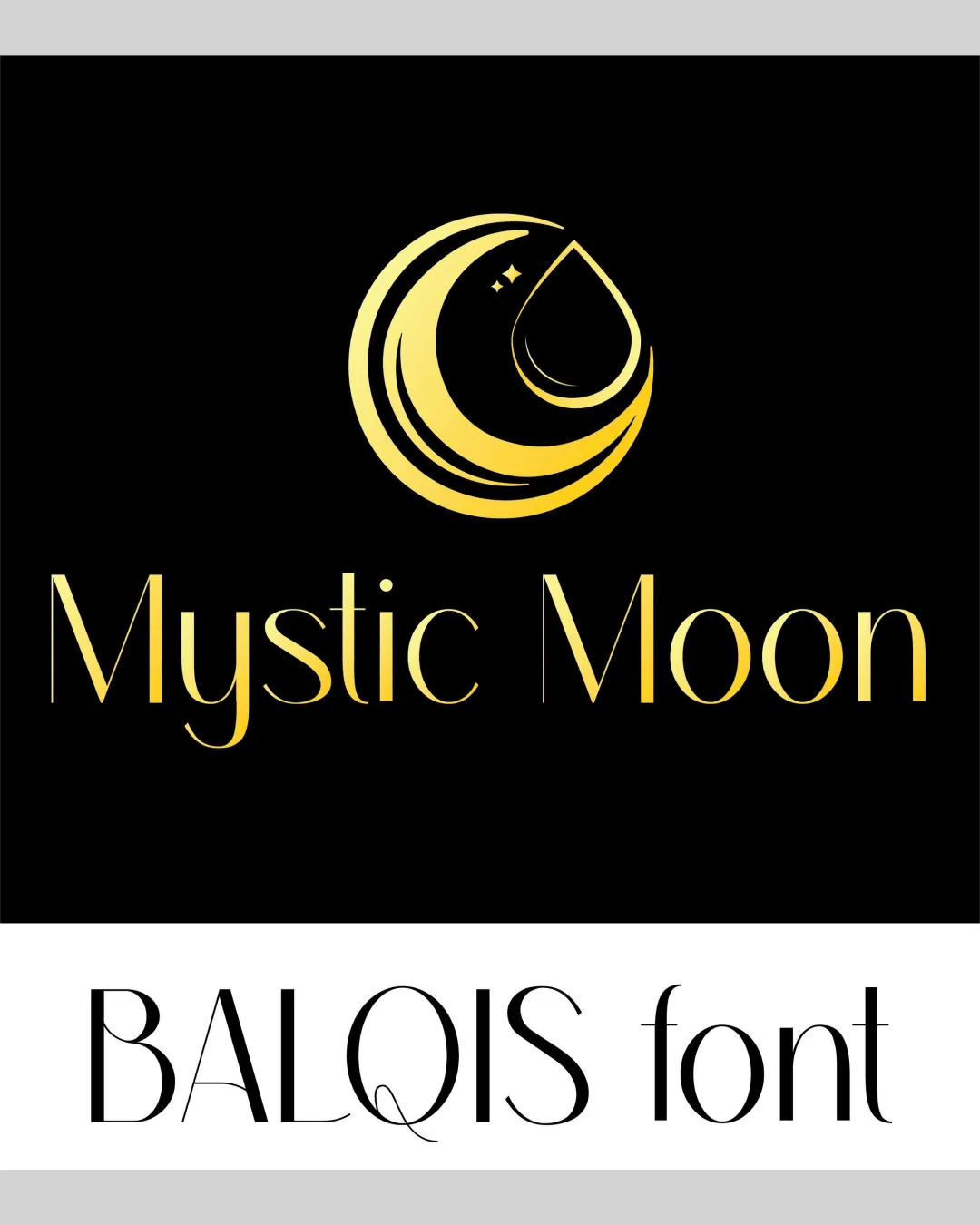
 Luxury serif font is highly stylish and legible at medium to large sizes Good contrast between text and background using gold on black
 Thin font strokes may lose clarity at smaller sizes or poor print quality Stylized elements in some letters ('y', 'n') could compromise instant readability in rapid glances
Originality
Elegant integration of crescent and teardrop symbol, mildly creative Star elements add a subtle unique touch
Crescent moon is a fairly common symbol in wellness and mysticism logos Overall execution does not stray far from standard industry motifs
Color harmony
Good use of controlled color palette; gold and black complement the theme Gradient application is smooth and not overwhelming
Reliance on gradient may not be versatile for all backgrounds or monochrome applications
Gold Gradient
#FFD700
Black
#000000
Your palette is close. Refine the color roles and combinations before updating the logo.
Build brand colorsBalance alignment
Balanced composition; symbol centered above wordmark with good spacing Clean vertical alignment between logomark and text
Minor imbalance due to the logo mark’s heavier lower stroke compared to thinner top; feels weighted towards the bottom

Scalability
Bold symbol is recognizable when scaled to medium sizes (e.g., product labels, packaging) Simple geometry aids clarity at larger scales like billboards
Thin lines of both symbol and font may vanish at very small applications such as favicons or embroidery Gradient effect will not reproduce well in all print techniques (e.g., single-color embroidery for uniforms)
200x250 px
100×125 px
50×62 px
Misinterpretations
No inappropriate or misleading imagery detected in the composition
Symbol & text fit
Both symbol and wordmark share an elegant, modern style; visual relationship feels intentional
Gradient and line weight match across symbol and text
Slight visual disconnect between curvilinear logomark and more rigid letterforms could be harmonized further
Try your own review
Review my logo
Wondering how your logo performs?
Get a clear logo score, key risks, and priority fix ideas before your client or audience sees it.
Keep exploring