 View review
Logo score
Logo review of
Myvo
Review the detailed scores below to see what is working and what should be refined first.
Objective AI feedback. Your creative decision.
Legibility
Originality
Misread
Balance
Scale
Detailed review
Logo performance breakdown
Legibility
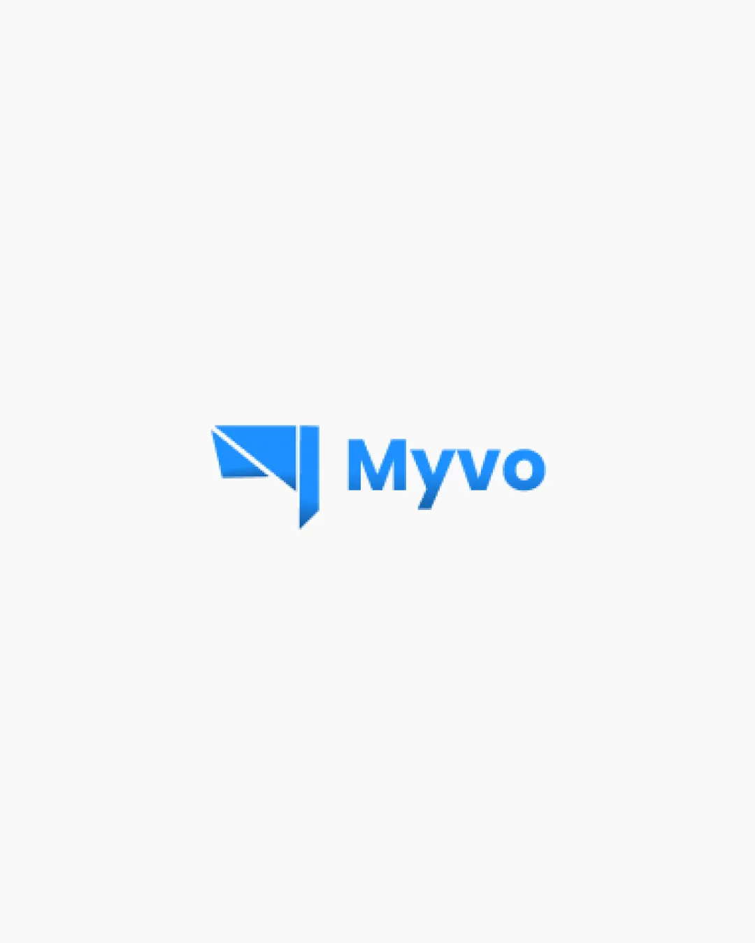
 The Myvo text is highly readable with strong, clean sans-serif typography. There is clear contrast between the blue text and the white background, ensuring effortless legibility.
Originality
Combination of megaphone and geometric/paper plane styling adds a modern twist.
 Megaphone icons are common in tech and communication industries, risking lack of distinction. No highly unique or cleverly integrated negative space elements.
Color harmony
Limited to blue and white, ensures clarity and professional feel. Blue evokes trust and technology themes effectively.
Blue
#2196F3
White
#FFFFFF
Balance alignment
Good visual alignment between the logomark and wordmark. Icon and text are visually balanced, neither overshadowing the other.
The pointed angle of the icon's lower edge draws some visual weight downward, slightly disrupting overall symmetry.

Scalability
The geometric logomark remains recognizable at various sizes. Simple color palette ensures clarity on digital and print material such as business cards and large signage.
The thin details within the megaphone/paper plane icon may become less distinct at extremely small scales (e.g., favicon or embroidery).
200x250 px
100×125 px
50×62 px
Misinterpretations
No inappropriate or confusing visual interpretations detected.
Symbol & text fit
Both symbol and wordmark share a modern, geometric visual language.
Sizing relation between icon and text is harmonious.
Try your own review
Review my logo
Wondering how your logo performs?
Get a clear logo score, key risks, and priority fix ideas before your client or audience sees it.
Keep exploring


