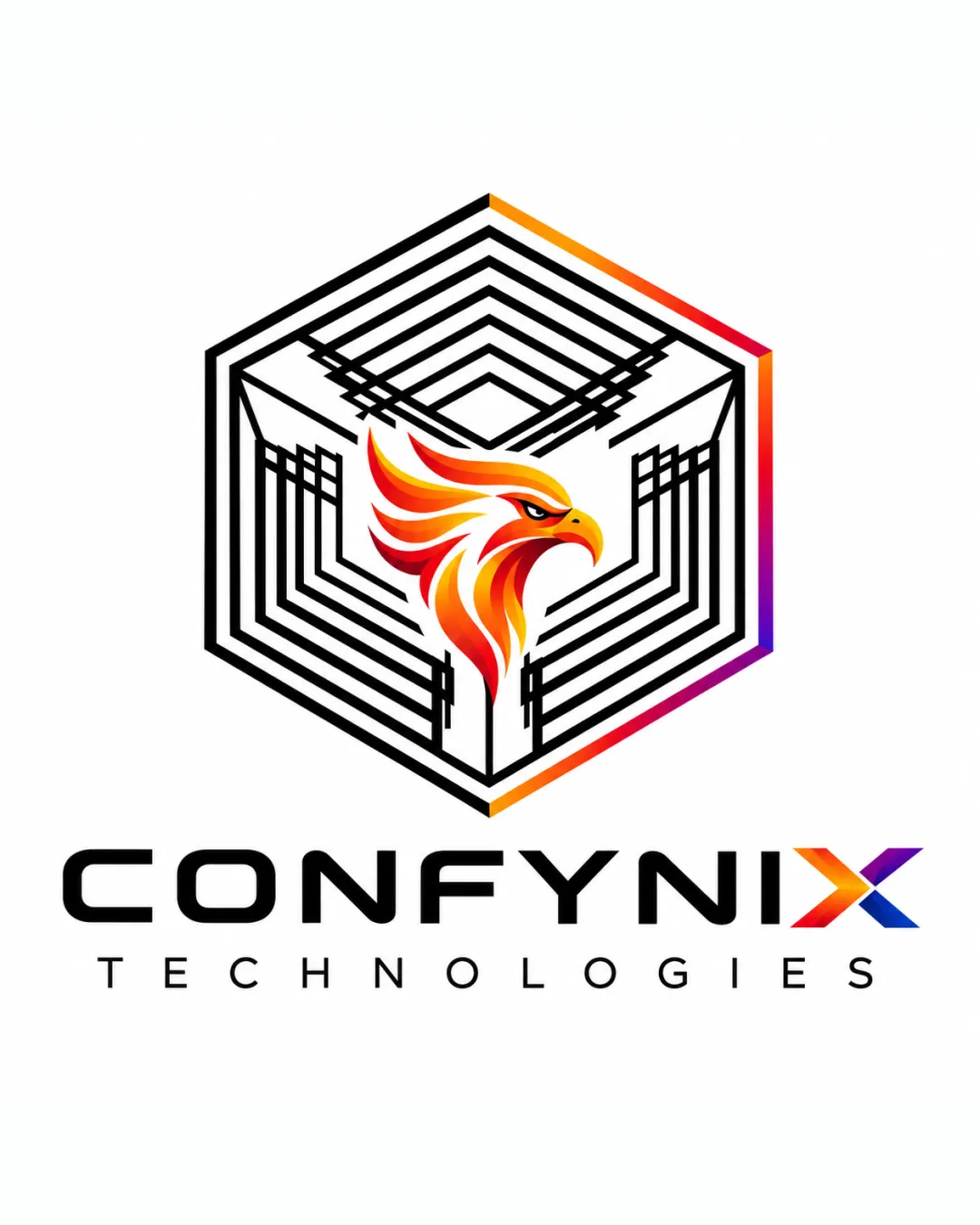
CONFYNIX TECHNOLOGIES logo review
4.3/5
Logo score
Logo review of

Confynix Technologies

Distinctive, modern, and visually compelling combination mark with a strong technology sector fit. With minor adjustments for scalability, it will function excellently as a brand asset.

Combination Mark Modern Geometric Tech Technology
4.5/5
Legibility
4.5/5
Originality
4.5/5
Misread
4/5
Balance
4/5
Scale
Action plan

What to fix first

The most important fixes to handle before polishing the full presentation.

1

Simplify some internal hexagon lines for small-scale robustness.

High priority

Fine lines and details risk merging at small sizes.

Impact: Improves Clarity At All Applications And Size Versatility. · Effort: Medium

2

Test alternate color/contrast options for the 'X' in the wordmark.

Medium priority

The gradient-heavy 'X' may lose impact at small or single-color sizes.

Impact: Increases Brand Readability And Coherence Across All Uses. · Effort: Low

Detailed review

Logo performance breakdown

4.5/5

Legibility

Checkmark icon Main wordmark 'CONFYNIX' is clear and bold.
Checkmark icon Subtext 'TECHNOLOGIES' is readable at most sizes.

Warning icon Gradient effect on 'X' may reduce clarity at small sizes.

4.5/5

Originality

Checkmark icon Distinctive fusion of geometric structure with a dynamic phoenix icon.
Checkmark icon Unique interplay with the 'X' in the wordmark matches the graphical style.

Warning icon Phoenix is a common tech symbol but executed with originality here.

4.5/5

Color harmony

Checkmark icon Gradient palette across mark and wordmark adds vibrancy and unity.
Checkmark icon Good balance of black for contrast.

Warning icon Gradient complexity may not translate in some print processes.

Black
#000000

Orange
#FF6A00

Yellow
#FFD700

Red
#E71C23

Blue
#4361EE

Magenta
#F72585

Your palette is close. Refine the color roles and combinations before updating the logo.

Build brand colors
4/5

Balance alignment

Checkmark icon Elements are well-centered and visually balanced.
Checkmark icon Wordmark aligns cleanly with the mark above.

Warning icon Lower right gradient could create slight visual drag.

logo 200x250 pixels scalability test alignment grid overlay
4/5

Scalability

Checkmark icon Strong geometric silhouette holds up in reduction.
Checkmark icon Central elements remain recognizable at moderate sizes.

Warning icon Fine hexagon lines and gradient phoenix details may blur or merge at very small scales.

logo 200x250 pixels scalability test

200x250 px

logo 100x125 pixels scalability test

100×125 px

logo 50x62 pixels scalability test

50×62 px

4.5/5

Misinterpretations

Checkmark icon No obvious dual meanings; design is clear.

4/5

Logo structure & brief match

Checkmark icon Color and angularity of the 'X' echo the logomark style.
Checkmark icon Thematic coherence with both parts conveying energy and renewal.

Warning icon The 'X' effect could distract slightly from the rest of the wordmark.

Checkmark icon Industry Relevance: Phoenix imagery and bold tech styling fit a technology company.

Try your own review

Wondering how your logo performs?

Get a clear logo score, key risks, and priority fix ideas before your client or audience sees it.

Review my logo