View review
Logo review ofNao Design Graphic
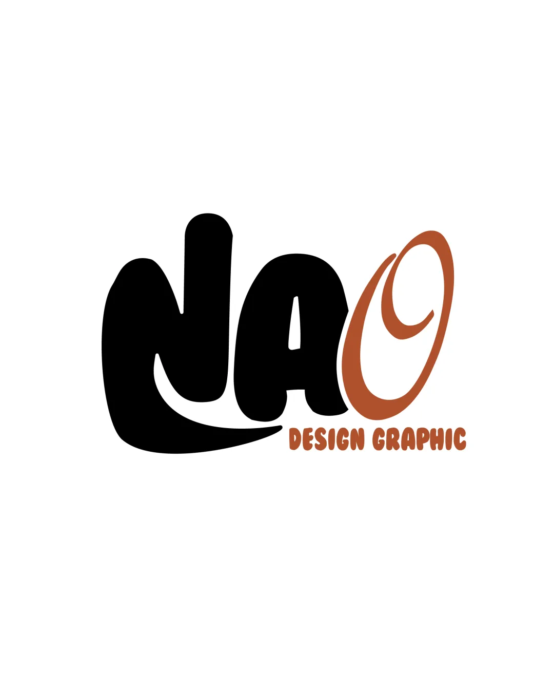
Solid concept for a playful design studio, but readability and minor balance issues must be addressed before showing to clients.
What to fix first
The most important fixes to handle before polishing the full presentation.
Refine the 'O' to enhance clarity—it currently looks less like a letter and more like a decorative element. Consider making it more immediately recognizable as an 'O'.
High priorityThe main business name must be instantly readable, especially for new clients.
Impact: Improves Legibility And Wordmark Unity, Key For Brand Recognition. · Effort: Medium
Adjust weight and balance between the left ('NA') and right ('O') parts for better symmetry.
Medium priorityImbalances draw attention away from the full brand and can look amateurish.
Impact: Elevates Professional Polish And Visual Harmony. · Effort: Low
Logo performance breakdown
Legibility
'DESIGN GRAPHIC' in all-caps and clearly readable
The 'NAO' part is bold and stylized, which may hinder quick reading, especially the 'O' resembling a swoosh/spiral.
Originality
Hand-drawn, playful type gives some personality.
Overall style is not highly distinctive; 'O' resembles clip-art swirl.
Color harmony
Limited palette; black and brown work together consistently.
Could introduce a secondary accent for more energy and hierarchy.
Black
#000000
Brown
#AC633D
Your palette is close. Explore sharper color combinations with Colorfly.design before updating the logo.
Explore palettesBalance alignment
Good weight distribution between 'NAO' and 'DESIGN GRAPHIC'.
'O' visually separated and slightly unbalanced relative to the rest; bottom curve of 'N' may feel heavy.
Scalability
Simple color palette supports one-color versions.
Thin line in the 'O' might vanish at small sizes; bold shapes may merge when scaled down.
200x250 px
100×125 px
50×62 px
Misinterpretations
No inappropriate or embarrassing shapes detected.
'O' is abstract and might be misread as a different symbol, but not in an offensive way.
Brief match
Industry: Visual style matches creative/graphic design industry; playful, hand-drawn aesthetic fits a creative business.
Wondering how your logo performs?
Get a clear logo score, key risks, and priority fix ideas before your client or audience sees it.