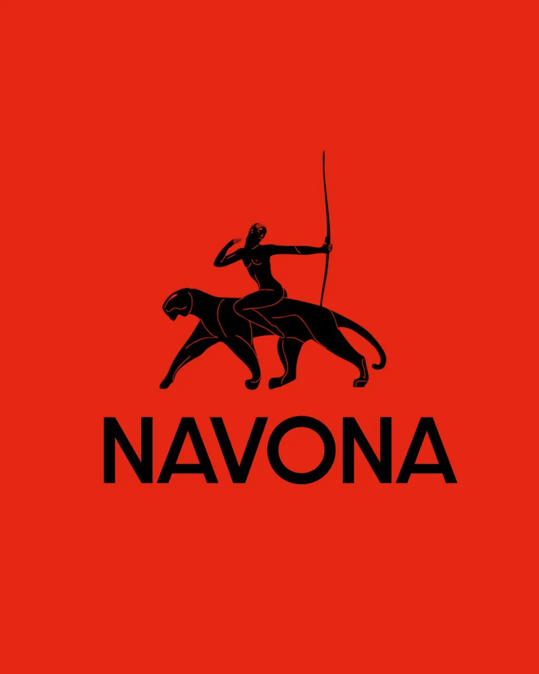
NAVONA logo review
4.6 / 5
Logo score
Logo review of

Navona

Review the detailed scores below to see what is working and what should be refined first.

Objective AI feedback. Your creative decision.

Combination Mark Bold, Elegant Luxury, Fashion, Or Lifestyle
5/5
Legibility
4/5
Originality
5/5
Balance
4/5
Scale
Detailed review

Logo performance breakdown

5/5

Legibility

Checkmark icon Text is clear and easy to read.

4/5

Originality

Checkmark icon Unique combination of elements.

Warning icon Archer on an animal is a common motif in various cultures.

4/5

Color harmony

Checkmark icon Strong contrast with striking color choice.

Warning icon Red background may be overpowering for some brands.

Your palette is close. Refine the color roles and combinations before updating the logo.

Build brand colors
5/5

Balance alignment

Checkmark icon Well-balanced alignment between symbol and text.

logo 200x250 pixels scalability test alignment grid overlay
4/5

Scalability

Checkmark icon Bold design works well across various mediums.

Warning icon Intricate symbol details may be lost in small sizes.

logo 200x250 pixels scalability test

200x250 px

logo 100x125 pixels scalability test

100×125 px

logo 50x62 pixels scalability test

50×62 px

5 / 5

Symbol & text fit

Checkmark icon Text and symbol harmonize well.

Try your own review

Wondering how your logo performs?

Get a clear logo score, key risks, and priority fix ideas before your client or audience sees it.

Review my logo