Reduce reliance on gradient for the monogram and consider simplifying the pen nib.
Gradients and detail may not hold up in all use cases and can complicate single-color applications.
Improves print scalability and versatility.
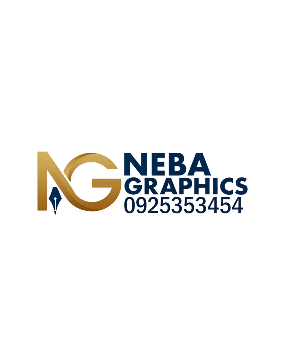
A functional and industry-relevant logo with strong readability, but the monogram's gradient and nibbled pen detail could hinder versatility; reliance on a contact number weakens brand cohesion.
Focus on the changes that matter. Keep what makes the logo work.
Gradients and detail may not hold up in all use cases and can complicate single-color applications.
Improves print scalability and versatility.
Logos are stronger without embedded contact details that can change or distract from the identity.
Increases balance and adaptability for various applications.
Integrates design-related pen nib; communicates graphic design focus.
Estimated colors. Use the original design file for exact values.
Create a full color palette using these colors
Create new palette
Inspect spacing with the guide. Optical balance may differ from geometric centering.
Get a clear logo score, key risks, and priority fix ideas before your client or audience sees it.
More credits needed
Add credits to continue without losing your work.
Then $7/month. Cancel anytime.
AI logo review
Estimated progress



