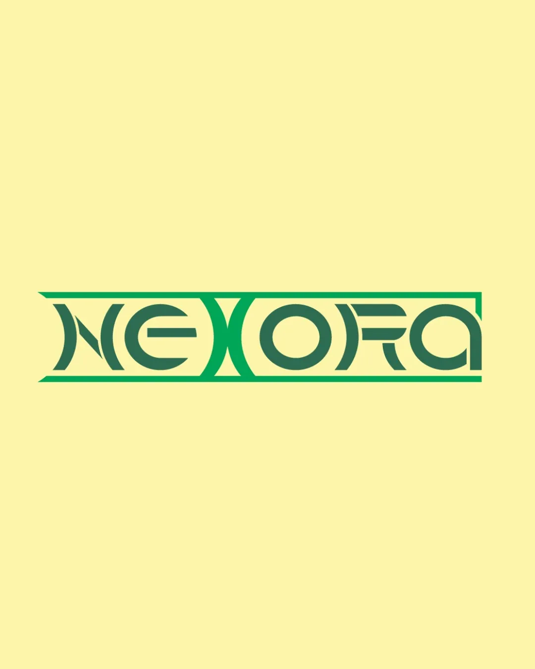
NEXORA logo review
3.9 / 5
Logo score

Logo review ofNexora

Review the detailed scores below to see what is working and what should be refined first.

Wordmark Geometric, Modern Technology
2/5
Legibility
4/5
Originality
5/5
Misread
4/5
Balance
3/5
Scale
Review next
Detailed review

Logo performance breakdown

2/5

Legibility

Checkmark icon Unique geometric forms create a modern feel.

Warning icon Letterforms are highly stylized, making the text hard to read, especially for 'N' and 'R'.
Warning icon The creative cuts and lines in each letter reduce immediate legibility, which may present problems for quick recognition or at a distance.
Warning icon Low contrast between inner negative spaces further impacts readability.

4/5

Originality

Checkmark icon Distinctive, geometric type design—stands out from generic sans-serifs.
Checkmark icon Consistent use of geometric cuts and forms across each letter enhances uniqueness.

Warning icon Letter modification leans into a decorative style replicable by other brands aiming for a 'futuristic/tech' appearance. Some aspects may risk looking trendy rather than evergreen.

5/5

Color harmony

Checkmark icon Green gradient contrasts well with pale yellow background.
Checkmark icon Two-tone palette prevents the logo from feeling chaotic.
Checkmark icon Good palette for digital display and print.

Green
#36A853

Zuccini
#263D2D

Pale Yellow
#F8EF9D

4/5

Balance alignment

Checkmark icon Overall horizontal alignment is consistent.
Checkmark icon Letter spacing and box framing feel balanced.

Warning icon Some internal shapes, like the 'R' and 'O', feel visually heavier due to thick lines, slightly affecting optical balance in the wordmark.

logo 200x250 pixels scalability test alignment grid overlay
3/5

Scalability

Checkmark icon Bold lines ensure some recognizability at medium to large sizes.
Checkmark icon Simplicity in the color palette aids in scaling.

Warning icon Thin interior details may disappear at very small sizes (e.g., favicon or embroidery).
Warning icon Rectangular wordmark with extended sides may not adapt well to every application (e.g., social media app icons/avatars).
Warning icon Highly horizontal aspect ratio reduces flexibility for stacked or compact applications.

logo 200x250 pixels scalability test

200x250 px

logo 100x125 pixels scalability test

100×125 px

logo 50x62 pixels scalability test

50×62 px

5/5

Misinterpretations

Checkmark icon No inappropriate or suggestive imagery detected.
Checkmark icon Overall composition is clear and intentional.

Try your own review

Wondering how your logo performs?

Get a clear logo score, key risks, and priority fix ideas before your client or audience sees it.

Review my logo