NobelzForge logo review
4/5
Logo score
Logo review of

Nobelzforge

A bold, distinctive logo with a memorable integrated mark, but the stylized 'z' may impede instant recognition and warrants refinement.

Combination Bold Geometric, Playful Mark Integration Technology/education
3/5
Legibility
4.5/5
Originality
5/5
Misread
4/5
Balance
3.5/5
Scale
Your next steps

What to fix first

Focus on the changes that matter. Keep what makes the logo work.

1

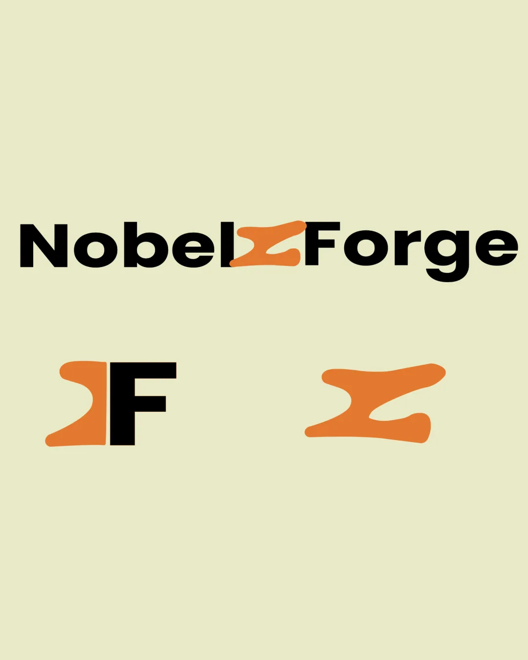
primary wordmark (top band)

Simplify or slightly refine the 'z' shape to improve unmistakable letterform recognition without losing character.

Visible issue High priority Medium effort
Area to inspectApproximate location

The stylized 'z' in 'NobelzForge' is not immediately readable as a 'z', which may hinder first-time recognition of the brand name.

How to check

Test with users unfamiliar with the brand for immediate reading success.

See the category review
2

standalone mark (bottom right band)

Validate clarity and brand association at favicon and app icon sizes.

Worth testing Medium priority Low effort
Area to inspectApproximate location

Very abstract 'z' mark might lose definition or brand connection at small scales or out of context.

How to check

Print or render at 16-32px to verify shape is still distinct and tied to 'z'.

See the category review
Detailed review

Logo performance breakdown

4/5

Brief & logo match

Based on your brief
Compared with

NobelForge simulates a real software development workplace experience for job seekers; the logo must signal authenticity, technical relevance, and distinctiveness.

Clearly fits the ambitious, job-simulation platform but 'z' legibility is an execution risk.

  • Simulated Workplace Authenticity

    The bold, direct composition and integrated mark evoke a sense of practical teamwork and unique process, aligning with an authentic tech/education brand.

  • Brand Distinctiveness For Job-focused Platform

    The custom 'z' mark gives NobelForge a memorable identity that stands out from generic job or edtech logos.

3/5

Legibility

  • Bold, clear supporting typography
  • The stylized 'z' in 'NobelzForge' is not immediately readable as a 'z', which may hinder first-time recognition of the brand name.

    Visible issue primary wordmark (top band)

    Try: Simplify or slightly refine the 'z' shape to improve unmistakable letterform recognition without losing character.

    Check: Test with users unfamiliar with the brand for immediate reading success.
    Area to inspectApproximate location
4.5/5

Originality

  • Distinctive custom letterform treatment
  • Unique integration of mark within wordmark and submarks
4/5

Color harmony

  • Cohesive use of black and orange accent
Orange#F2993C
Black#111111
Light Beige#E5E3BC

Estimated colors. Use the original design file for exact values.

Create a full color palette using these colors

Create new palette
4/5

Balance alignment

  • Strong alignment and weight coherence in the wordmark
  • Visual consistency among versions
Uploaded logoAlignment guide overlay

Inspect spacing with the guide. Optical balance may differ from geometric centering.

3.5/5

Scalability

  • Simple silhouette, minimal details
  • Very abstract 'z' mark might lose definition or brand connection at small scales or out of context.

    Worth testing standalone mark (bottom right band)

    Try: Validate clarity and brand association at favicon and app icon sizes.

    Check: Print or render at 16-32px to verify shape is still distinct and tied to 'z'.

    Area to inspectApproximate location
Uploaded logo at 200 pixels wide
200 × 250 px
Uploaded logo at 100 pixels wide
100 × 125 px
Uploaded logo at 50 pixels wide
50 × 63 px

Compare the detail at different sizes. Labels show the full image dimensions.

5/5

Misinterpretations

  • No unintended readings detected
5/5

Symbol & text fit

  • Excellent integration of the orange 'z' throughout all versions

Black & white

Does the shape still work without color?

These tests are available only for logos uploaded in vector (SVG) format.

Background contrast

Find the surfaces where your logo stays clear.

These tests are available only for logos uploaded in vector (SVG) format.

Blur & silhouette

A 3px blur softens fine details so you can check whether the overall shape stays recognizable. If key gaps close or elements merge, the logo may rely too heavily on detail.

These tests are available only for logos uploaded in vector (SVG) format.

Try your own review

Wondering how your logo performs?

Get a clear logo score, key risks, and priority fix ideas before your client or audience sees it.

Review my logo