RECREATIONAL USE GOLF logo review
3.2/5
Logo score
Logo review of

Recreational Use Golf

A laid-back, visually distinctive logo, but the abstract symbol requires refinement to avoid ambiguity and strengthen relevance.

Combination Abstract Hand-drawn Minimalism Sports/recreation
4/5
Legibility
3/5
Originality
2.5/5
Misread
4/5
Balance
3/5
Scale
Your next steps

What to fix first

Focus on the changes that matter. Keep what makes the logo work.

1

Standalone mark

Clarify the symbol or introduce a more direct graphical cue to golf recreation.

Visible issue High priority Medium effort

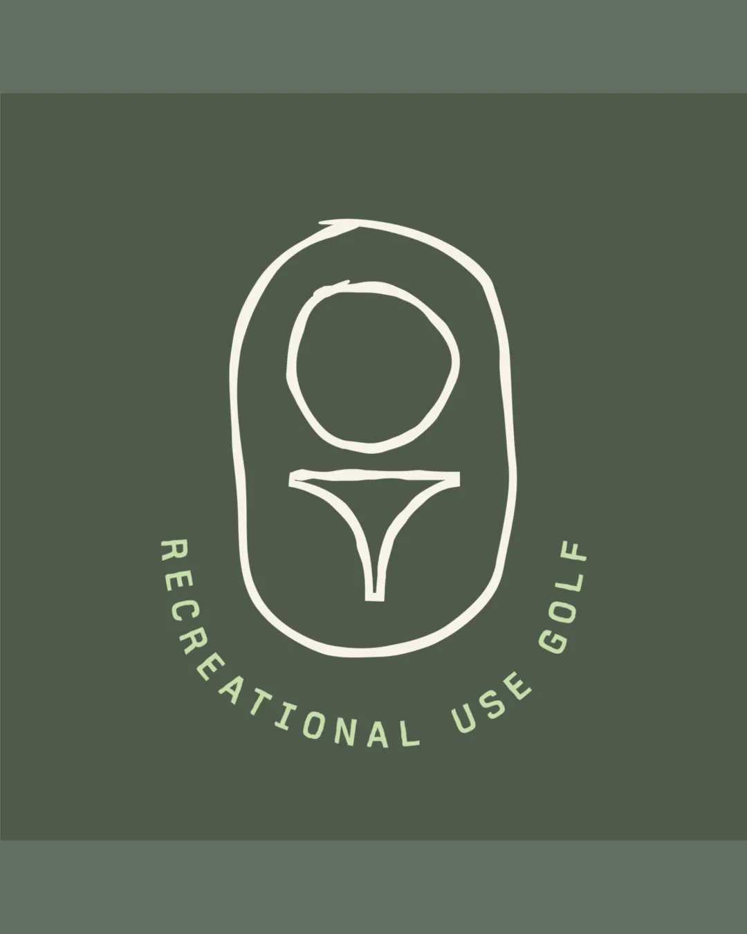
The symbol’s abstract, hand-drawn design offers some distinctiveness but its meaning as golf-related is ambiguous without context.

How to check

Test whether new audiences recognize the mark as golf-related.

See the category review
2

Standalone mark

Test with target audiences for unintended readings or confusion.

Worth testing High priority Medium effort
Area to inspectApproximate location

The abstract symbol may unintentionally be interpreted as unrelated objects, given its loose, minimal form.

How to check

Conduct audience review for misinterpretation risk.

See the category review
Detailed review

Logo performance breakdown

3/5

Brief & logo match

Based on an inferred industry
Compared with

Recreational golf, as directly referenced in the wordmark and suggested (though ambiguously) in the symbol.

The design partially fits the recreational golf context, but the symbol's meaning is unclear without the supporting text.

  • Recreation/Golf Symbolism

    While the wordmark states 'golf', the mark itself gives only an abstract reference that may be lost without the text.

  • Relaxed/approachable Character

    The hand-drawn, loose lines align well with a laid-back, recreational brand identity.

4/5

Legibility

  • Wordmark is clear and sufficiently sized.
  • The curved wordmark is readable but spacing feels slightly wide, which can reduce compactness and visibility at small sizes.

    Optional refinement wordmark

    Try: Tighten the letter spacing slightly for improved legibility, especially in small-scale usage.

    Check: Review the wordmark at smaller scales for spacing performance.

3/5

Originality

  • Hand-drawn aesthetic is distinctive.
  • The symbol’s abstract, hand-drawn design offers some distinctiveness but its meaning as golf-related is ambiguous without context.

    Visible issue Standalone mark

    Try: Clarify the symbol or introduce a more direct graphical cue to golf recreation.

    Check: Test whether new audiences recognize the mark as golf-related.

4/5

Balance alignment

  • Elements are vertically centered, with a balanced text curve.
Uploaded logoAlignment guide overlay

Inspect spacing with the guide. Optical balance may differ from geometric centering.

3/5

Scalability

  • Simple strokes aid scaling.
Uploaded logo at 200 pixels wide
200 × 250 px
Uploaded logo at 100 pixels wide
100 × 125 px
Uploaded logo at 50 pixels wide
50 × 63 px

Compare the detail at different sizes. Labels show the full image dimensions.

2.5/5

Misinterpretations

  • The abstract symbol may unintentionally be interpreted as unrelated objects, given its loose, minimal form.

    Worth testing Standalone mark

    Try: Test with target audiences for unintended readings or confusion.

    Check: Conduct audience review for misinterpretation risk.

    Area to inspectApproximate location
4/5

Symbol & text fit

  • The curved wordmark nicely frames the abstract symbol.

Black & white

Does the shape still work without color?

These tests are available only for logos uploaded in vector (SVG) format.

Background contrast

Find the surfaces where your logo stays clear.

These tests are available only for logos uploaded in vector (SVG) format.

Blur & silhouette

A 3px blur softens fine details so you can check whether the overall shape stays recognizable. If key gaps close or elements merge, the logo may rely too heavily on detail.

These tests are available only for logos uploaded in vector (SVG) format.

Try your own review

Wondering how your logo performs?

Get a clear logo score, key risks, and priority fix ideas before your client or audience sees it.

Review my logo