PSL CONSULTING logo review
3.2/5
Logo score Wordmark category

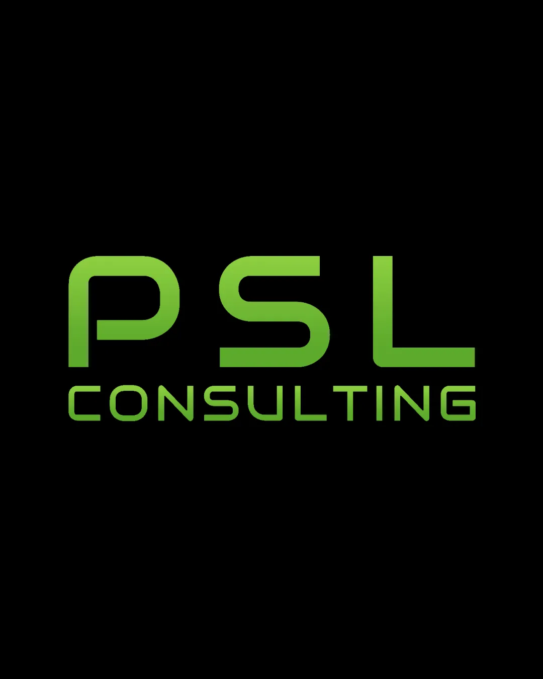
PSL CONSULTING

creative753007 Essential logo review

The wordmark is clean and legible with a modern tech feel, but lacks unique features needed for strong brand distinction.

Legible text:
PSL CONSULTING
Wordmark Modern Geometric Sans-serif Consulting / Technology
5/5
Legibility
2.5/5
Originality
4/5
Balance
4/5
Scale
Your next steps

What to fix first

Focus on the changes that matter. Keep what makes the logo work.

Concept & direction

A clean, geometric wordmark featuring the company initials and name in a modern green gradient, suggesting technology and forward thinking.

Spelling & grammar

No obvious issue found

All text is clearly readable and correctly spelled.

1

wordmark

Consider introducing a unique typographic detail or symbol to enhance memorability.

High priority Visible issue Medium effort

The logo uses a generic geometric sans-serif style without unique customization or a distinctive mark, which is common in the consulting and tech sectors.

How to check

Evaluate contrast with leading consulting/tech brands and test market recall.

See the category review
2

wordmark

Adjust line spacing (leading) between the two lines.

Medium priority Optional refinement Low effort

Spacing between 'PSL' and 'CONSULTING' is well-balanced but could benefit from slightly increased line spacing for clarity at small sizes.

See the category review
Detailed review

Logo performance breakdown

3.5/5

Brief & logo match

The logo has a modern, tech-focused aesthetic but does not stand out in the consulting and AI sector.

5/5

Legibility

  • Clear, modern sans-serif letters.
  • Readable at multiple sizes.
2.5/5

Originality

  • The logo uses a generic geometric sans-serif style without unique customization or a distinctive mark, which is common in the consulting and tech sectors.

    Visible issue wordmark

    Try: Consider introducing a unique typographic detail or symbol to enhance memorability.

    Check: Evaluate contrast with leading consulting/tech brands and test market recall.

4/5

Color harmony

  • Consistent fresh green gradient on black background.
Green#6DD033
Black#000000

Estimated colors. Use the original design file for exact values.

Create a full color palette using these colors

Create new palette
4/5

Balance alignment

  • Elements are optically aligned and spaced.
  • Spacing between 'PSL' and 'CONSULTING' is well-balanced but could benefit from slightly increased line spacing for clarity at small sizes.

    Optional refinement wordmark

    Try: Adjust line spacing (leading) between the two lines.

Uploaded logoAlignment guide overlay

Inspect spacing with the guide. Optical balance may differ from geometric centering.

4/5

Scalability

  • Simple, bold geometry scales well.
5/5

Misinterpretations

  • No negative spaces or ambiguous forms.
Try your own review

Wondering how your logo performs?

Get a clear logo score, key risks, and priority fix ideas before your client or audience sees it.

Review my logo