Consider simplifying the monogram's flourishes for small-size clarity.
Thin loops could disappear in small applications or embroidery.
Improves scalability and reproduction at smaller sizes.
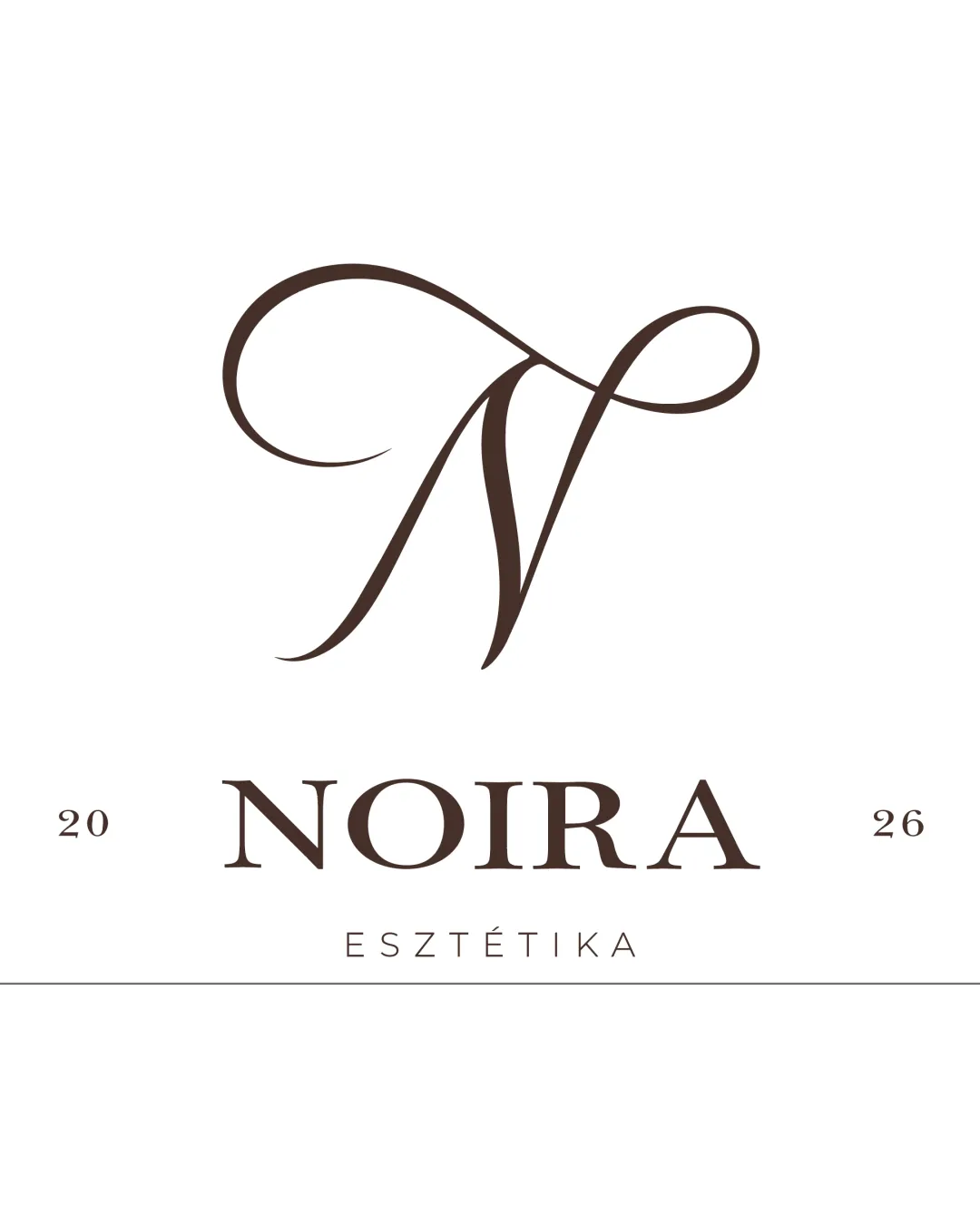
A sophisticated, balanced, and visually refined beauty-sector logo with strong shelf appeal and minor polish opportunities.
Focus on the changes that matter. Keep what makes the logo work.
Thin loops could disappear in small applications or embroidery.
Improves scalability and reproduction at smaller sizes.
Creates a tighter brand presence especially on digital platforms.
Enhances polish and perceived craft.
Elegant monogram and serif wordmark convey premium beauty brand successfully
Design feels professional and gender-neutral, suitable for high-end clientele

Inspect spacing with the guide. Optical balance may differ from geometric centering.
Compare the detail at different sizes. Labels show the full image dimensions.
Does the shape still work without color?
Find the surfaces where your logo stays clear.
A 3px blur softens fine details so you can check whether the overall shape stays recognizable. If key gaps close or elements merge, the logo may rely too heavily on detail.
Get a clear logo score, key risks, and priority fix ideas before your client or audience sees it.
More credits needed
Add credits to continue without losing your work.
Then $7/month. Cancel anytime.