nox DESIGN logo logo review
3.7/5
Logo score Combination mark category

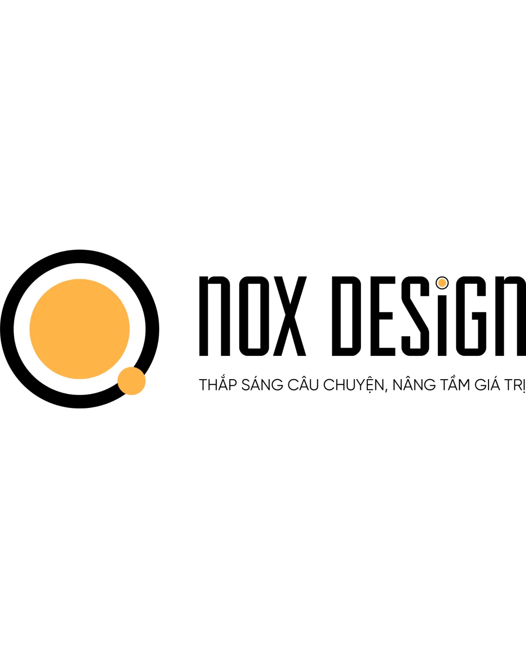
nox DESIGN logo

creative653760 Essential logo review

Distinctive and professional with strong creative appeal; main polish needed in vertical balance between symbol and text.

This logo lockup shows solid execution, supported by distinctive construction and text readability; improving visual balance is the clearest next step.

Combination Mark Minimalist, Geometric Graphic Design / Creative Agency
4/5
Legibility
4/5
Originality
3.3/5
Balance
3.4/5
Scale
4/5
Color
4/5
Style consistency
Your next steps

What to fix first

Focus on the changes that matter. Keep what makes the logo work.

1

Primary lockup: wordmark and symbol

Raise the symbol slightly or adjust the wordmark position for improved vertical balance.

High priority Visible issue Low effort

The vertical alignment between the symbol and wordmark feels slightly off—symbol sits visually heavier and lower than the tallest point of the wordmark, affecting overall balance.

See the category review
Detailed review

Logo performance breakdown

4/5

Brief & logo match

The minimalist, modern symbol and wordmark align well with the creative, professional goals for a visual branding studio; minor polish needed in balance and tagline clarity for optimal use across all branded materials.

5/5

Misinterpretations

  • No harmful or ambiguous misreadings supported.
4/5

Legibility

Wordmark 4/5 · Layout 4/5

  • Wordmark is clear and readable at main size.
  • Distinctive letterforms balance style and clarity.
4/5

Originality

Symbol 4/5 · Wordmark 4/5

  • Abstract symbol is stylish and distinct.
  • Wordmark has unique type characteristics.
4/5

Color harmony

Symbol 4/5 · Wordmark 4/5

  • Black and orange create strong contrast and a fresh, creative impression.
Black#000000
Orange#FDBD46

Estimated colors. Use the original design file for exact values.

Create a full color palette using these colors

Create new palette
4/5

Style consistency

  • Shared circular motif and dot color tie symbol and wordmark together.
3.4/5

Scalability

Symbol 4/5 · Wordmark 3/5 · Layout 3/5

Available in Advanced logo reviews
3.3/5

Balance alignment

Symbol 3/5 · Wordmark 4/5 · Layout 3/5

Available in Advanced logo reviews
Try your own review

Wondering how your logo performs?

Get a clear logo score, key risks, and priority fix ideas before your client or audience sees it.

Review my logo