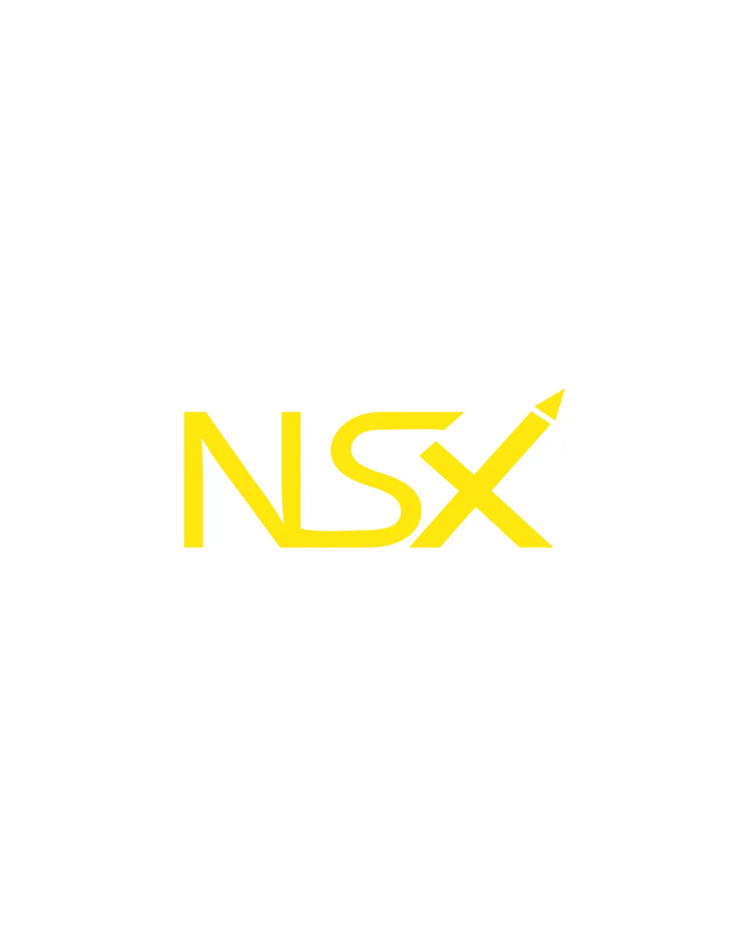
NSX logo review
4.0 / 5
Logo score
Logo review of

Nsx

Review the detailed scores below to see what is working and what should be refined first.

Objective AI feedback. Your creative decision.

Lettermark Modern, Minimal Education
4/5
Legibility
4/5
Originality
5/5
Misread
4/5
Balance
3/5
Scale
Detailed review

Logo performance breakdown

4/5

Legibility

Checkmark icon The NSX letters are generally clear and readable.
Checkmark icon Good spacing and no over-decoration.

Warning icon The pencil integration in the X adds a minor distraction and could reduce clarity at smaller sizes.
4/5

Originality

Checkmark icon The use of a pencil to form part of the letter X is a creative approach that adds uniqueness and directly relates to the education or creative industry.

Warning icon Pencil motifs in logos are somewhat common in the educational sector, but this implementation is moderately original.

4/5

Color harmony

Checkmark icon Single vivid yellow works well on a white background, offering strong contrast and modern appeal.

Warning icon May lose effect on colored and dark backgrounds; lacks a secondary color for depth or adaptability.

Yellow
#FFE600

White
#FFFFFF

Your palette is close. Refine the color roles and combinations before updating the logo.

Build brand colors
4/5

Balance alignment

Checkmark icon Overall composition feels visually balanced; letters are uniformly weighted.

Warning icon The X with the pencil leans rightward, creating minor asymmetry compared to NS. Centering could use refinement.

logo 200x250 pixels scalability test alignment grid overlay
3/5

Scalability

Checkmark icon Strong, bold shapes will print well on larger formats like posters and signage.
Checkmark icon Simplicity aids reproduction in most contexts.

Warning icon Thin sections in the pencil tip and stylization may lose detail at very small sizes e.g., favicons or embroidery.
Warning icon Monochrome/one-color adaptation could lose the pencil representation.

logo 200x250 pixels scalability test

200x250 px

logo 100x125 pixels scalability test

100×125 px

logo 50x62 pixels scalability test

50×62 px

5/5

Misinterpretations

Checkmark icon No inappropriate dual meanings or problematic symbolism detected.

Try your own review

Wondering how your logo performs?

Get a clear logo score, key risks, and priority fix ideas before your client or audience sees it.

Review my logo