What to preserve
The logo uses geometric, stylized letterforms to create a unique, tightly spaced wordmark with some letters using angled cuts for distinction.
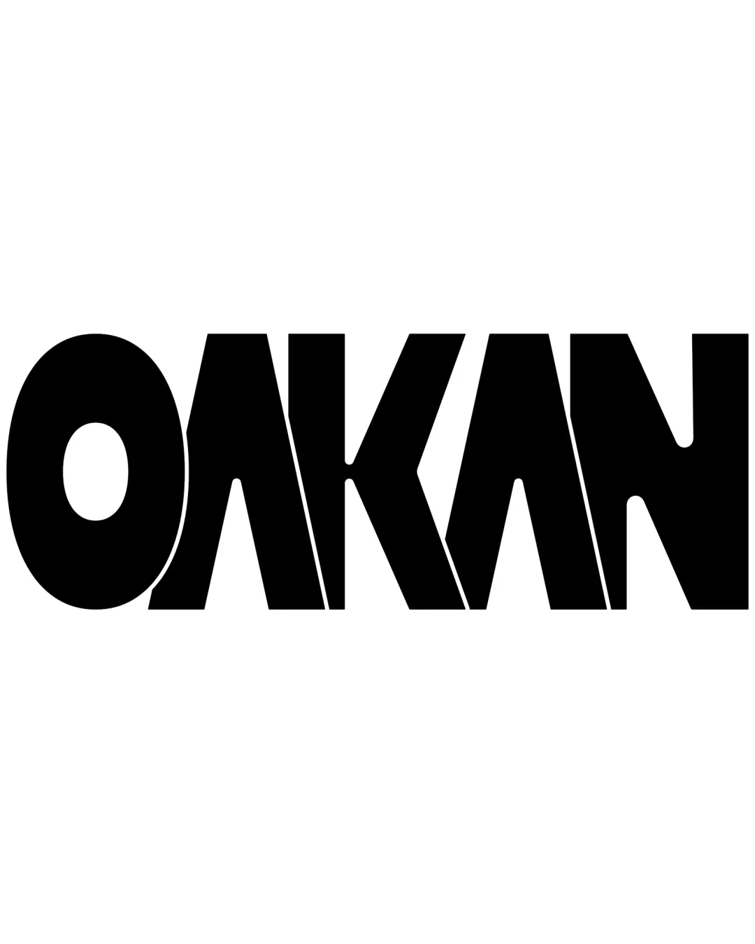
A bold, modern wordmark with strong visual impact and originality; small refinements will further elevate its versatility.
Focus on the changes that matter. Keep what makes the logo work.
The logo uses geometric, stylized letterforms to create a unique, tightly spaced wordmark with some letters using angled cuts for distinction.
Currently the spacing is very tight and could limit usage on small formats.
Improves readability and legibility across applications.

Inspect spacing with the guide. Optical balance may differ from geometric centering.
Get a clear logo score, key risks, and priority fix ideas before your client or audience sees it.
More credits needed
Add credits to continue without losing your work.
Then $7/month. Cancel anytime.
Essential logo review with AI
Estimated progress