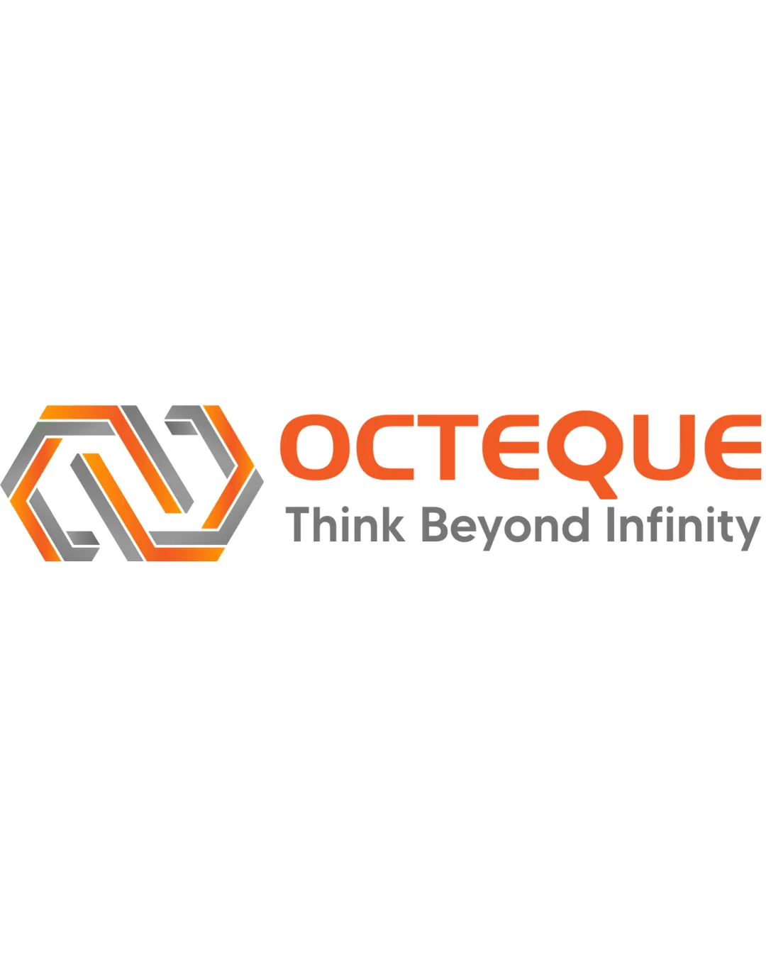
OCTEQUE
Think Beyond Infinity logo review
3.5/5
Logo score
Logo review of

Octeque Think Beyond Infinity

Strong, on-brand logo that would benefit from unique adjustments and minor compositional refinements.

Combination Modern Geometric Technology Consulting
5/5
Legibility
3/5
Originality
5/5
Misread
3/5
Balance
4/5
Scale
Your next steps

What to fix first

Focus on the changes that matter. Keep what makes the logo work.

1

Standalone mark and wordmark

Refine visual weight relationship between symbol and text, either by resizing or adjusting thickness.

Optional refinement Medium priority Low effort
Area to inspectApproximate location

There is a slight imbalance in visual weight between the dense geometric mark and lighter wordmark, which could reduce overall harmony.

How to check

Ensure mark and wordmark feel more unified and balanced side by side.

See the category review
2

Standalone mark

Explore minor unique tweaks or integrations to further differentiate the symbol.

Optional refinement Medium priority Medium effort
Area to inspectApproximate location

While the geometric elements are well-crafted, the interlocking hexagonal style is somewhat common in the tech consulting space.

How to check

Test refined version for greater distinctiveness against category norms.

See the category review
Detailed review

Logo performance breakdown

4/5

Brief & logo match

Based on your brief
Compared with

It is technology consulting company

Logo clearly communicates technology and consulting focus, with minor risks of blending into generic tech iconography.

  • Tech Consulting Identity

    Geometric ribbon mark suggests connectivity and technology.

  • Forward-thinking Ethos

    Tagline and modern style signal innovation and ambition.

5/5

Legibility

  • Both main text and tagline are clearly readable.
3/5

Originality

  • Mark is well-executed but uses familiar geometric symbolism.
  • While the geometric elements are well-crafted, the interlocking hexagonal style is somewhat common in the tech consulting space.

    Optional refinement Standalone mark

    Try: Explore minor unique tweaks or integrations to further differentiate the symbol.

    Check: Test refined version for greater distinctiveness against category norms.

    Area to inspectApproximate location
4/5

Color harmony

  • Orange and gray combo is modern and vibrant.
Orange#F16220
Gray#818285
White#FFFFFF

Estimated colors. Use the original design file for exact values.

Create a full color palette using these colors

Create new palette
3/5

Balance alignment

  • Elements are generally aligned.
  • There is a slight imbalance in visual weight between the dense geometric mark and lighter wordmark, which could reduce overall harmony.

    Optional refinement Standalone mark and wordmark

    Try: Refine visual weight relationship between symbol and text, either by resizing or adjusting thickness.

    Check: Ensure mark and wordmark feel more unified and balanced side by side.
    Area to inspectApproximate location
Uploaded logoAlignment guide overlay

Inspect spacing with the guide. Optical balance may differ from geometric centering.

4/5

Scalability

  • Mark and wordmark are clean and maintain clarity at smaller sizes.
Uploaded logo at 200 pixels wide
200 × 250 px
Uploaded logo at 100 pixels wide
100 × 125 px
Uploaded logo at 50 pixels wide
50 × 63 px

Compare the detail at different sizes. Labels show the full image dimensions.

5/5

Misinterpretations

  • No unintended or confusing secondary readings detected.
4/5

Symbol & text fit

  • Color palette and style provide a visual link between logomark and wordmark.

Black & white

Does the shape still work without color?

These tests are available only for logos uploaded in vector (SVG) format.

Background contrast

Find the surfaces where your logo stays clear.

These tests are available only for logos uploaded in vector (SVG) format.

Blur & silhouette

A 3px blur softens fine details so you can check whether the overall shape stays recognizable. If key gaps close or elements merge, the logo may rely too heavily on detail.

These tests are available only for logos uploaded in vector (SVG) format.

Try your own review

Wondering how your logo performs?

Get a clear logo score, key risks, and priority fix ideas before your client or audience sees it.

Review my logo