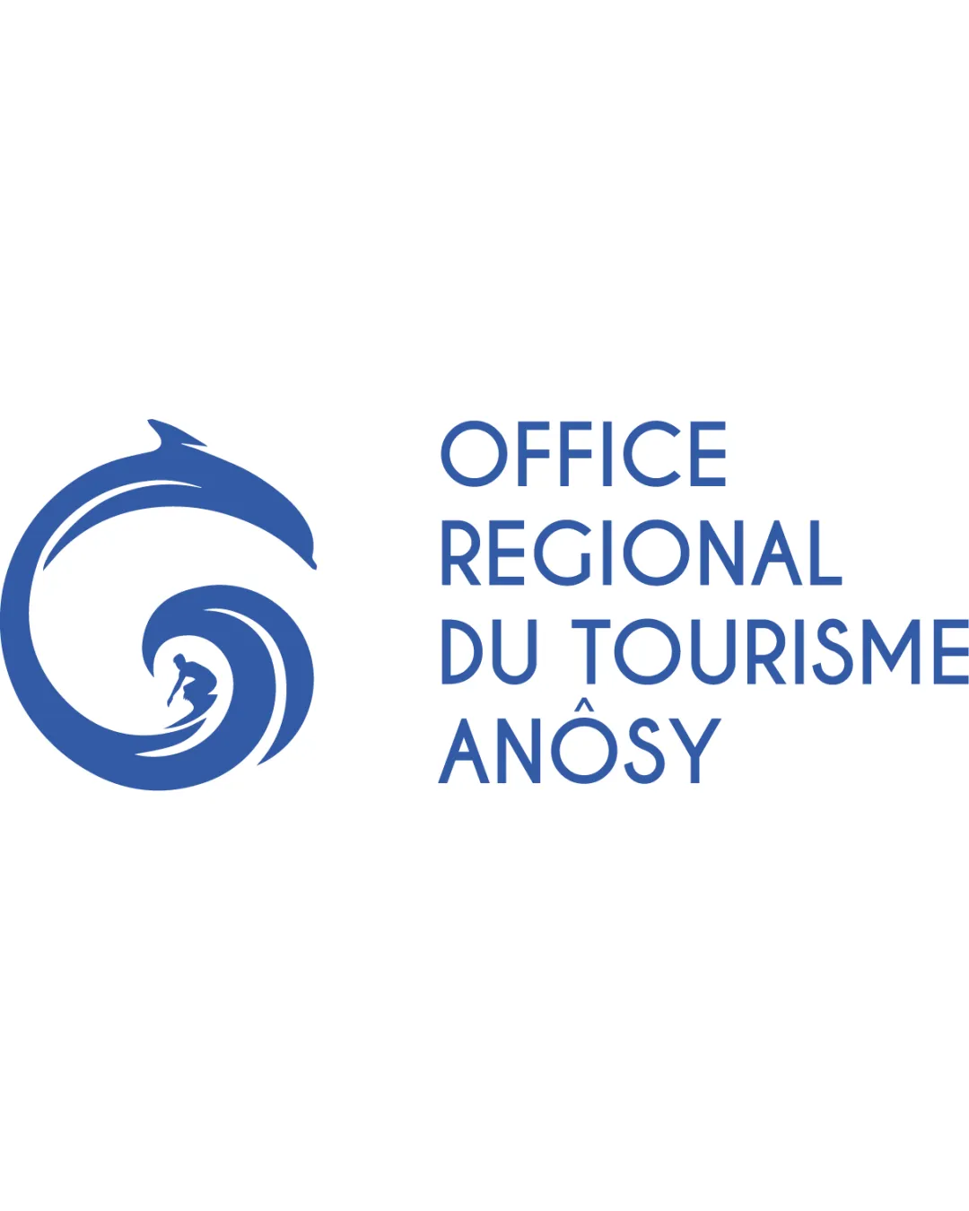
OFFICE REGIONAL DU TOURISME ANÔSY logo review
4/5
Logo score
Logo review of

Office Regional Du Tourisme Anôsy

A lively and regionally meaningful logo with strong clarity and minor scalability risks.

Combination Modern Pictorial With Geometric Sans-serif Wordmark Tourism
5/5
Legibility
4/5
Originality
5/5
Misread
3/5
Balance
3/5
Scale
Your next steps

What to fix first

Focus on the changes that matter. Keep what makes the logo work.

1

Standalone mark

Test the mark at small reproduction sizes to ensure the surfer remains visible.

Worth testing High priority Low effort
Area to inspectApproximate location

The surfer detail within the wave may become indistinct at small sizes, reducing recognizability.

How to check

Review legibility with common avatar, favicon, or stamp usages.

See the category review
2

wordmark alignment

Explore text positioning or size adjustments for stronger logo integration.

Optional refinement Medium priority Low effort

The geometric sans-serif type aligns left but feels disconnected from the circular energy of the symbol, causing mild imbalance.

How to check

Compare visual flow with alternative lockups or relative scaling.

See the category review
Detailed review

Logo performance breakdown

4/5

Brief & logo match

Based on an inferred industry
Compared with

Tourism organization, likely coastal or regional focus, inferred from visual elements and French text.

The logo fits its inferred tourism context with appropriate and evocative coastal imagery.

  • Tourism And Regional Identity

    The combination of wave, dolphin, and surfer directly promotes a coastal, adventure-focused tourism appeal.

  • Clarity And Accessibility

    Sans-serif type and plain French labeling ensure legibility and easy understanding for French-speaking audiences.

5/5

Legibility

  • Clear, well-spaced type
  • No textual ambiguity
4/5

Originality

  • Distinctive dolphin-and-wave integration
  • Active, regionally relevant concept
3/5

Balance alignment

  • Strong vertical rhythm in text
  • The geometric sans-serif type aligns left but feels disconnected from the circular energy of the symbol, causing mild imbalance.

    Optional refinement wordmark alignment

    Try: Explore text positioning or size adjustments for stronger logo integration.

    Check: Compare visual flow with alternative lockups or relative scaling.

Uploaded logoAlignment guide overlay

Inspect spacing with the guide. Optical balance may differ from geometric centering.

3/5

Scalability

  • Distinct silhouette for the mark
  • The surfer detail within the wave may become indistinct at small sizes, reducing recognizability.

    Worth testing Standalone mark

    Try: Test the mark at small reproduction sizes to ensure the surfer remains visible.

    Check: Review legibility with common avatar, favicon, or stamp usages.
    Area to inspectApproximate location
Uploaded logo at 200 pixels wide
200 × 250 px
Uploaded logo at 100 pixels wide
100 × 125 px
Uploaded logo at 50 pixels wide
50 × 63 px

Compare the detail at different sizes. Labels show the full image dimensions.

5/5

Misinterpretations

  • No plausible misreading
4/5

Symbol & text fit

  • Thematically coherent with organizational purpose

Black & white

Does the shape still work without color?

These tests are available only for logos uploaded in vector (SVG) format.

Background contrast

Find the surfaces where your logo stays clear.

These tests are available only for logos uploaded in vector (SVG) format.

Blur & silhouette

A 3px blur softens fine details so you can check whether the overall shape stays recognizable. If key gaps close or elements merge, the logo may rely too heavily on detail.

These tests are available only for logos uploaded in vector (SVG) format.

Try your own review

Wondering how your logo performs?

Get a clear logo score, key risks, and priority fix ideas before your client or audience sees it.

Review my logo