Wondering how your logo performs? 🧐
Get professional logo reviews in seconds and catch design issues in time.
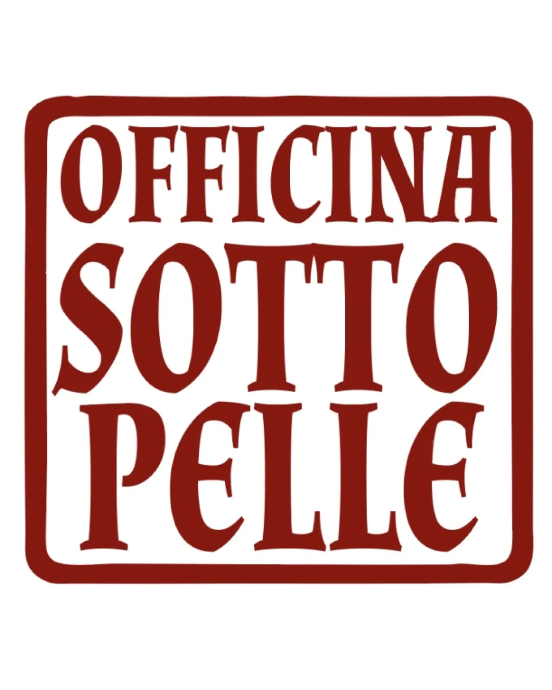
Try it Now!Logo review of OFFICINA SOTTO PELLE
 Logo analysis by AI
Logo type:
Style:
Detected symbol:
Detected text:
Business industry:
Review requested by Onyxnocturna
**If AI can recognize or misinterpret it, so can people.
Structured logo review
Legibility
 Text is highly readable with strong contrast against the background Distinct serif letterforms create visual character
 Custom serif styling leads to a few uneven letterforms, slightly affecting rapid readability, especially in the word 'SOTTO'
Scalability versatility
Very simple color palette improves clarity across applications Bold typography is generally recognizable at smaller scales
Thin serifs and compressed vertical layout may render poorly at tiny sizes such as app icons or embroidery Could lose impact or detail on signage from a distance
200x250 px
100×125 px
50×62 px
Balance alignment
Symmetrical horizontal centering adds structure Equal weight distribution between text lines
Letter spacing and alignment feel hand-drawn; uneven gaps (especially in 'OFFICINA' and 'PELLE') make visual rhythm inconsistent Rectangular border is slightly wobbly, amplifying imbalance

Originality
Custom type choice and vintage stamp-like style offer some uniqueness Frame design is less commonly used in contemporary logos
Wordmark-in-a-box layout is fairly standard for artisan brands No unusual negative space use or truly distinctive typographic twist
Aesthetic look
Strong visual impact from bold red color and vintage aesthetic Unified type style feels cohesive
Hand-drawn irregularity gives some charm but compromises refinement Feels somewhat plain and boxy; lacks dynamic flair
Dual meaning and misinterpretations
No accidental suggestive or negative shapes identified
Color harmony
Monochrome palette reinforces brand focus and elegance Red provides strong presence suitable for creative industries
Pueblo
#82190A