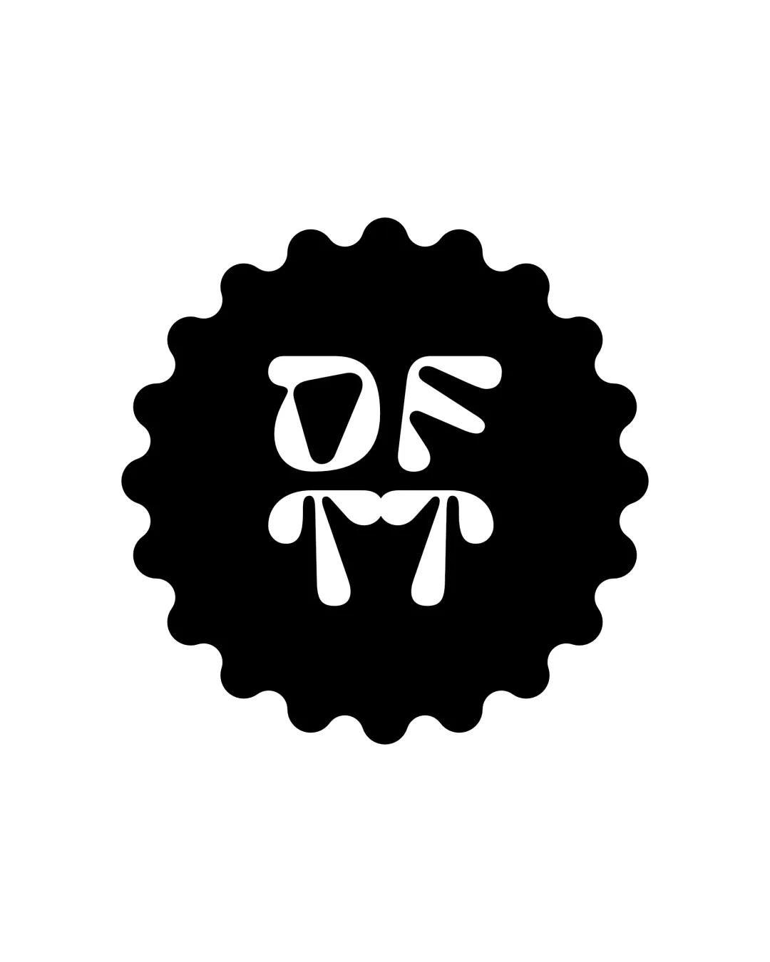
OFM logo review
3.0 / 5
Logo score
Logo review of

Ofm

Distinctive and playful, but the logo's creative letter styling compromises clear recognition and risks misinterpretation. Strengthen letter clarity to achieve professional quality.

Objective AI feedback. Your creative decision.

Monogram Playful Geometric
2.5/5
Legibility
4/5
Originality
2.5/5
Misread
3/5
Balance
4/5
Scale
Action plan

What to fix first

The most important fixes to handle before polishing the full presentation.

1

Fix possible misinterpretation

High priority

Some may misinterpret the letter arrangement or see a face or other shape, especially with the 'M' and 'F' forms.

Impact: High · Effort: Medium

2

Refine letter form clarity, especially the 'F', to improve instant recognition.

High priority

Core monogram legibility is the main weakness and impacts brand recall.

Impact: Readability And Brand Clarity Will Greatly Improve. · Effort: Medium

Detailed review

Logo performance breakdown

2.5/5

Legibility

Checkmark icon Custom letterforms are memorable.

Warning icon Letter shapes are uneven and borderline ambiguous.
Warning icon 'O' and 'M' are readable, but the 'F' could be mistaken for an 'E' or abstract mark.

4/5

Originality

Checkmark icon Bulbous, abstracted lettering is distinctive.
Checkmark icon Unusual silhouette and playful construction.

Warning icon Readability is sacrificed for style.

3/5

Balance alignment

Checkmark icon Circle provides consistent, central balance.

Warning icon Interior layout feels visually top-heavy.
Warning icon Spacing between the three letters is inconsistent.

logo 200x250 pixels scalability test alignment grid overlay
4/5

Scalability

Checkmark icon Simple, bold shapes reproduce well at various sizes.
Checkmark icon Minimal detail enhances scaling.

Warning icon Inner letter spacing may clog at tiny sizes.

logo 200x250 pixels scalability test

200x250 px

logo 100x125 pixels scalability test

100×125 px

logo 50x62 pixels scalability test

50×62 px

2.5/5

Misinterpretations

Checkmark icon Abstract forms are generally safe.

Warning icon Some may misinterpret the letter arrangement or see a face or other shape, especially with the 'M' and 'F' forms.

Try your own review

Wondering how your logo performs?

Get a clear logo score, key risks, and priority fix ideas before your client or audience sees it.

Review my logo