View review
Logo score
Logo review of
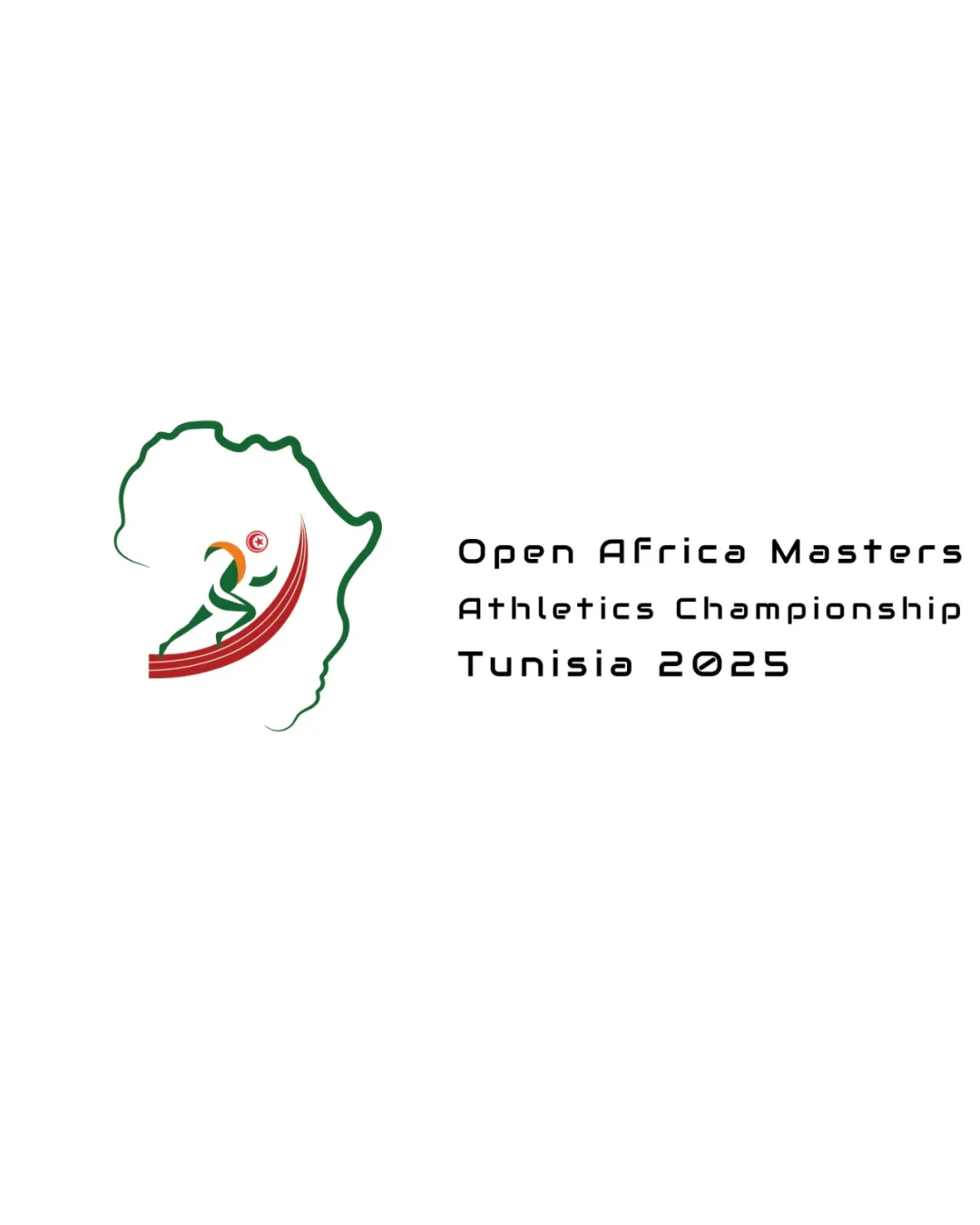
Open Africa Masters Athletics Championship Tunisia..
Review the detailed scores below to see what is working and what should be refined first.
Objective AI feedback. Your creative decision.
Legibility
Originality
Misread
Balance
Scale
Detailed review
Logo performance breakdown
Legibility
 Text is clear and readable Appropriate font choice for a sports event
 Spacing between lines could be improved for better clarity
Originality
Unique incorporation of African continent outline with a runner
Symbol is somewhat generic for sports events
Color harmony
Colors are appropriate and represent African themes
Consider reducing the number of colors for simplicity
Your palette is close. Refine the color roles and combinations before updating the logo.
Build brand colorsBalance alignment
Well balanced with clear separation between text and symbol
Alignment of text could be slightly adjusted for better visual balance

Scalability
Logo is recognizable at various sizes
Details in Africa outline and runner may lose clarity at smaller sizes
200x250 px
100×125 px
50×62 px
Misinterpretations
No inappropriate symbols detected
Try your own review
Review my logo
Wondering how your logo performs?
Get a clear logo score, key risks, and priority fix ideas before your client or audience sees it.
Keep exploring