Our Clean Beaches Foundation logo review
4/5
Logo score
Logo review of

Our Clean Beaches Foundation

This logo is strong and well-suited to its purpose, with minor refinements to balance elevating it to professional consistency.

Combination Mark Friendly Geometric Icon Suite With Modern Sans-serif Wordmark Environmental Nonprofit / Coastal Conservation
5/5
Legibility
4/5
Originality
5/5
Misread
3/5
Balance
4/5
Scale
Your next steps

What to fix first

Focus on the changes that matter. Keep what makes the logo work.

1

icon suite and wordmark positioning

Adjust the vertical alignment or scale the icon block marginally for better visual balance.

Optional refinement Medium priority Low effort
Area to inspectApproximate location

The horizontal alignment between the icon block and the text is not fully optically balanced; the icon block's visual weight slightly overpowers the wordmark start.

How to check

Print or display the logo at multiple sizes and judge perceived balance at a glance.

See the category review
Detailed review

Logo performance breakdown

4/5

Brief & logo match

Based on an inferred industry
Compared with

Environmental nonprofit with a focus on clean beaches and marine life.

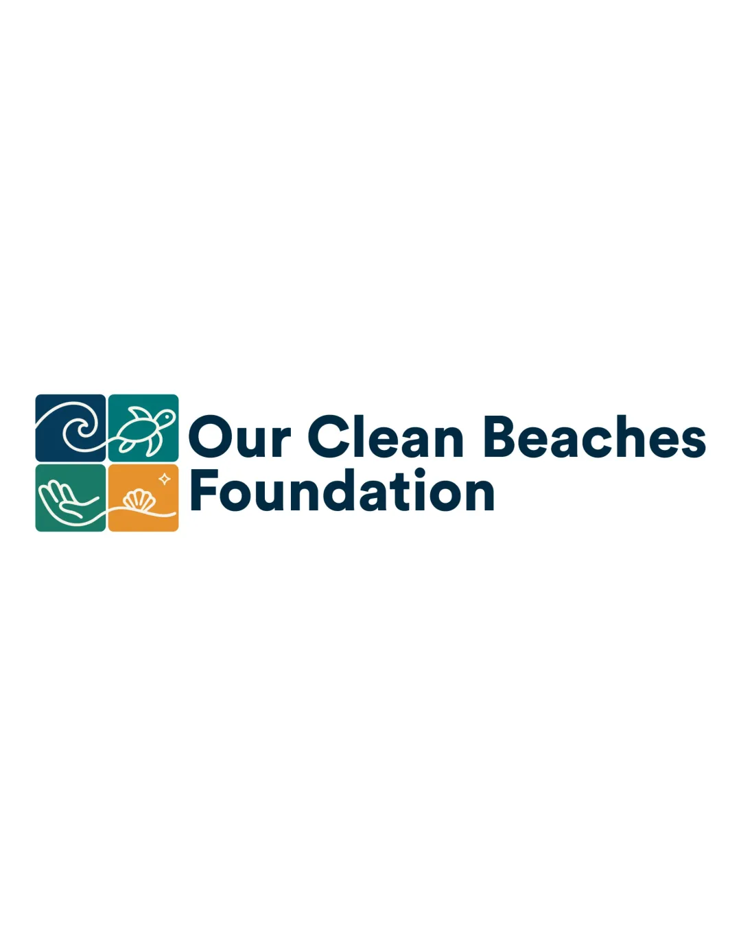
The logo clearly signals environmental stewardship and beach conservation with inviting, understandable icons and contemporary type.

  • Coastal And Environmental Theme

    Wave, turtle, seashell, and hand represent relevant environmental and beach motifs.

  • Readability And Modernity

    Sans-serif typeface is modern and highly legible, supporting a contemporary nonprofit image.

5/5

Legibility

  • Excellent large, clear typeface
  • Icons remain understandable at moderate reduction
4/5

Originality

  • Icon set is friendly and approachable
  • Good use of visual metaphors for coastal care
4/5

Color harmony

  • Fresh color palette fits theme
  • Strong contrast between icons and background
Dark Blue#002E44
Teal#23A294
Gold#F9B04E
Green#44B87F
White#FFFFFF

Estimated colors. Use the original design file for exact values.

Create a full color palette using these colors

Create new palette
3/5

Balance alignment

  • Icon grid is visually structured
  • Wordmark has even spacing
  • The horizontal alignment between the icon block and the text is not fully optically balanced; the icon block's visual weight slightly overpowers the wordmark start.

    Optional refinement icon suite and wordmark positioning

    Try: Adjust the vertical alignment or scale the icon block marginally for better visual balance.

    Check: Print or display the logo at multiple sizes and judge perceived balance at a glance.

    Area to inspectApproximate location
Uploaded logoAlignment guide overlay

Inspect spacing with the guide. Optical balance may differ from geometric centering.

4/5

Scalability

  • Icons have simple forms with enough separation
  • Should reproduce well in digital and most print formats
Uploaded logo at 200 pixels wide
200 × 250 px
Uploaded logo at 100 pixels wide
100 × 125 px
Uploaded logo at 50 pixels wide
50 × 63 px

Compare the detail at different sizes. Labels show the full image dimensions.

5/5

Misinterpretations

  • No plausible misreadings detected
4/5

Symbol & text fit

  • Icon block and wordmark are thematically unified

Black & white

Does the shape still work without color?

These tests are available only for logos uploaded in vector (SVG) format.

Background contrast

Find the surfaces where your logo stays clear.

These tests are available only for logos uploaded in vector (SVG) format.

Blur & silhouette

A 3px blur softens fine details so you can check whether the overall shape stays recognizable. If key gaps close or elements merge, the logo may rely too heavily on detail.

These tests are available only for logos uploaded in vector (SVG) format.

Try your own review

Wondering how your logo performs?

Get a clear logo score, key risks, and priority fix ideas before your client or audience sees it.

Review my logo