Wondering how your logo performs? 🧐
Get professional logo reviews in seconds and catch design issues in time.
Try it Now!Logo review of OwlTnk
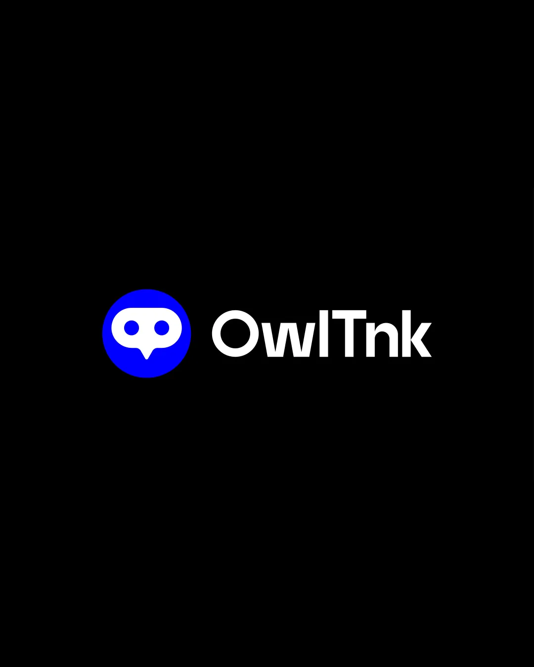
 Logo analysis by AI
Logo type:
Style:
Detected symbol:
Negative space:
Detected text:
Business industry:
Review requested by Mehedi
**If AI can recognize or misinterpret it, so can people.
Structured logo review
Legibility
 The text 'OwlTnk' is clear, bold, and easy to read against the dark background. Font choice is modern and well-balanced with good spacing.
Scalability versatility
The symbol is simple and would remain recognizable at small sizes, such as in app icons or favicons. Text is bold enough to remain legible on business cards or small print formats.
 The thin gap between the owl eyes and beak details could get lost at extremely small sizes. Some loss of clarity might occur when used as monochrome embroidery or etched in small detail applications.
200x250 px
100×125 px
50×62 px
Balance alignment
Excellent alignment between the symbol and the wordmark; the proportions feel intentional and cohesive. Horizontal arrangement creates a balanced and visually stable composition.

Originality
Creative use of an owl face formed by negative space within a chat bubble - a clever integration with relevance to technology/communication. Distinct from generic owl or chatbot symbols due to the custom eye-and-beak mark.
The chat bubble concept is common in tech/logos for messaging or communication, so some level of familiarity persists.
Logomark wordmark fit
The modern, geometric style of the wordmark complements the symbol perfectly. Both elements share a clean, bold visual language.
Aesthetic look
Minimalist approach is attractive and professional. Strong visual contrast enhances immediate recognition. The visual metaphor is pleasing without being overly literal.
Dual meaning and misinterpretations
No inappropriate or confusing imagery detected in any orientation. Symbol is easily understood as an owl and a chat bubble.
Color harmony
Limited palette (blue, white, black) is harmonious and suitable for technology branding. High contrast improves legibility and visual impact.
Blue
#0953FF
White
#FFFFFF
Black
#000000