View review
Logo score
Logo review of
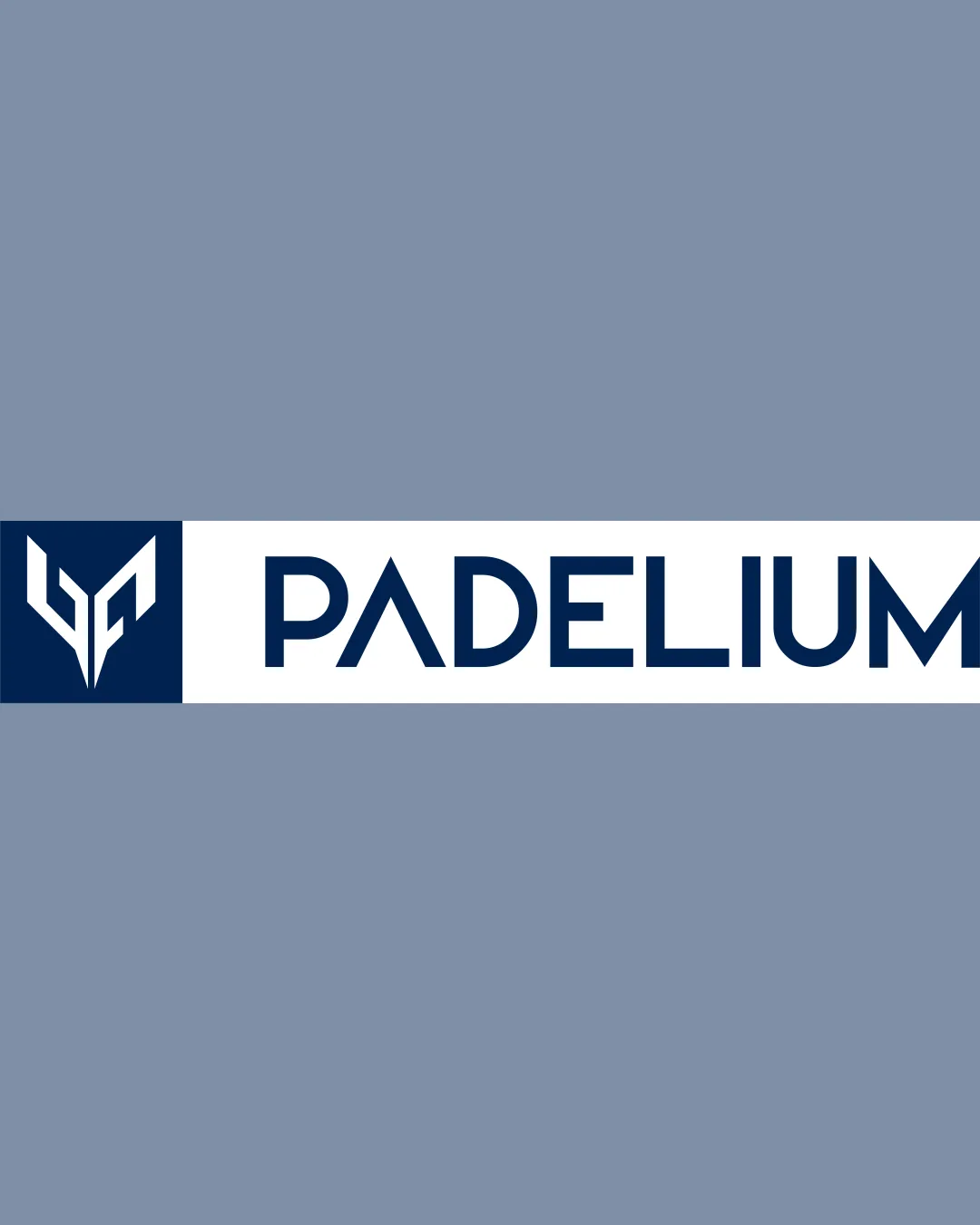
Padelium
Review the detailed scores below to see what is working and what should be refined first.
Objective AI feedback. Your creative decision.
Legibility
Originality
Misread
Balance
Scale
Detailed review
Logo performance breakdown
Legibility
 Wordmark is constructed with clear, modern typography. Excellent contrast ensures high readability. Letter spacing improves legibility, especially for a sports context.
Originality
Monogram creates a unique, memorable visual that distinguishes the brand. Use of negative space is thoughtful and adds creativity.
 The geometric monogram style is somewhat common in the sports/fitness industry.
Color harmony
Limited to two main tones—delivering a clean, professional, and versatile look. High contrast between text, logomark, and background enhances visual accessibility.
Dark Blue
#1E314C
White
#FFFFFF
Pale Blue
#8A97A7
Balance alignment
Good horizontal alignment between logomark and wordmark. Consistent spacing and cohesive geometrical proportions.
Logomark may feel slightly heavy compared to the fine quality of the wordmark, leading to minor visual weight imbalance.

Scalability
Bold lines and clear shapes maintain clarity at smaller sizes. Simple color palette enhances reproduction on various media such as jerseys, signage, and merchandise.
Small details within the monogram may become less distinct at very tiny scales like favicons or embroidery. Elongated horizontal format may not fit social media avatars or square applications seamlessly.
200x250 px
100×125 px
50×62 px
Misinterpretations
No inappropriate or misleading symbolism detected. Abstractness allows for versatile interpretation without negative connotations.
Symbol & text fit
Modern angular theme is consistent in both the logomark and wordmark.
Color matching and proportion are thoughtfully considered.
Slight stylistic disjunction: the monogram feels a bit sharper and heavier than the more refined wordmark.
Try your own review
Review my logo
Wondering how your logo performs?
Get a clear logo score, key risks, and priority fix ideas before your client or audience sees it.
Keep exploring