 View review
Logo score
Logo review of
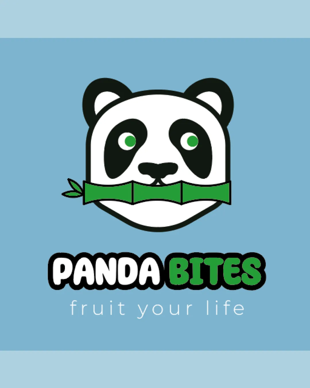
Panda Bites, Fruit Your Life
Review the detailed scores below to see what is working and what should be refined first.
Objective AI feedback. Your creative decision.
Legibility
Originality
Balance
Scale
Detailed review
Logo performance breakdown
Legibility
 The text is clear and easy to read.
Originality
The use of a panda with bamboo creatively ties to the brand name.
 Panda images are commonly used, slightly affecting originality.
Color harmony
The color scheme is harmonious and fitting for both the brand and theme.
Balance alignment
The elements are well balanced and aligned.

Scalability
The design is simple enough to be recognizable at smaller sizes.
Detailed features of the panda might be lost at very small sizes.
200x250 px
100×125 px
50×62 px
Symbol & text fit
The mascot and text work well together, creating a cohesive look.
Try your own review
Review my logo
Wondering how your logo performs?
Get a clear logo score, key risks, and priority fix ideas before your client or audience sees it.
Keep exploring


