Concept & direction
A dot and sweeping loops create a single, energetic abstract gesture.
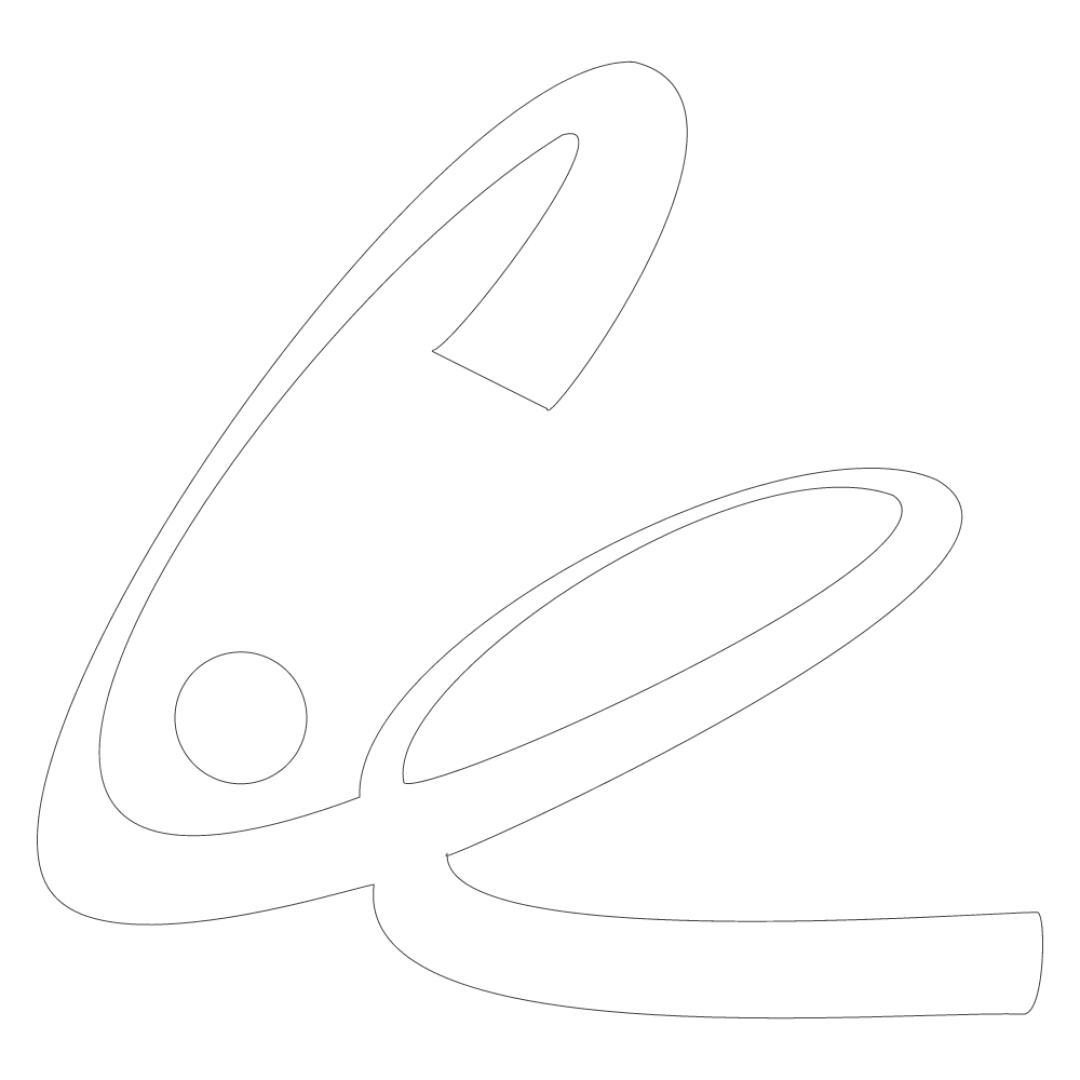
A distinctive, fluid symbol with a potential small-scale stroke-weight issue.
This logomark shows solid execution, supported by distinctive construction and visual balance; improving clarity at smaller sizes is the clearest next step.
Focus on the changes that matter. Keep what makes the logo work.
A dot and sweeping loops create a single, energetic abstract gesture.
Logo preview unavailable. The written feedback is still available on this card.
Upper edge of the right-hand loop
The loop’s upper edge is much thinner than the broad lower strokes and may weaken at small sizes.
See the category reviewThere isn't enough brand context to assess the match.
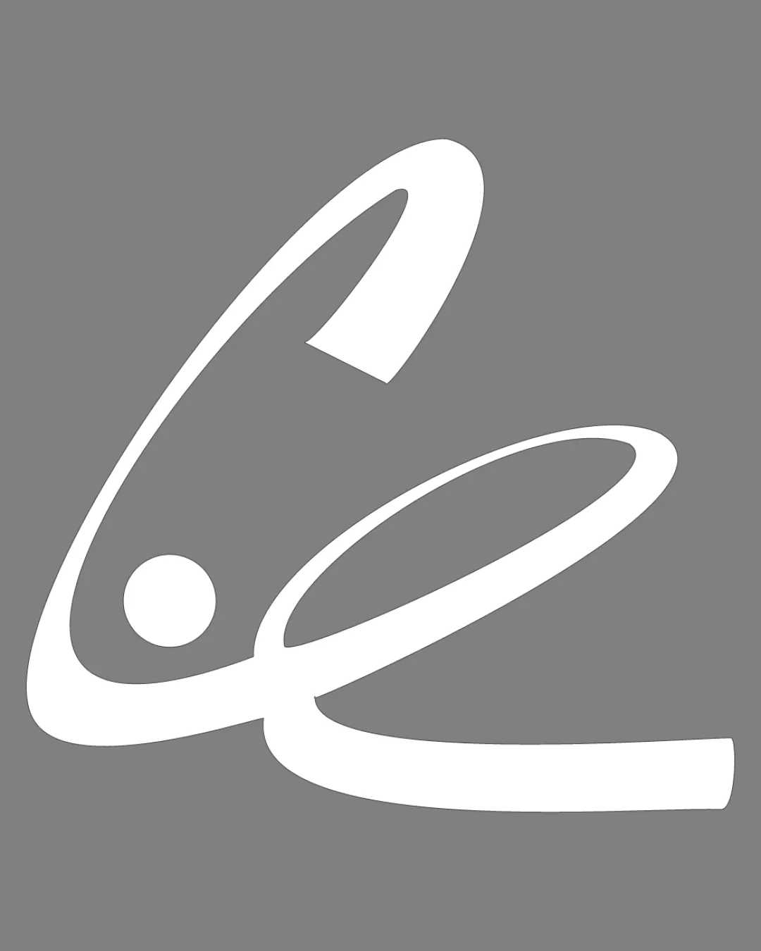

Inspect spacing with the guide. Optical balance may differ from geometric centering.
The loop’s upper edge is much thinner than the broad lower strokes and may weaken at small sizes.
Try: Test the mark at intended small sizes and thicken the edge only if it loses definition.
Logo preview unavailable. The written feedback is still available on this card.
Get a clear logo score, key risks, and priority fix ideas before your client or audience sees it.
More credits needed
Add credits to continue without losing your work.
Then $7/month. Cancel anytime.
Essential logo review with AI
Estimated progress