 View review
Logo score
Logo review of
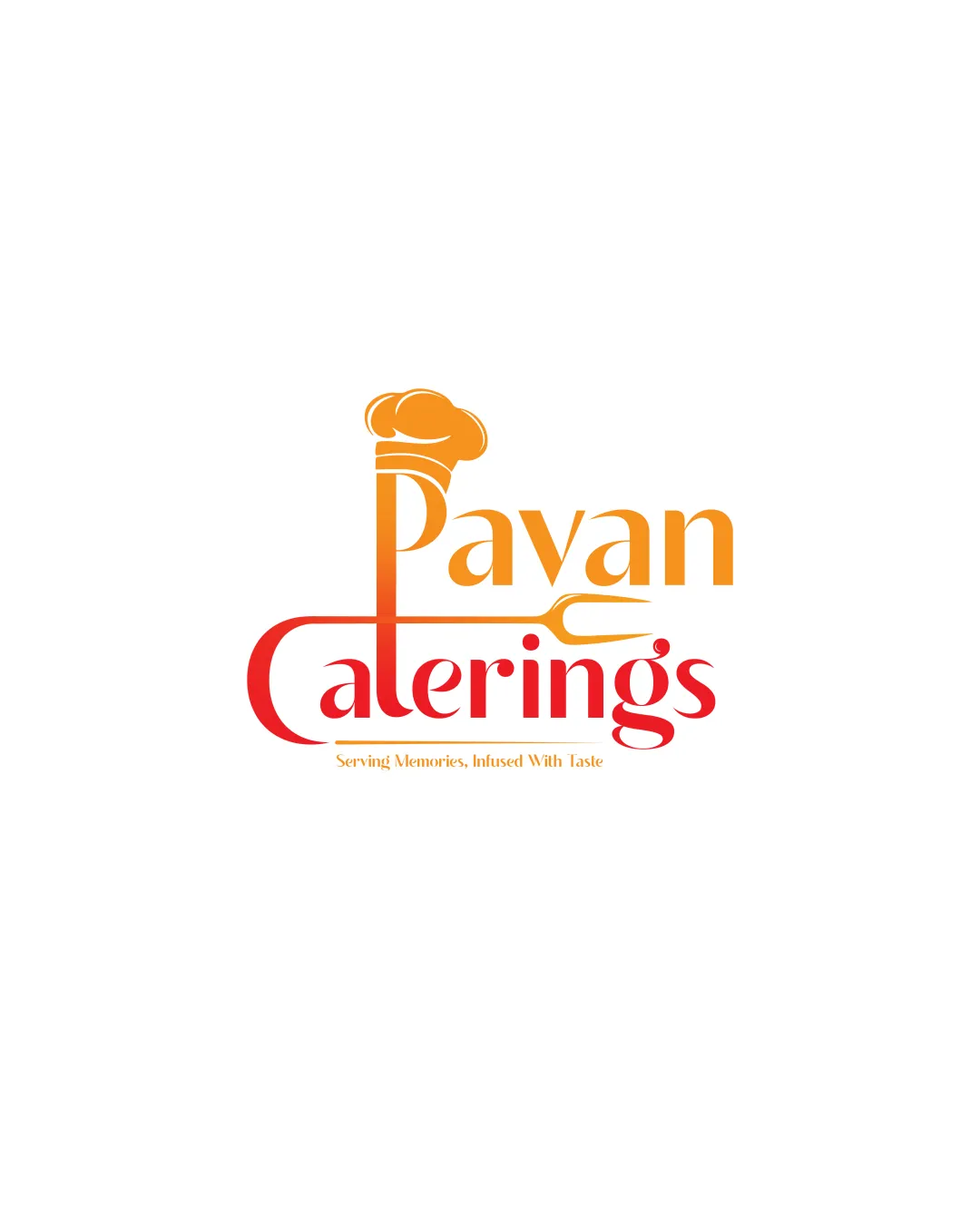
Pavan Caterings
Review the detailed scores below to see what is working and what should be refined first.
Objective AI feedback. Your creative decision.
Legibility
Originality
Misread
Balance
Scale
Detailed review
Logo performance breakdown
Legibility
 Text is clear and easy to read. Fonts are modern and appropriate for the industry.
 Color contrast between letters could be enhanced for better visibility.
Originality
Creative integration of the chef's hat into the text.
Chef's hat is a common symbol in the food industry.
Color harmony
Warm color palette evokes feelings of food and hospitality.
Gradients could affect reproduction quality in print.
Color may be holding this logo back. Build a stronger strategic palette before updating the logo.
Build brand colorsBalance alignment
Elements are well aligned and create a cohesive look. The balance between the text and symbol is strong.
Slight imbalance due to varied text size could be refined.

Scalability
Design is simple and can be scaled easily. Works well on digital platforms.
Fine details in the hat may lose clarity in very small sizes. Might not be as effective in monochrome versions.
200x250 px
100×125 px
50×62 px
Misinterpretations
No unintended negative imagery detected.
Try your own review
Review my logo
Wondering how your logo performs?
Get a clear logo score, key risks, and priority fix ideas before your client or audience sees it.
Keep exploring


