View review
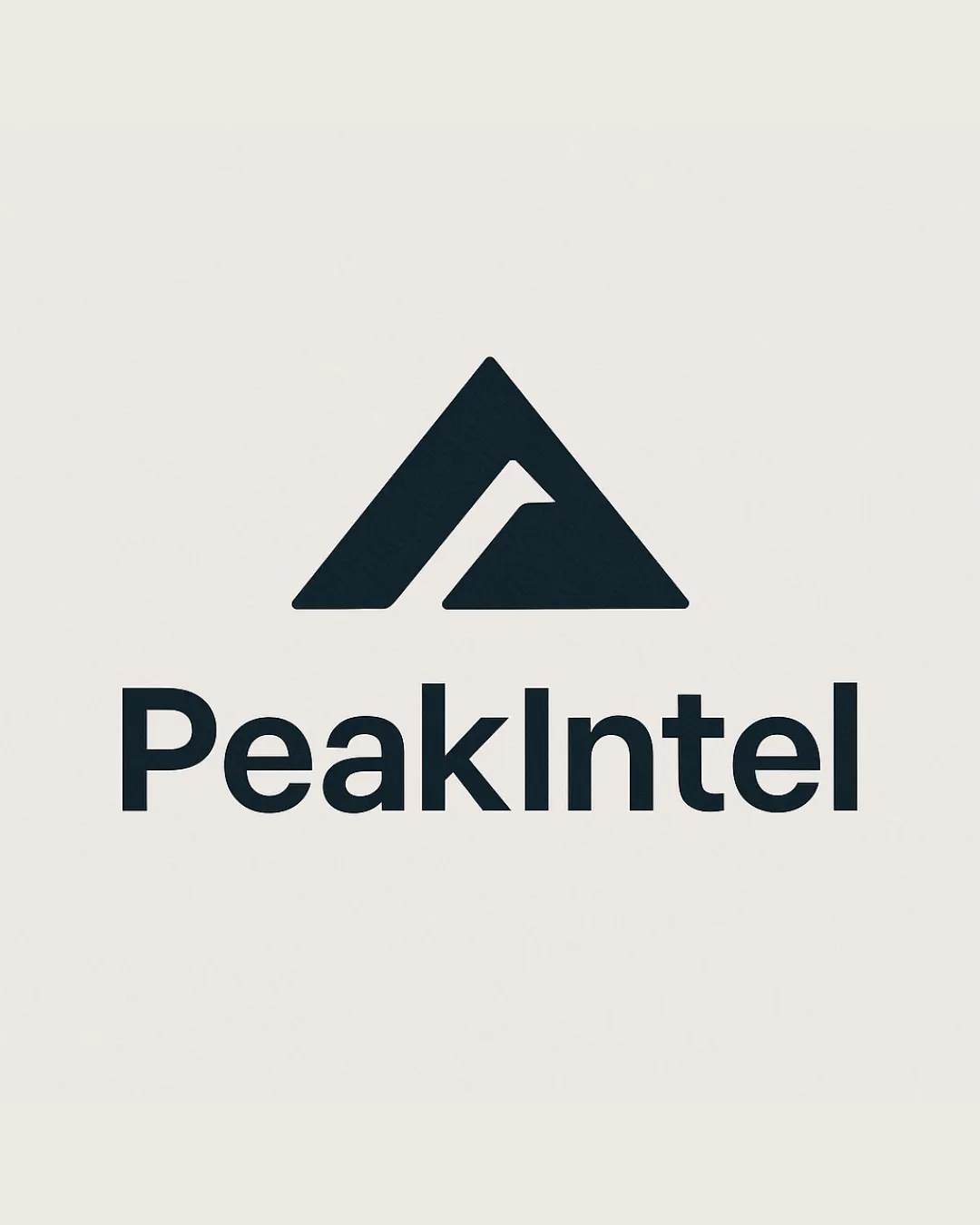
Peakintel
Review the detailed scores below to see what is working and what should be refined first.
Objective AI feedback. Your creative decision.
Logo performance breakdown
Legibility
Text is crisp, bold, and highly readable even at smaller sizes.
Font choice is clean and contemporary, matching the tech industry standards.
Originality
Mountain is a commonly used motif, but the incorporation of a subtle 'P' in negative space is smart and elevates uniqueness.
Minimalist style and abstract approach feel modern.
Abstract mountain peaks are fairly common in branding for tech and consulting companies, slightly reducing distinctiveness.
Color harmony
Monochromatic scheme ensures high contrast and excellent adaptability to various backgrounds.
Classic black and white is always versatile.
Black
#121A1B
Alabaster
#F6F3EF
Balance alignment
Proper visual alignment between the logomark and wordmark.
The weight of the mark complements the wordmark, providing good optical balance.
Scalability
The logo mark is simple and geometric; effective on business cards, mobile apps, and website favicons.
Wordmark maintains clarity in digital and print formats.
The relatively thin negative space and fine cuts in the symbol may blur slightly at very small sizes or in poorer print conditions.
On extremely small promotional items or embroidery, the cut inside the mountain may be lost.
200x250 px
100×125 px
50×62 px
Misinterpretations
No inappropriate dual meanings or undesirable symbolisms detected.
Logo communicates peak and intelligence without risk of misinterpretation.
Symbol & text fit
Stylistic consistency and harmonious sizing between symbol and wordmark.
Both elements have modern, geometric qualities.
Wondering how your logo performs?
Get a clear logo score, key risks, and priority fix ideas before your client or audience sees it.




