View review
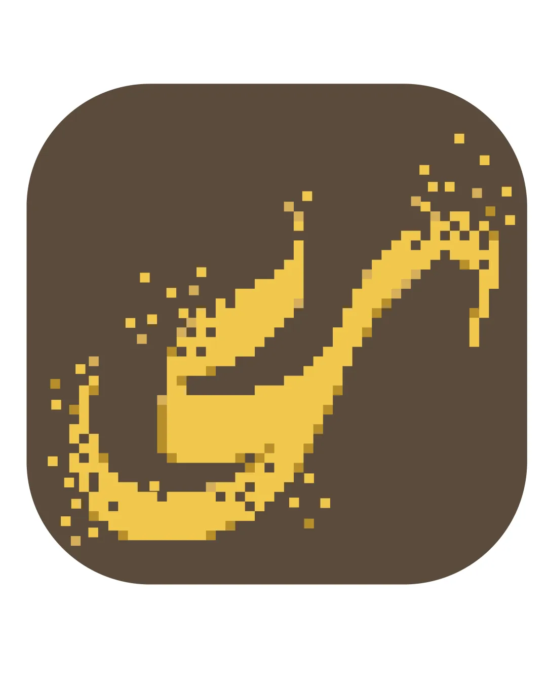
Pixelated Dragon Or Serpent
Review the detailed scores below to see what is working and what should be refined first.
Objective AI feedback. Your creative decision.
Logo performance breakdown
Originality
Unique use of pixel art for an abstract animal form, offering a distinct retro style.
Creative motif for the gaming or tech sector, moving away from generic game controllers or joysticks.
Pixel art dragon/serpent motifs are not entirely novel in the video game space—more refinement or detail may further distinguish it.

Color harmony
Two-tone palette creates strong contrast and reinforces retro pixel roots.
Colors work well together, giving an earthy yet playful vibe.
#6B5434—Brown
#FFD966—Golden Yellow
Balance alignment
Central composition ensures the logo feels mostly balanced within the rounded square background.
Pixel dispersion is reasonably symmetrical, aiding visual weight.
Some pixel scatterings feel more prominent on the left and bottom, making the composition slightly heavier there.
The curved top right is visually lighter, reducing overall equilibrium.
Scalability
Simple shapes can translate well to a variety of sizes.
Distinct colors maintain contrast in both large and medium applications such as mobile icons or app launch screens.
Fine pixel details may blur or lose clarity at very small sizes, such as website favicons or embroidered patches.
The pixelated approach may lose its recognizable form in miniature formats.
200x250 px
100×125 px
50×62 px
Misinterpretations
Clear visual reference and does not appear to unintentionally reference inappropriate objects or symbols.
Wondering how your logo performs?
Get a clear logo score, key risks, and priority fix ideas before your client or audience sees it.



