postzap logo review
3.5/5
Logo score
Logo review of

Postzap

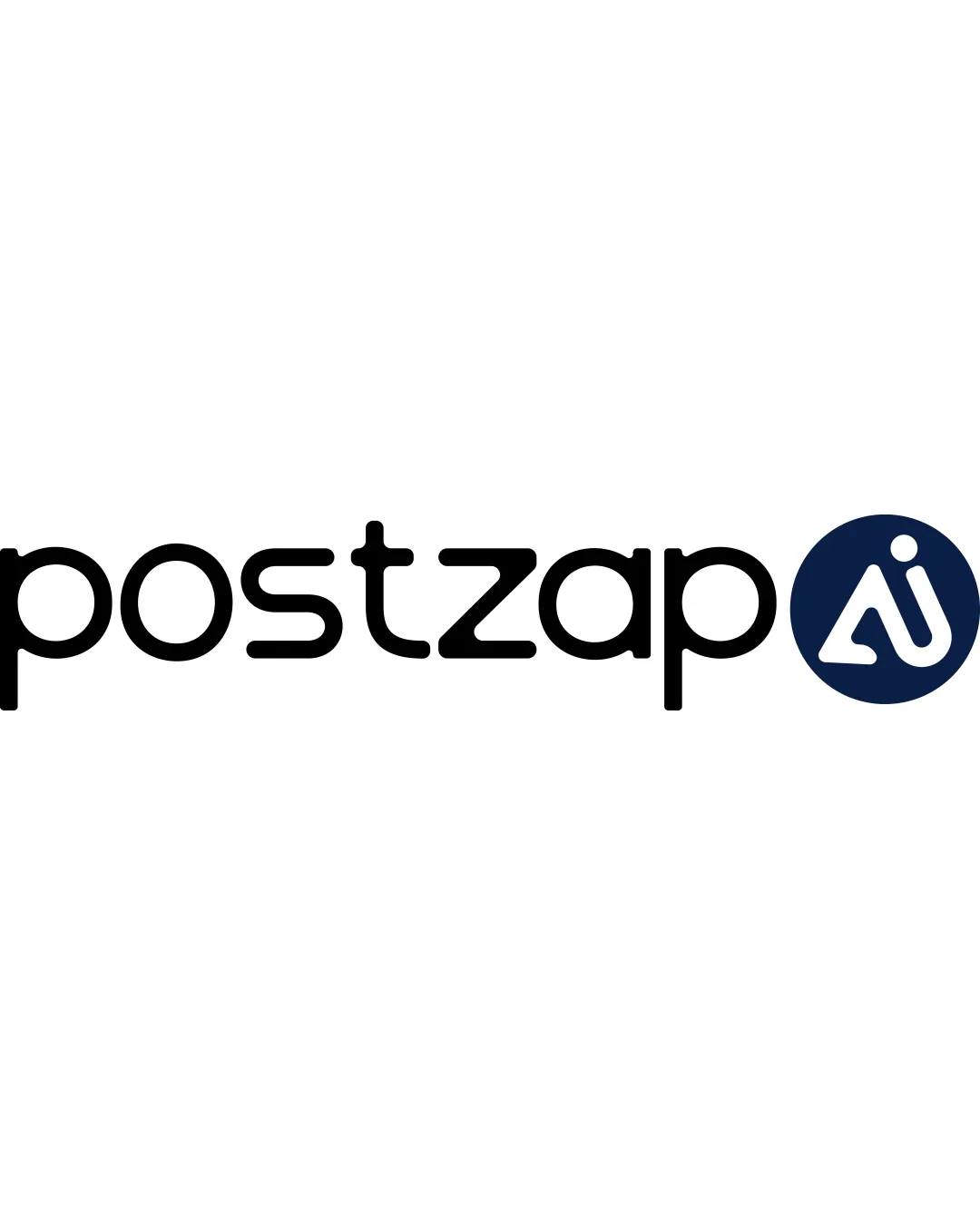
A functional, modern SaaS logo with clear AI reference; benefits from minor refinement in distinctiveness and visual unity.

Combination Mark Modern Geometric Rounded Technology/SaaS
4/5
Legibility
3/5
Originality
5/5
Misread
3/5
Balance
3/5
Scale
Your next steps

What to fix first

Focus on the changes that matter. Keep what makes the logo work.

1

monogram in navy circle

Test the monogram legibility at app icon and favicon scale.

Worth testing High priority Low effort

The monogram uses thin lines and a relatively small dot that may lose clarity at smaller sizes.

How to check

Create small-size mockups to confirm mark clarity in digital use.

See the category review
2

alignment between wordmark and monogram

Tighten the spacing between 'postzap' and the 'AI' monogram or integrate the mark more cohesively.

Optional refinement Medium priority Low effort

The circular monogram sits slightly apart from the wordmark with a gap that feels visually disconnected.

How to check

Review horizontal balance and visual connection in logo lockup.

See the category review
Detailed review

Logo performance breakdown

4/5

Brief & logo match

Based on your brief
Compared with

A SaaS platform for social media management with AI focus.

The logo expresses AI and modern tech qualities, suiting a SaaS social tool, but could benefit from stronger distinctiveness.

  • AI Emphasis

    The monogram directly highlights 'AI,' matching the SaaS and artificial intelligence focus.

  • Modern SaaS Feel

    Rounded geometric wordmark suits a tech-forward, online platform image.

4/5

Legibility

  • Wordmark is clear and easily readable
  • 'AI' mark is recognizable at moderate sizes
3/5

Originality

  • Clever 'AI' integration in monogram
  • The rounded type is clean but resembles common modern geometric fonts, making it look somewhat generic.

    Optional refinement wordmark letterforms

    Try: Explore unique tweaks to one or two letterforms for more distinctiveness.

    Check: Compare wordmark against popular geometric fonts for differentiators.

4/5

Color harmony

  • Professional navy/black/white palette
  • Good contrast between wordmark and mark
Black#000000
Navy Blue#112345
White#FFFFFF

Estimated colors. Use the original design file for exact values.

Create a full color palette using these colors

Create new palette
3/5

Balance alignment

  • Overall horizontally balanced
  • The circular monogram sits slightly apart from the wordmark with a gap that feels visually disconnected.

    Optional refinement alignment between wordmark and monogram

    Try: Tighten the spacing between 'postzap' and the 'AI' monogram or integrate the mark more cohesively.

    Check: Review horizontal balance and visual connection in logo lockup.

Uploaded logoAlignment guide overlay

Inspect spacing with the guide. Optical balance may differ from geometric centering.

3/5

Scalability

  • Clean geometric shapes aid scaling
  • Standalone mark possible for icon use
  • The monogram uses thin lines and a relatively small dot that may lose clarity at smaller sizes.

    Worth testing monogram in navy circle

    Try: Test the monogram legibility at app icon and favicon scale.

    Check: Create small-size mockups to confirm mark clarity in digital use.
Uploaded logo at 200 pixels wide
200 × 250 px
Uploaded logo at 100 pixels wide
100 × 125 px
Uploaded logo at 50 pixels wide
50 × 63 px

Compare the detail at different sizes. Labels show the full image dimensions.

5/5

Misinterpretations

  • No visible risk of misinterpretation
4/5

Symbol & text fit

  • Both parts have a modern, rounded style
  • AI monogram directly supports product positioning

Black & white

Does the shape still work without color?

These tests are available only for logos uploaded in vector (SVG) format.

Background contrast

Find the surfaces where your logo stays clear.

These tests are available only for logos uploaded in vector (SVG) format.

Blur & silhouette

A 3px blur softens fine details so you can check whether the overall shape stays recognizable. If key gaps close or elements merge, the logo may rely too heavily on detail.

These tests are available only for logos uploaded in vector (SVG) format.

Try your own review

Wondering how your logo performs?

Get a clear logo score, key risks, and priority fix ideas before your client or audience sees it.

Review my logo