 View review
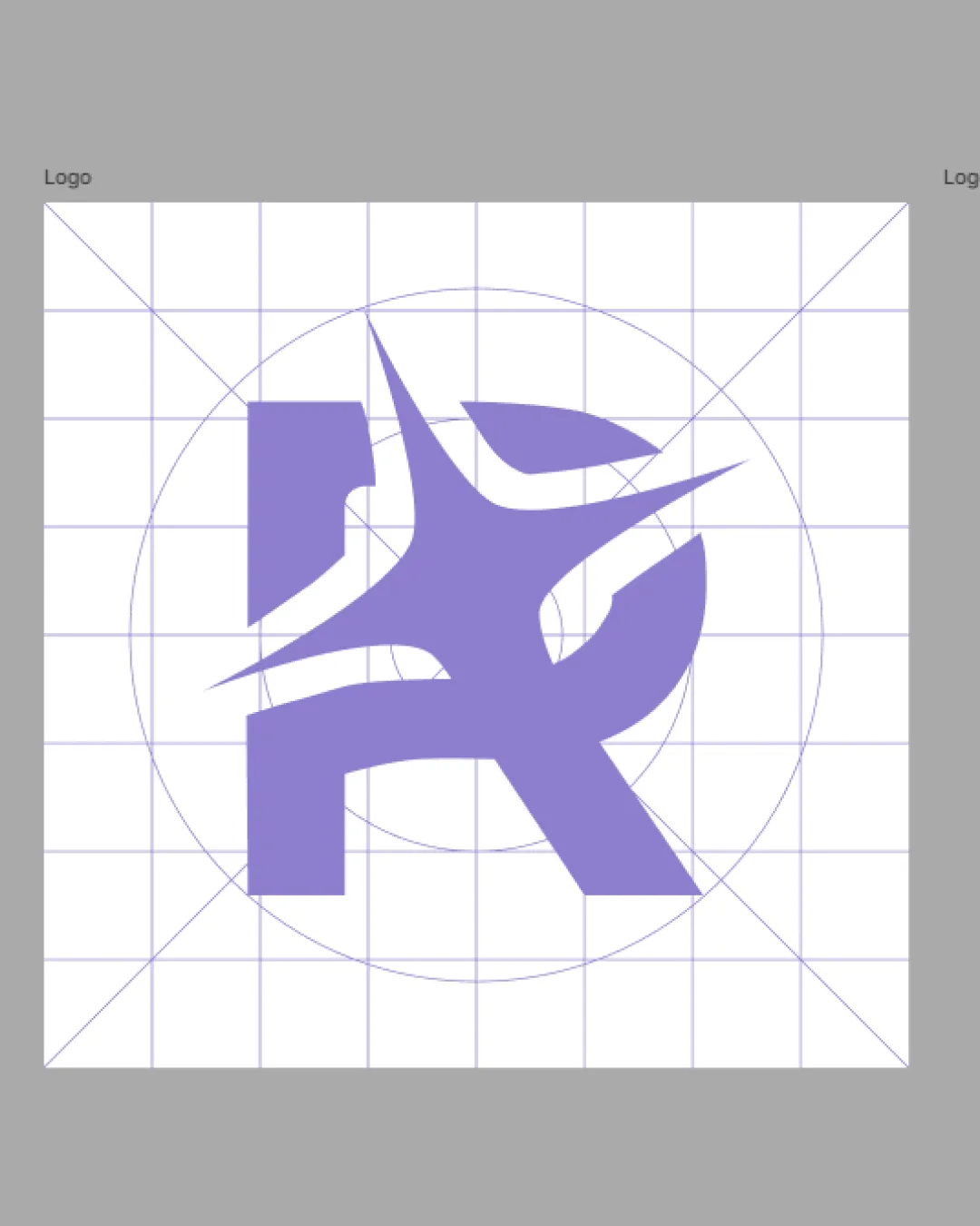
Logo score
Logo review ofR
Review the detailed scores below to see what is working and what should be refined first.
Originality
Misread
Balance
Scale
Action plan
What to fix first
The most important fixes to handle before polishing the full presentation.
1
Fix possible misinterpretation
High prioritySpikes could unintentionally suggest sharpness or danger rather than dynamism depending on viewer.
Impact: High · Effort: Medium
Detailed review
Logo performance breakdown
Originality
![]() Abstract, non-traditional take on the letter R.
Abstract, non-traditional take on the letter R.![]() Geometric approach feels contemporary.
Geometric approach feels contemporary.
![]() The spiked motif does not clearly communicate industry or intent, and could be interpreted as generic 'dynamic' symbolism.
The spiked motif does not clearly communicate industry or intent, and could be interpreted as generic 'dynamic' symbolism.![]() No recognizable or distinctive storytelling element that sets it far apart from other abstract R monograms.
No recognizable or distinctive storytelling element that sets it far apart from other abstract R monograms.
Color harmony
![]() Single muted main color with neutral background is professional.
Single muted main color with neutral background is professional.![]() Good contrast ensures clear separation from background.
Good contrast ensures clear separation from background.
![]() Color selection is safe but lacks personality or strong distinction.
Color selection is safe but lacks personality or strong distinction.
Blue Bell
#9686C7
Grey
#BEBEBE
Your palette is close. Explore sharper color combinations with Colorfly.design before updating the logo.
Explore palettesBalance alignment
![]() Central placement is correct and uses geometric aids.
Central placement is correct and uses geometric aids.
![]() Unbalanced composition—the left side is blocky and weighted while the right is light and spiked, leading to visual instability.
Unbalanced composition—the left side is blocky and weighted while the right is light and spiked, leading to visual instability.![]() The top spikes visually dominate, creating imbalance and visual discomfort as the letter's core is visually interrupted.
The top spikes visually dominate, creating imbalance and visual discomfort as the letter's core is visually interrupted.

Scalability
![]() Strong, bold shapes will print well at medium-to-large sizes like signage or digital headers.
Strong, bold shapes will print well at medium-to-large sizes like signage or digital headers.![]() Simple color palette aids reproduction on merch or in monochrome.
Simple color palette aids reproduction on merch or in monochrome.
![]() Fine points and overlapping shapes can become unclear or visually muddy at small scale applications like favicons or embroidery.
Fine points and overlapping shapes can become unclear or visually muddy at small scale applications like favicons or embroidery.![]() Thin spikes may not translate well to low-resolution contexts.
Thin spikes may not translate well to low-resolution contexts.
200x250 px
100×125 px
50×62 px
Misinterpretations
![]() Abstractness avoids directly inappropriate imagery.
Abstractness avoids directly inappropriate imagery.
![]() Spikes could unintentionally suggest sharpness or danger rather than dynamism depending on viewer.
Spikes could unintentionally suggest sharpness or danger rather than dynamism depending on viewer.
Try your own review
Review my logo
Wondering how your logo performs?
Get a clear logo score, key risks, and priority fix ideas before your client or audience sees it.
Keep exploring


