 View review
Logo score
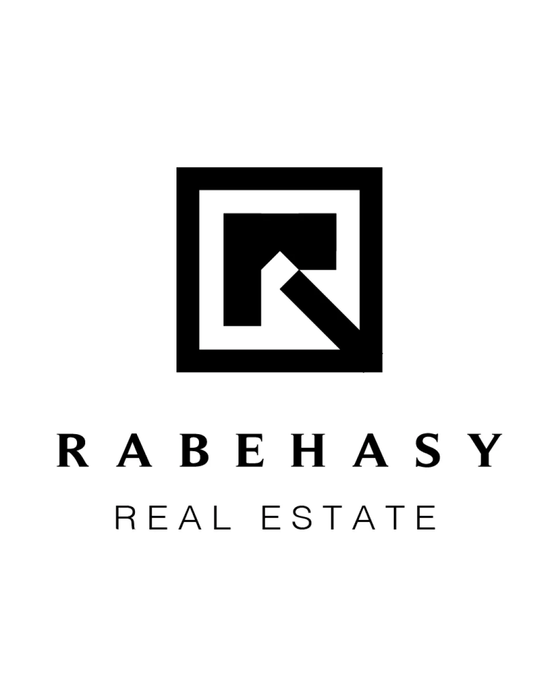
Logo review ofRabehasy Real Estate
Well-executed, very usable logo; refinement could further improve distinctiveness and micro-size performance.
Legibility
Originality
Color
Balance
Scale
Action plan
What to fix first
The most important fixes to handle before polishing the full presentation.
1
Explore adjusting fine negative spaces in the 'R' mark for extreme scalability.
Medium priorityCurrent gaps may blur when reproduced tiny, slightly reducing versatility.
Impact: Improve Legibility At Very Small Sizes, Enhancing Versatility. · Effort: Low
2
Push for a more ownable or unique take on the symbol if greater brand differentiation is required.
Medium priorityCurrent logo's structure is solid but leans toward generic for the sector.
Impact: Could Set The Brand Apart In A Competitive Real Estate Market. · Effort: Medium
Detailed review
Logo performance breakdown
Legibility
![]() Both brand and descriptor text are crisp and highly legible
Both brand and descriptor text are crisp and highly legible
Originality
![]() Stylized geometric 'R' provides some uniqueness
Stylized geometric 'R' provides some uniqueness
![]() Square frame with initial is a common motif in real estate branding
Square frame with initial is a common motif in real estate branding
Color harmony
![]() Monochrome palette conveys professionalism and versatility
Monochrome palette conveys professionalism and versatility
Black
#000000
White
#FFFFFF
Balance alignment
![]() Centrally aligned mark and text create good visual hierarchy
Centrally aligned mark and text create good visual hierarchy![]() Well-proportioned spacing between elements
Well-proportioned spacing between elements

Scalability
![]() Bold lines maintain integrity at small sizes
Bold lines maintain integrity at small sizes![]() Minimal detail ensures clarity
Minimal detail ensures clarity
![]() Fine gaps within the 'R' mark could merge at very small sizes
Fine gaps within the 'R' mark could merge at very small sizes
200x250 px
100×125 px
50×62 px
Misinterpretations
![]() No obvious unintended shapes or inappropriate resemblances
No obvious unintended shapes or inappropriate resemblances
Logo structure & brief match
![]() Mark and wordmark style are visually cohesive
Mark and wordmark style are visually cohesive
![]() Industry: The strong, geometric mark and formal serif wordmark are appropriate for the real estate sector, communicating stability and trust.
Industry: The strong, geometric mark and formal serif wordmark are appropriate for the real estate sector, communicating stability and trust.
Try your own review
Review my logo
Wondering how your logo performs?
Get a clear logo score, key risks, and priority fix ideas before your client or audience sees it.
Keep exploring