View review
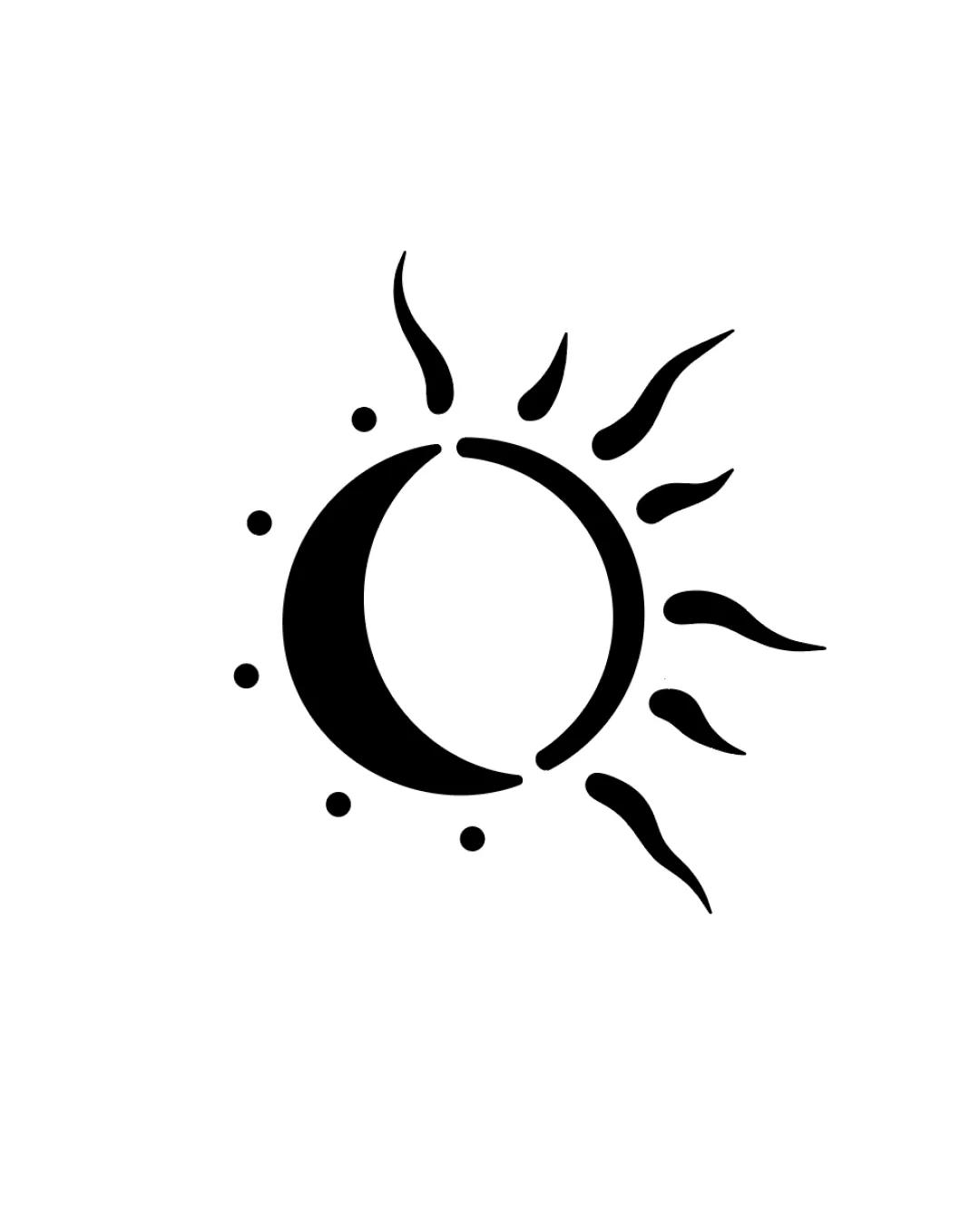
Stylized Sun And Moon Combination With Radiating F..
Distinctive and fitting abstract mark with strong symbolism for spiritual or transformation brands. Visual polish will elevate impact further.
Objective AI feedback. Your creative decision.
What to fix first
The most important fixes to handle before polishing the full presentation.
Slightly rebalance visual weight for optimal symmetry, possibly by tweaking the sun rays' distribution or width.
Medium priorityThe right side is slightly heavier with rays; subtle tweaks would enhance balance.
Impact: Moderate Improvement In Visual Harmony And Professional Polish. · Effort: Low
Logo performance breakdown
Originality
Unique synthesis of sun and moon in a single minimal form.
Organic execution stands out from conventional celestial icons.
Celestial motifs are common in the category, though this is notably distinctive.
Balance alignment
Organic asymmetry supports a natural, flowing feel.
Forms are visually connected and cohesive.
Slight imbalance toward the sun-ray side; left side feels visually lighter.
Scalability
Simple, bold lines enable clear scaling.
No fine detail to lose at small sizes.
Thinest rays may lose crispness at extremely small sizes.
200x250 px
100×125 px
50×62 px
Misinterpretations
Silhouette is clear and culturally safe.
No plausible negative or confusing readings.
Brief match
Nature, Balance, And Connection Representation: Strong integration of natural celestial forms and organic linework communicates balance and connection effectively.
Emotional-spiritual, Personal Transformation: Celestial duality (sun/moon) reflects cycles and transformation, aligning with spiritual growth and accompaniment.
Wondering how your logo performs?
Get a clear logo score, key risks, and priority fix ideas before your client or audience sees it.