Racho Vitória logo review
3.5/5
Logo score Emblem category

Racho Vitória

creative231580 Essential logo review

Distinctive farm-themed emblem with strong composition, but spelling accuracy should be confirmed.

Symbols recognized:
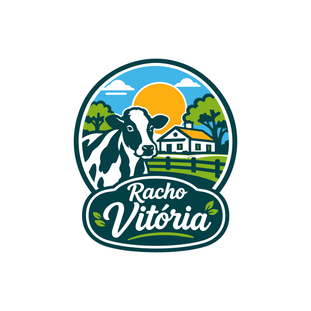
A cow in the foreground, farm landscape with house, sun, and trees inside an oval badge; script wordmark below.
Legible text:
Racho Vitória
Emblem Farmhouse Retro Badge Agriculture
3/5
Legibility
4/5
Originality
4/5
Balance
3/5
Scale
Your next steps

What to fix first

Focus on the changes that matter. Keep what makes the logo work.

What to preserve

A farm-themed illustrative emblem with a clear cow, rural house, and sunrise motif, showcasing rural freshness and authenticity.

Spelling & grammar

Possible spelling or grammar issue

"Racho" may be a misspelling of "Rancho"; needs confirmation.
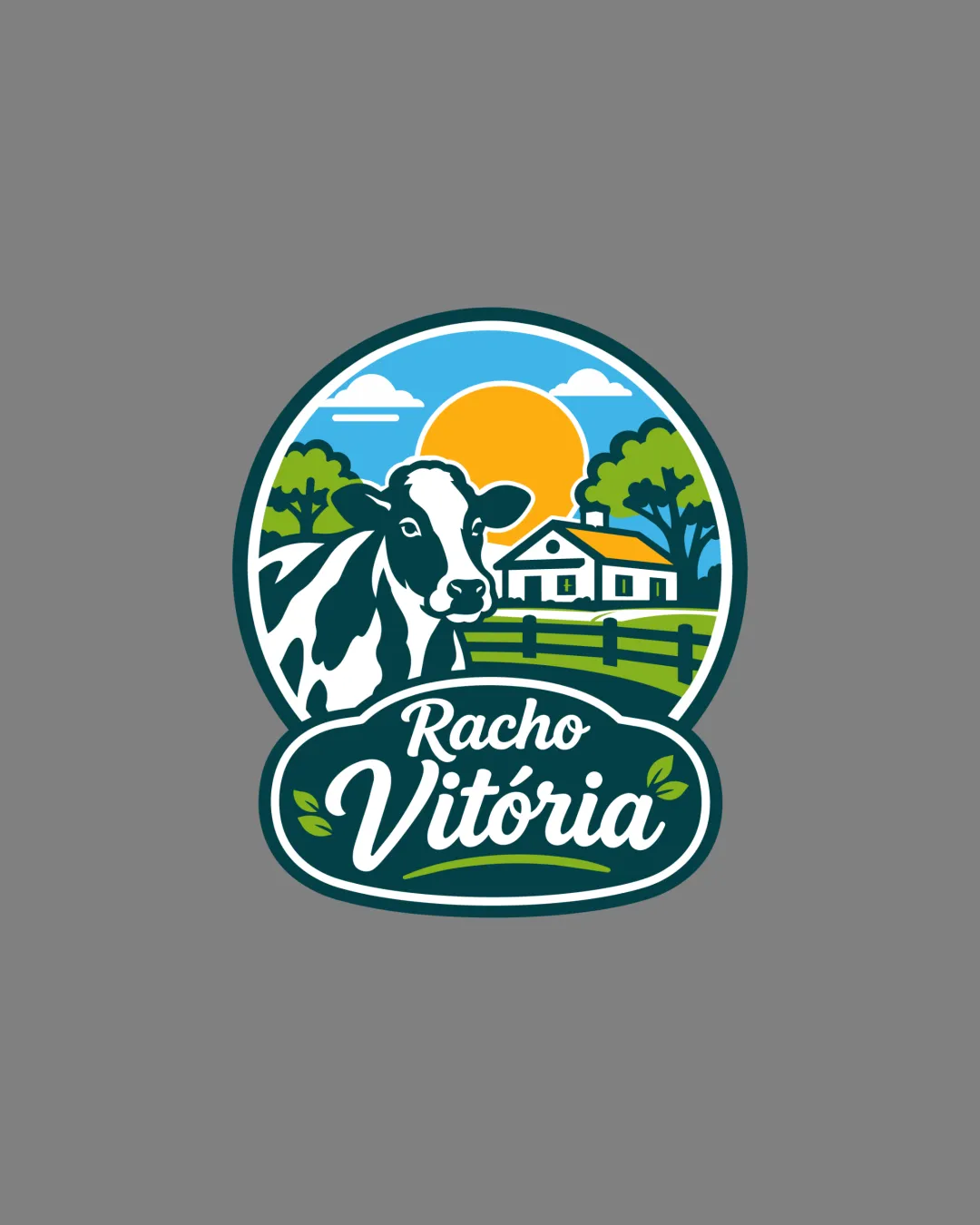
1

wordmark

Confirm if "Racho" is the intended spelling or correct to "Rancho" if it is a mistake.

High priority Visible issue Low effort

The word "Racho" may be a misspelling of "Rancho," which could cause confusion or appear unprofessional if unintended.

See the category review
2

emblem illustration

Test the logo at reduced sizes to ensure elements remain distinguishable.

Medium priority Worth testing Medium effort

The detailed scenic illustration may lose clarity and detail at very small sizes, especially in the house and fence elements.

See the category review
Detailed review

Logo performance breakdown

4/5

Brief & logo match

Visually matches agricultural/farm category very well, but wordmark clarity needs confirmation.

3/5

Legibility

  • Main script is stylish and mostly clear.
  • The word "Racho" may be a misspelling of "Rancho," which could cause confusion or appear unprofessional if unintended.

    Visible issue wordmark

    Try: Confirm if "Racho" is the intended spelling or correct to "Rancho" if it is a mistake.

3/5

Scalability

  • Good strong outline holds detail together.
  • The detailed scenic illustration may lose clarity and detail at very small sizes, especially in the house and fence elements.

    Worth testing emblem illustration

    Try: Test the logo at reduced sizes to ensure elements remain distinguishable.

4/5

Originality

  • Distinctive illustration and integrated rural theme.
4/5

Balance alignment

  • Farm scene and text are well-composed within emblem.
  • Hierarchy leads the eye from mark to name.
Uploaded logoAlignment guide overlay

Inspect spacing with the guide. Optical balance may differ from geometric centering.

4/5

Symbol & text fit

  • Stylized farm illustration pairs naturally with script.
5/5

Color harmony

  • Fresh palette with green, blue, and yellow enhances rural theme.
DarkGreen#37474F
Green#388E3C
Blue#0288D1
Yellow#FBC02D
White#FFFFFF
Black#000000

Estimated colors. Use the original design file for exact values.

Create a full color palette using these colors

Create new palette
5/5

Misinterpretations

  • No unintended readings; clear subject.
Try your own review

Wondering how your logo performs?

Get a clear logo score, key risks, and priority fix ideas before your client or audience sees it.

Review my logo