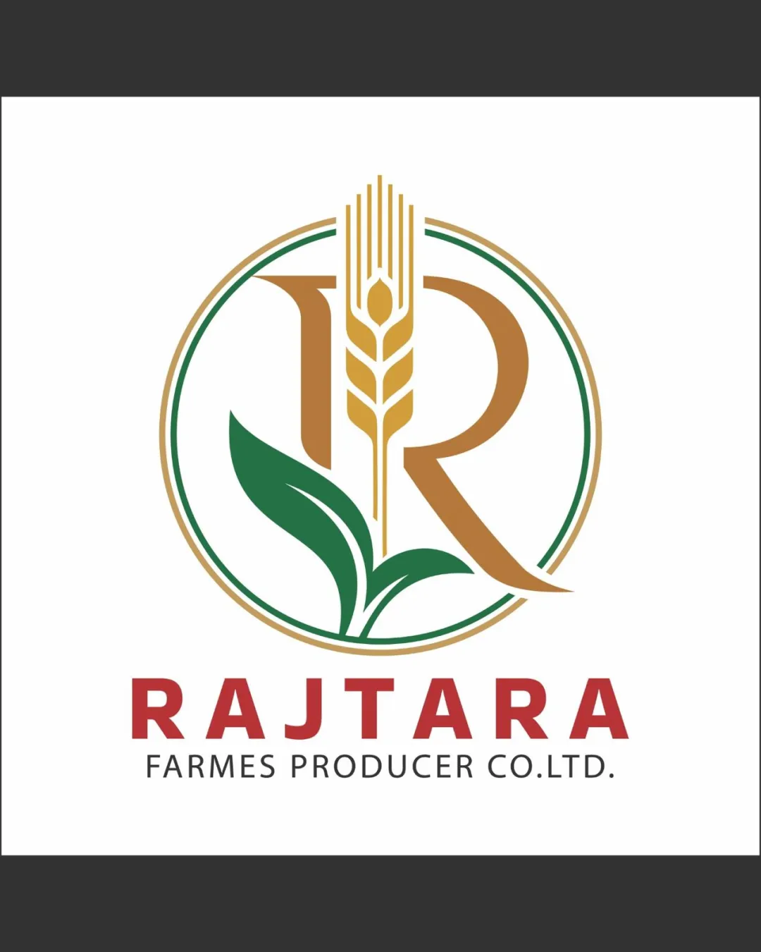
RAJTARA FARMES PRODUCER CO.LTD. logo review
3.5/5
Logo score Combination mark category

RAJTARA FARMES PRODUCER CO.LTD.

creative463382 Essential logo review

A functional and visually balanced logo for agriculture, but requires refinements for professional polish and maximum clarity.

Combination Mark Modern Agricultural Agriculture
4/5
Legibility
3/5
Originality
4/5
Balance
3.5/5
Scale
Your next steps

What to fix first

Focus on the changes that matter. Keep what makes the logo work.

Concept & direction

The logo combines agricultural elements (wheat, leaves) with a letter 'R' in a circular composition, suggesting farm production and growth.
1

Simplify or thicken fine details in the symbol (grain and outlines) for better small-size legibility.

High priority Medium effort

Fine linework currently risks losing detail when scaled down.

Improves clarity and usability in diverse applications.

2

Correct 'FARMES' to 'FARMERS' in the tagline for professionalism.

Medium priority Low effort

Typographic accuracy is crucial for client trust.

Prevents client embassment and reinforces attention to detail.

Detailed review

Logo performance breakdown

Not scored

Brief & logo match

Agricultural symbols and palette match farming/produce sector.

4/5

Legibility

  • Wordmark is bold and easy to read.
  • Tagline legible at regular size.
  • Minor spacing issue: 'FARMES' appears to be a typo (should be 'FARMERS').
3/5

Originality

  • Integration of wheat and leaves with letter provides some uniqueness.
  • Common agricultural motif; circular framing is typical in sector.
4/5

Color harmony

  • Earth-toned color palette suits agricultural industry and provides good contrast.
  • Red wordmark doesn't tie directly to the main symbol tones.
Bronze#B8860B
ForestGreen#228B22
Brown#A52A2A
Firebrick#B22222

Estimated colors. Use the original design file for exact values.

Create a full color palette using these colors

Create new palette

4/5

Balance alignment

  • Mark and type are visually balanced and centered.
  • Consistent circular framing enhances structure.
  • Letter 'R' and leaf elements overlap slightly awkwardly.
Uploaded logoAlignment guide overlay

Inspect spacing with the guide. Optical balance may differ from geometric centering.

3.5/5

Scalability

  • Forms are relatively simple; major elements remain identifiable at smaller sizes.
  • Thin lines in wheat and double outline may lose clarity when scaled down.
5/5

Misinterpretations

  • No plausible negative or confusing secondary readings.
4/5

Symbol & text fit

  • Color palette and geometric proportions unify mark and wordmark.
  • Slight complexity mismatch: mark is ornate, wordmark is plain.
Try your own review

Wondering how your logo performs?

Get a clear logo score, key risks, and priority fix ideas before your client or audience sees it.

Review my logo