Wondering how your logo performs? 🧐

Get professional logo reviews in seconds and catch design issues in time.

Try it Now!

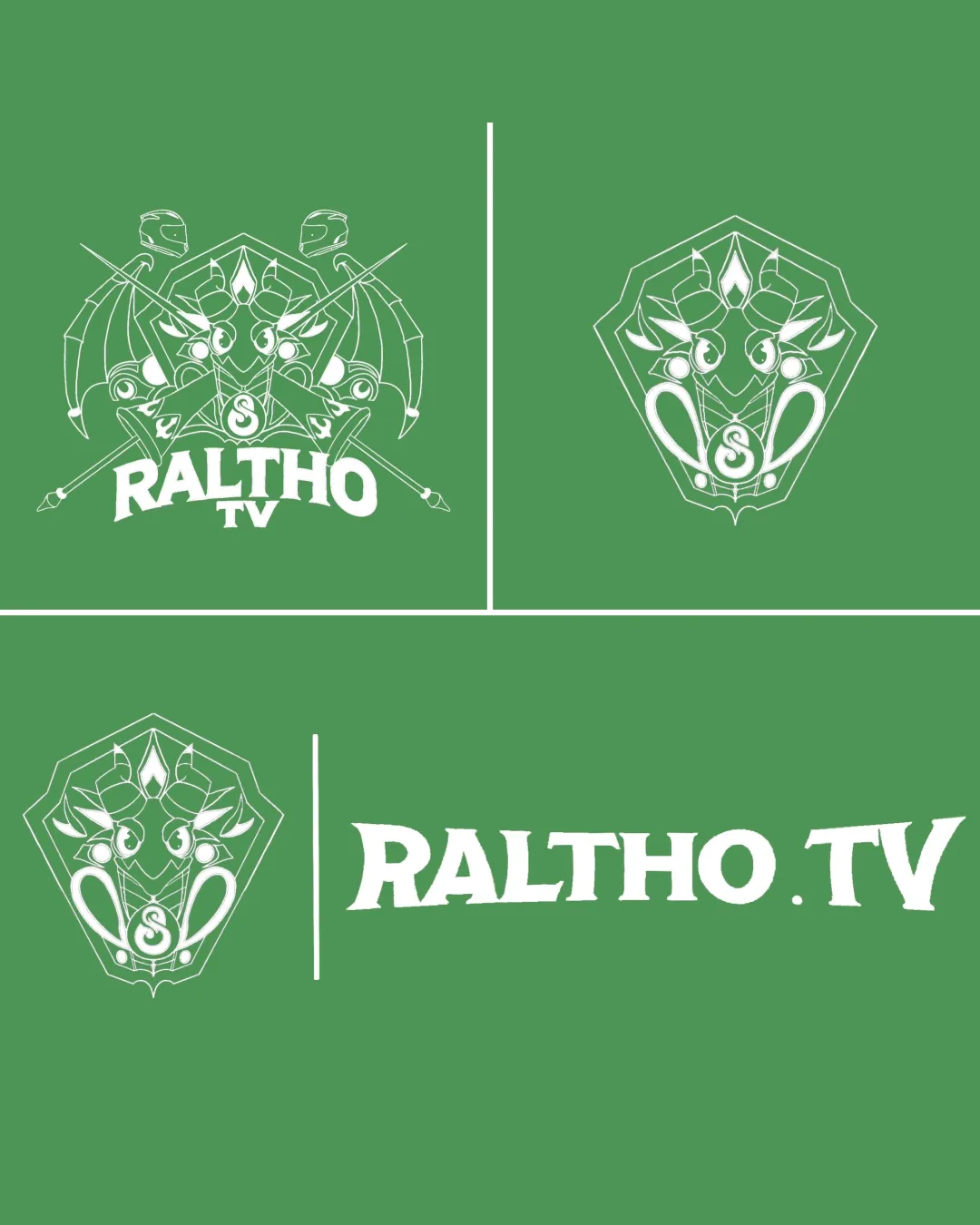
Logo review of RALTHO TV

Zoom icon Logo analysis by AI

Recognized style: Intricate and medieval

Logo type: Emblem

Detected symbol: Complex shield design with swords and crest

Detected text: RALTHO TV

Business industry: Entertainment/Media

Review requested by Louistiti011

**If AI can recognize or misinterpret it, so can people.

Structured logo review

3 / 5

Legibility

Checkmark icon The business name 'RALTHO TV' is clear.

Warning icon The intricate design may distract from the readability of the text.
2 / 5

Scalability versatility

Checkmark icon The logo has a strong presence.

Warning icon The detailed emblem may lose clarity in smaller sizes.

logo 200x250 pixels scalability test

200x250 px

logo 100x125 pixels scalability test

100×125 px

logo 50x62 pixels scalability test

50×62 px

3 / 5

Balance alignment

Checkmark icon The design feels balanced with symmetrical elements.

Warning icon The emblem may overshadow the text in some compositions.

logo 200x250 pixels scalability test alignment grid overlay
4 / 5

Originality

Checkmark icon Unique use of medieval and fantasy design elements.

Warning icon The shield and swords theme is commonly used in similar industries.

3 / 5

Logomark wordmark fit

Checkmark icon The text style matches the theme of the emblem.

Warning icon The emblem could be more integrated with the wordmark.

3 / 5

Aesthetic look

Checkmark icon The logo presents a distinct and appealing aesthetic.

Warning icon The complexity may not appeal to all audiences.

5 / 5

Cultural sensitivity dual meaning

Checkmark icon No cultural sensitivity issues detected.

4 / 5

Color harmony

Checkmark icon The color scheme is cohesive and fitting.

Warning icon Limited color variation may limit appeal.




