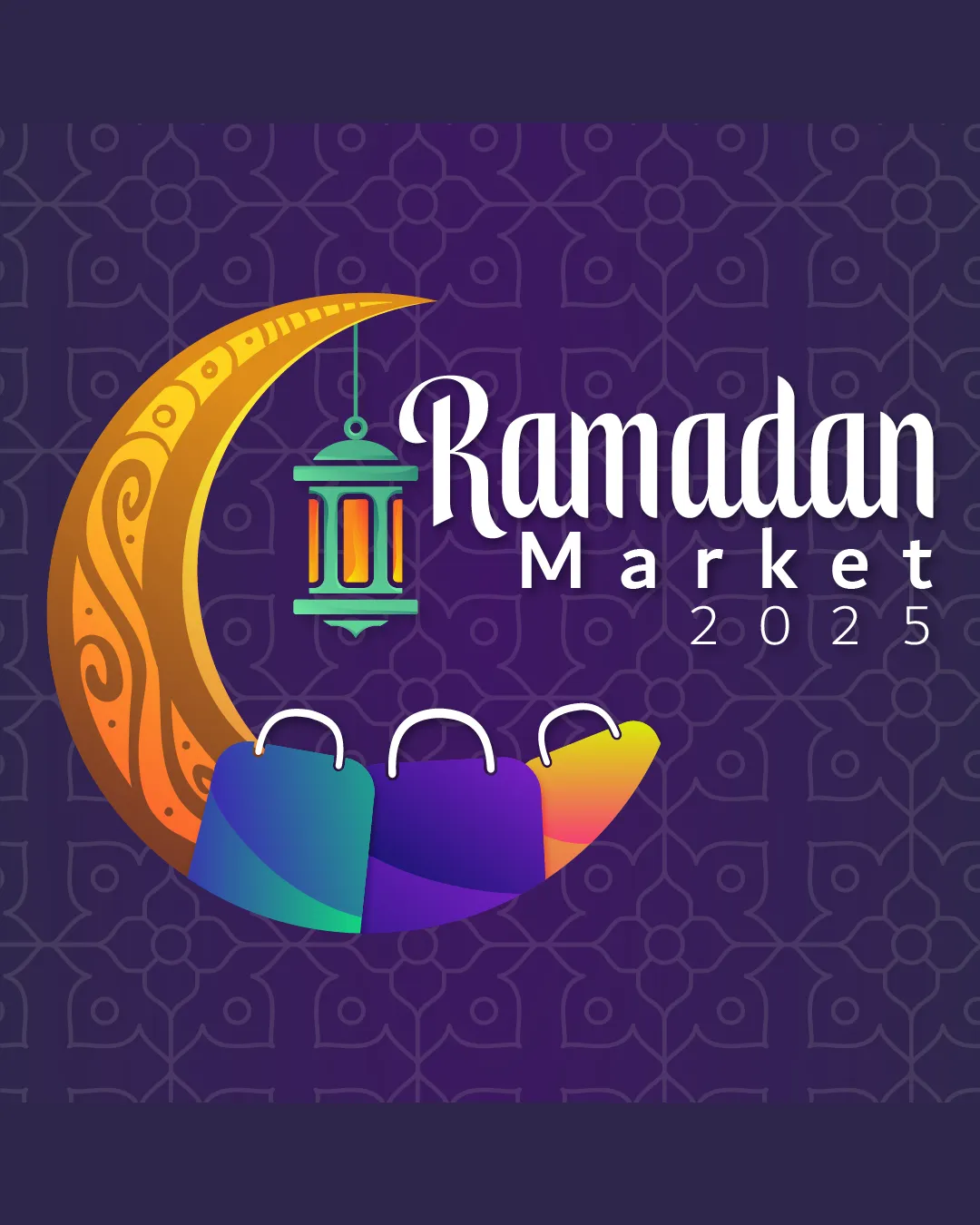
Ramadan Market 2023 logo review
4.6/5
Logo score
Logo review of

Ramadan Market 2023

Review the detailed scores below to see what is working and what should be refined first.

Combination Mark Vibrant And Thematic Marketplace Or Festival
4/5
Legibility
4/5
Originality
5/5
Balance
4/5
Scale
Detailed review

Logo performance breakdown

4/5

Legibility

  • Text is clear and legible against the background.
  • The year could be more prominent for better visibility.
4/5

Originality

  • Creative inclusion of crescent and lantern symbolizing Ramadan.
  • Crescent and lantern are common Ramadan symbols.
5/5

Color harmony

  • Vibrant colors are well-blended and appropriate for the theme.
5/5

Balance alignment

  • Elements are well-aligned and balanced within the composition.
Uploaded logoAlignment guide overlay

Inspect spacing with the guide. Optical balance may differ from geometric centering.

4/5

Scalability

  • Design is scalable with distinct elements.
  • Complexity of details may be an issue at very small sizes.
Uploaded logo at 200 pixels wide
200 × 250 px
Uploaded logo at 100 pixels wide
100 × 125 px
Uploaded logo at 50 pixels wide
50 × 63 px

Compare the detail at different sizes. Labels show the full image dimensions.

5/5

Symbol & text fit

  • The symbol and text work harmoniously together.

Black & white

Does the shape still work without color?

These tests are available only for logos uploaded in vector (SVG) format.

Background contrast

Find the surfaces where your logo stays clear.

These tests are available only for logos uploaded in vector (SVG) format.

Blur & silhouette

A 3px blur softens fine details so you can check whether the overall shape stays recognizable. If key gaps close or elements merge, the logo may rely too heavily on detail.

These tests are available only for logos uploaded in vector (SVG) format.

Try your own review

Wondering how your logo performs?

Get a clear logo score, key risks, and priority fix ideas before your client or audience sees it.

Review my logo