Wondering how your logo performs? 🧐
Get professional logo reviews in seconds and catch design issues in time.
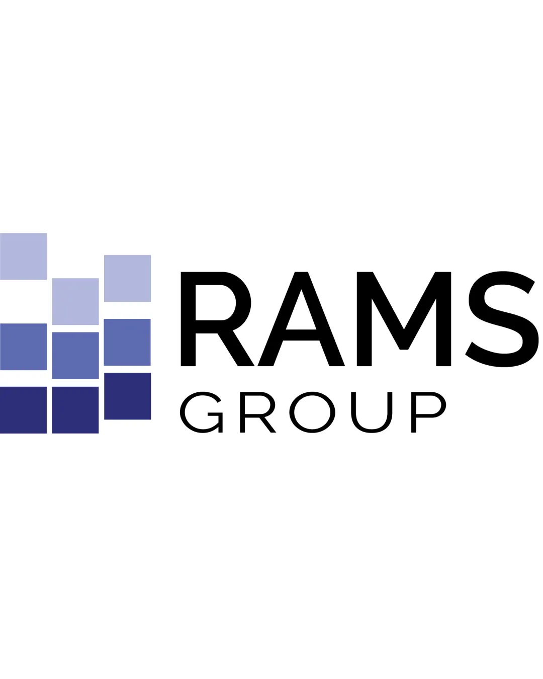
Try it Now!Logo review of RAMS GROUP
 Logo analysis by AI
Logo type:
Style:
Detected symbol:
Detected text:
Business industry:
Review requested by Vincentzo
**If AI can recognize or misinterpret it, so can people.
Structured logo review
Legibility
![]() Text is highly legible with clear contrast against the white background.
Text is highly legible with clear contrast against the white background.![]() Simple, bold font with no overdecoration ensures easy readability.
Simple, bold font with no overdecoration ensures easy readability.
Scalability versatility
![]() Logo will reproduce well on most formats, including signage and business cards.
Logo will reproduce well on most formats, including signage and business cards.![]() Simple geometric shapes are easy to scale without loss of clarity.
Simple geometric shapes are easy to scale without loss of clarity.
![]() Thin lines in 'GROUP' text may lose definition at very small sizes, such as favicons or embroidery.
Thin lines in 'GROUP' text may lose definition at very small sizes, such as favicons or embroidery.![]() Gradients on symbol may not translate well to all print applications.
Gradients on symbol may not translate well to all print applications.
200x250 px
100×125 px
50×62 px
Balance alignment
![]() Text is aligned horizontally with the graphic; overall layout is clean.
Text is aligned horizontally with the graphic; overall layout is clean.![]() Visual weight is distributed well between the grid and the wordmark.
Visual weight is distributed well between the grid and the wordmark.
![]() The grid symbol dominates a bit visually compared to the lighter 'GROUP' text, leading to slight imbalance in weight.
The grid symbol dominates a bit visually compared to the lighter 'GROUP' text, leading to slight imbalance in weight.

Originality
![]() Abstract grid concept is clean and somewhat modern.
Abstract grid concept is clean and somewhat modern.![]() Gradient application adds a touch of uniqueness.
Gradient application adds a touch of uniqueness.
![]() Squares/grid concepts are commonly used in industries like real estate, tech, or construction, which makes the design less distinctive.
Squares/grid concepts are commonly used in industries like real estate, tech, or construction, which makes the design less distinctive.![]() No inventive use of negative space or unique shape manipulation.
No inventive use of negative space or unique shape manipulation.
Logomark wordmark fit
![]() Stylistically, the sans-serif wordmark pairs logically with the geometric symbol.
Stylistically, the sans-serif wordmark pairs logically with the geometric symbol.![]() Both convey a sense of modernity and professionalism.
Both convey a sense of modernity and professionalism.
![]() Visual weight disparity between the bolder symbol and thinner 'GROUP' wordmark.
Visual weight disparity between the bolder symbol and thinner 'GROUP' wordmark.![]() Symbol is more attention-grabbing than the text, impacting harmony.
Symbol is more attention-grabbing than the text, impacting harmony.
Aesthetic look
![]() Modern, versatile, and visually clean.
Modern, versatile, and visually clean.![]() Color palette is harmonious and non-distracting.
Color palette is harmonious and non-distracting.
![]() Design is bordering on generic due to use of simple square elements.
Design is bordering on generic due to use of simple square elements.![]() Gradient is quite subtle and can seem flat at smaller sizes.
Gradient is quite subtle and can seem flat at smaller sizes.
Dual meaning and misinterpretations
![]() No inappropriate double meanings, symbols, or mistaken interpretations detected.
No inappropriate double meanings, symbols, or mistaken interpretations detected.
Color harmony
![]() Color gradient runs in a harmonious spectrum of blues, conveying trust and reliability.
Color gradient runs in a harmonious spectrum of blues, conveying trust and reliability.![]() Good contrast with black text ensures clarity.
Good contrast with black text ensures clarity.
Perano
#A2ACD6
Blue Marguerite
#5A66A1
Cloud Burst
#272C54
Black
#000000