View review
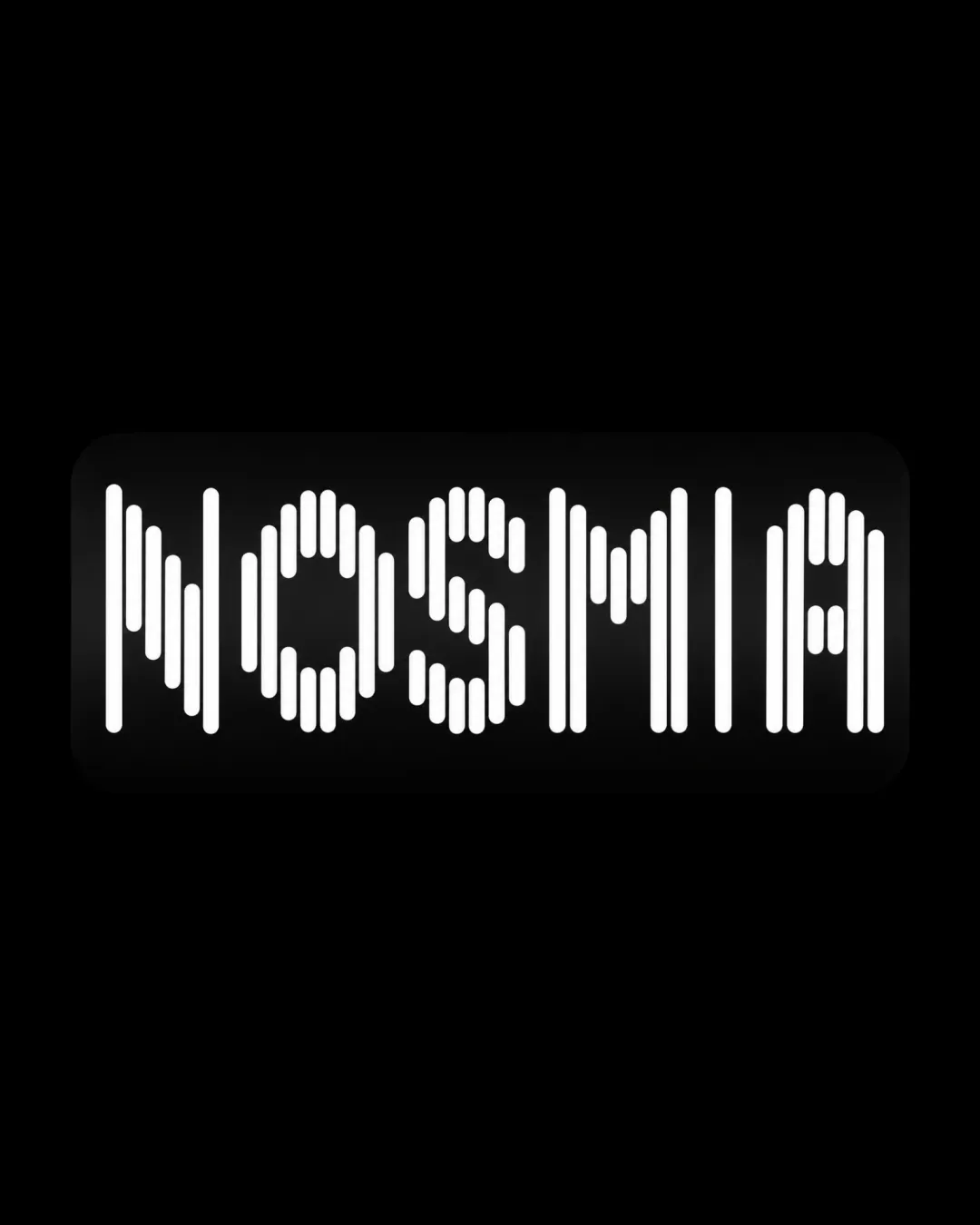
Nosmia
Distinct and appropriate concept for a modern niche brand, but must boost readability and structural balance before wide rollout.
What to fix first
The most important fixes to handle before polishing the full presentation.
Increase line segment thickness or slightly reduce segmentation to improve legibility and small-scale clarity.
High priorityThin, closely spaced segments can merge or blur when the logo is reduced in size or printed.
Impact: Legibility Is Fundamental For Recognition And Usability Across Brand Touchpoints. · Effort: Medium
Fine-tune vertical alignment for more consistent optical weight across all letters.
Medium priorityVariation in the top and bottom edges currently produces minor unevenness.
Impact: Creates A More Polished And Balanced Appearance, Elevating Professional Feel. · Effort: Low
Logo performance breakdown
Legibility
Each letter is visually distinct with effort.
Segmented lines reduce immediate readability, especially at small sizes.
Originality
Distinct line-segment construction provides a unique visual identity.
Segmented style is trendy and seen in digital/tech spaces.
Color harmony
High-contrast, minimalist monochrome palette is visually striking and versatile.
White
#FFFFFF
Black
#000000
Balance alignment
Good overall centering and alignment within the rounded rectangle.
Line segment heights vary, creating uneven optical weight in spots.
Scalability
Simple palette adapts well to one color.
Fine segmented line construction may collapse or blur when scaled down.
200x250 px
100×125 px
50×62 px
Misinterpretations
No obvious inappropriate or confusing double meanings detected.
No AI design signals found
Likely designed by a human
No obvious generative artifacts; segmentation and construction appear deliberate and controlled.
- Consistent line spacing and geometry
- Logical letter construction
Visual assessment; not definitive proof of authorship.
Brief match
Perfume As Narrative, Unconventional Positioning: The segmented, contemporary wordmark breaks convention and suggests modernity and distinction, fitting an independent, storytelling-driven fragrance brand.
Distinctiveness For Niche Colombian Brand: Unique typography helps stand out; contemporary flair aligns well with a niche, creative positioning.
Wondering how your logo performs?
Get a clear logo score, key risks, and priority fix ideas before your client or audience sees it.