Wondering how your logo performs? 🧐
Get professional logo reviews in seconds and catch design issues in time.
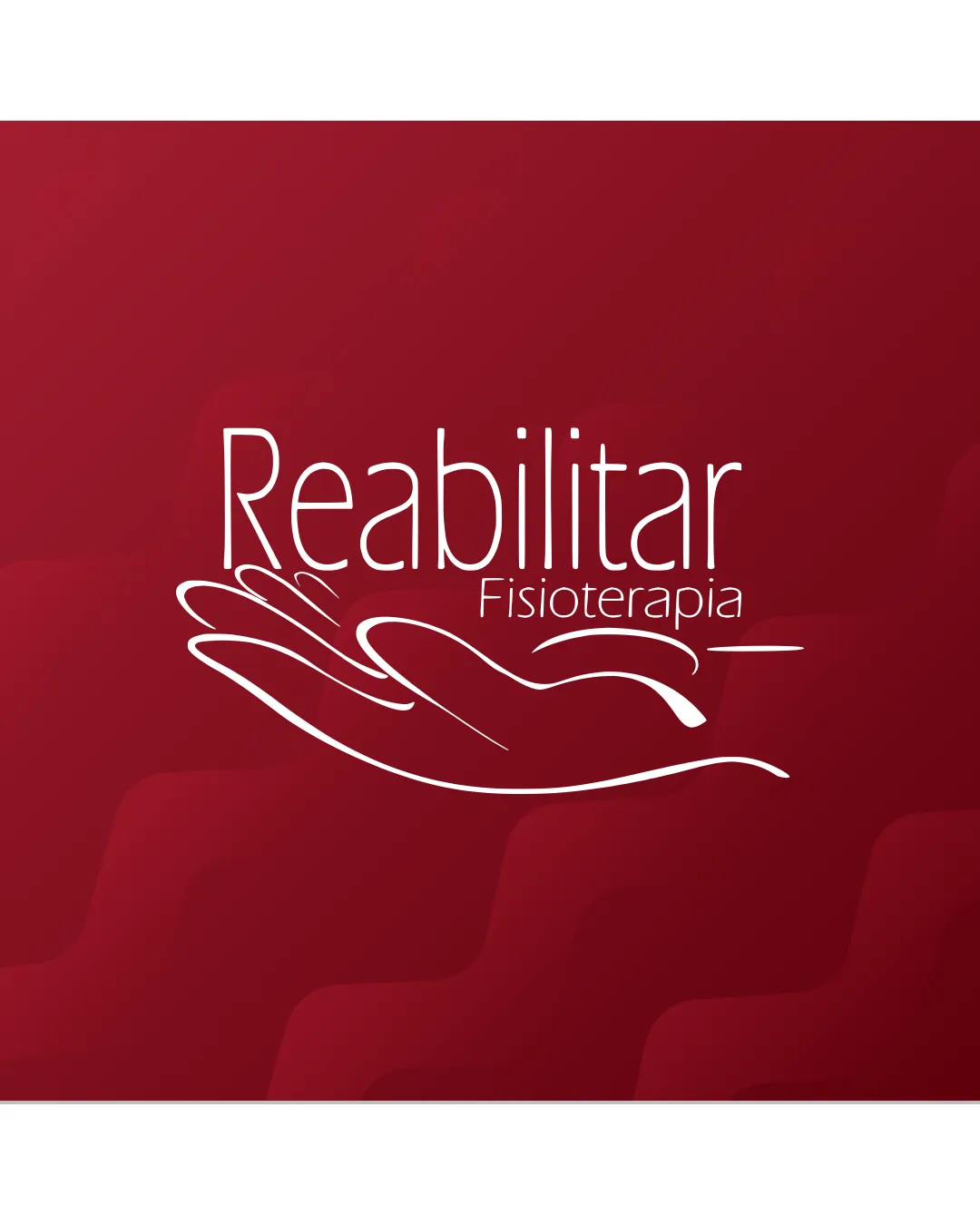
Try it Now!Logo review of Reabilitar Fisioterapia
 Logo analysis by AI
Logo type:
Style:
Detected symbol:
Detected text:
Business industry:
Review requested by Starcreatyverify
**If AI can recognize or misinterpret it, so can people.
Structured logo review
Legibility
Main word 'Reabilitar' is clear and easy to read.
Good contrast between white text and dark red background.
'Fisioterapia' is noticeably smaller and may be less legible at a glance or from a distance.
Scalability versatility
Simple, clean lines and minimal detail are advantageous for scaling.
Would work well on business cards, stationery, and digital applications.
Thin linework of the hand could become hard to distinguish on small-scale applications like favicon or embroidery.
Text 'Fisioterapia' could be completely lost in small formats.

200x250 px

100×125 px

50×62 px
Balance alignment
Text and hand illustration are generally aligned, creating a unified visual flow.
The composition feels slightly visually top-heavy due to the large word 'Reabilitar' paired with the delicate thin lines of the hand.
The positioning of 'Fisioterapia' disrupts perfect vertical alignment.


Originality
The hand illustration integrates well and is elegantly rendered.
Hand motifs are common in healthcare and rehabilitation industries, which reduces distinctiveness.
No unique visual twist or original concept beyond expected norm.
Logomark wordmark fit
Hand symbol complements the supportive, healing message suggested by the name.
Typography style is modern and matches the clean look of the hand illustration.
Relationship between the delicate hand and strong wordmark could be refined for even better coherence.
Aesthetic look
Elegant, minimal, and professional aesthetic.
The color palette feels welcoming and appropriate for healthcare.
The secondary text size and hand line thickness could be tweaked for better harmony.
Dual meaning and misinterpretations
No accidental inappropriate or ambiguous visual meanings.
Color harmony
Simple palette is soothing and professional.
High contrast assures readability.
Dark Red
#8A1538
White
#FFFFFF


