 View review
Logo score
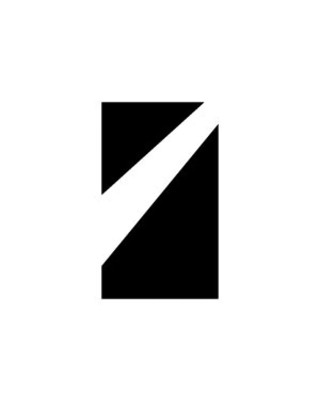
Logo review ofRectangular Shape With Diagonal White Slash
Review the detailed scores below to see what is working and what should be refined first.
Originality
Misread
Balance
Scale
Detailed review
Logo performance breakdown
Originality
![]() Sleek abstract form stands out in minimalist settings.
Sleek abstract form stands out in minimalist settings.
![]() Diagonal-slash-through-rectangle concept is somewhat generic and used in various sectors.
Diagonal-slash-through-rectangle concept is somewhat generic and used in various sectors.![]() No distinct details or unique visual elements to differentiate from other abstract logos.
No distinct details or unique visual elements to differentiate from other abstract logos.
Color harmony
![]() Simple black and white palette creates strong contrast and high versatility across backgrounds.
Simple black and white palette creates strong contrast and high versatility across backgrounds.![]() No color clashes or visual clutter.
No color clashes or visual clutter.
Black
#000000
White
#FFFFFF
Balance alignment
![]() Excellent symmetry and visual balance within the square.
Excellent symmetry and visual balance within the square.![]() Diagonal slash effectively divides space, creating dynamic movement without upsetting equilibrium.
Diagonal slash effectively divides space, creating dynamic movement without upsetting equilibrium.

Scalability
![]() Highly scalable due to minimalist and bold design.
Highly scalable due to minimalist and bold design.![]() Works well in both small and large formats, suitable for favicons, app icons, and billboards.
Works well in both small and large formats, suitable for favicons, app icons, and billboards.![]() No excessive detail, ensuring clarity in all media.
No excessive detail, ensuring clarity in all media.
200x250 px
100×125 px
50×62 px
Misinterpretations
![]() No inappropriate or ambiguous secondary visuals.
No inappropriate or ambiguous secondary visuals.![]() Abstract design prevents unintended interpretations.
Abstract design prevents unintended interpretations.
Try your own review
Review my logo
Wondering how your logo performs?
Get a clear logo score, key risks, and priority fix ideas before your client or audience sees it.
Keep exploring