1
Category Fit
Good fitTheme, style, and tools fit the industry standard.
Recognizable as a plumbing/home service mark.
High-risk visual misinterpretation detected. Resolve this before presenting the logo.
The most important fixes to handle before polishing the full presentation.
Plumber's rear/pose is exaggerated and could be read as comedic or inappropriate, risking embarrassment or unprofessional perception
Impact: High · Effort: Medium
Mascot detail and outlines may collapse in favicon, social icon, or embroidery.
Impact: Better Scalability And Broader Usage · Effort: Medium
Text and badge are strong; preserve these as much as possible during mascot refinement.
Impact: Preserves Brand Equity Through Transition · Effort: Medium
![]() Bold serif text is highly readable
Bold serif text is highly readable![]() Strong contrast between text and background
Strong contrast between text and background
![]() Mascot rendering adds character
Mascot rendering adds character
![]() Traditional pose and layout are fairly standard for the industry
Traditional pose and layout are fairly standard for the industry
![]() Simple two-color palette is cohesive and industry-appropriate
Simple two-color palette is cohesive and industry-appropriate
Denim
#1F3864
Cinnabar
#E8413C
White
#FFFFFF
![]() Main text is well centered and aligned with badge
Main text is well centered and aligned with badge![]() Mascot sits visually central in design
Mascot sits visually central in design
![]() Plumber's pose draws much weight to the top, creating slight upper bias
Plumber's pose draws much weight to the top, creating slight upper bias

![]() Bold outlines help at smaller size
Bold outlines help at smaller size
![]() High detail in mascot may collapse at small sizes
High detail in mascot may collapse at small sizes![]() Multiple outlines reduce clarity in small applications
Multiple outlines reduce clarity in small applications
200x250 px
100×125 px
50×62 px
![]() Plumber's rear/pose is exaggerated and could be read as comedic or inappropriate, risking embarrassment or unprofessional perception
Plumber's rear/pose is exaggerated and could be read as comedic or inappropriate, risking embarrassment or unprofessional perception
![]() Mascot integrates smoothly into the badge with typographic base
Mascot integrates smoothly into the badge with typographic base
![]() Visual emphasis is more on the mascot than text; slight disconnect in focus
Visual emphasis is more on the mascot than text; slight disconnect in focus
![]() Industry: Fits plumbing/home services sector with instantly identifiable visual cues (wrench, hose, badge, faucet).
Industry: Fits plumbing/home services sector with instantly identifiable visual cues (wrench, hose, badge, faucet).
![]() Brand Personality: Conveys approachable and friendly but risks being seen as overly cheeky or lacking professionalism due to mascot pose.
Brand Personality: Conveys approachable and friendly but risks being seen as overly cheeky or lacking professionalism due to mascot pose.
Risk of negative differentiation and professionalism concerns.
While visually on-par with typical plumbing sector mascots, the current pose introduces an unprofessional tone that could undermine market trust.
Theme, style, and tools fit the industry standard.
Recognizable as a plumbing/home service mark.
Visual gag risks making brand memorable for wrong reasons.
Competitors likely use similar mascots without risqué humor.
Impression may be unserious or embarrassing for business clients.
Professionalism and trust could be compromised.
Where the logo is ready to use, where it needs adjustment, and where it may break in real applications.
Mascot detail and pose risk unprofessional impression on main site.
Exaggerated mascot shape could embarrass when featured large.
Palette simplifies well, but mascot's clarity still an issue.
Details may collapse and risqué pose could be misread at small scale.
Mascot detail will not translate to stitched formats unless simplified.
A practical checklist of the logo versions to prepare before sending the final files to a client or team.
Main logo and visual anchor.
Needed for broader and more sensitive professional use.
Ensures usability in all print/embroidery cases.
Useful for diverse layouts.
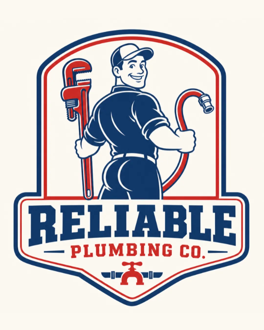
A vintage badge emblem featuring a smiling mascot plumber holding a pipe wrench and hose, with bold text 'RELIABLE PLUMBING CO.' and a faucet icon.
'RELIABLE' is set in a bold, italicized serif font for strength, with 'PLUMBING CO.' in a secondary red block below.
Mascot shows a retro-style plumber in cap with oversized wrench and hose, currently with exaggerated lower body and back-facing pose.
A friendly, vintage-inspired plumbing logo with a bold badge and industry-classic mascot.
Classic tools and a badge create strong visual recognition and trust.
Color palette and typography reinforce reliability and professionalism.
Get a clear logo score, key risks, and priority fix ideas before your client or audience sees it.