 View review
Logo score
Logo review of
Resorte
Review the detailed scores below to see what is working and what should be refined first.
Objective AI feedback. Your creative decision.
Legibility
Originality
Misread
Balance
Scale
Detailed review
Logo performance breakdown
Legibility
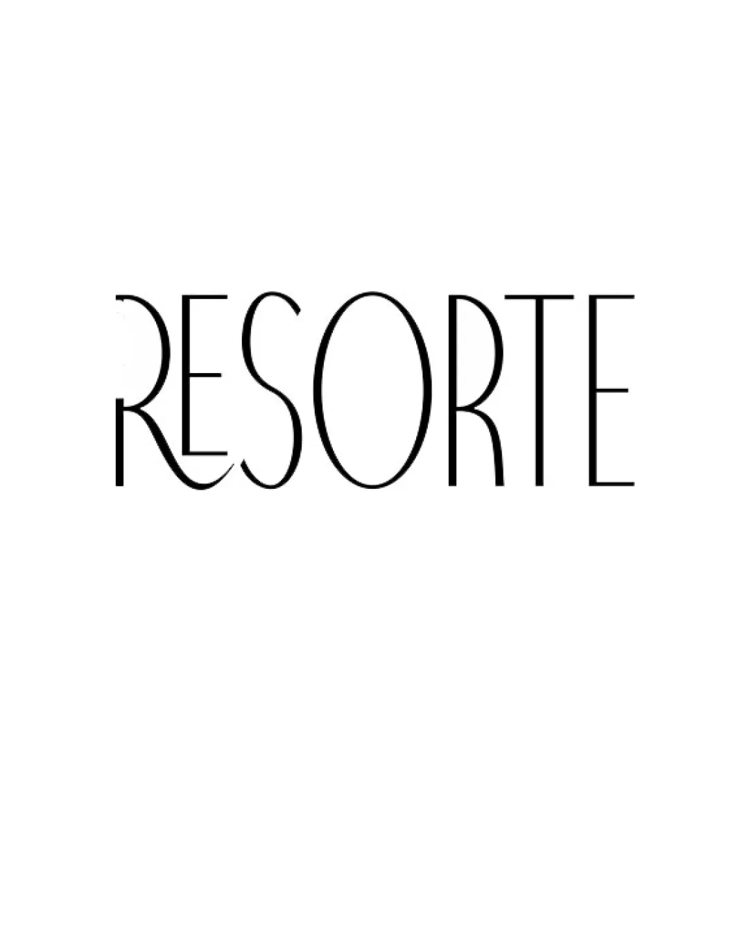
 Most characters are easy to read due to clean lines and generous spacing. High contrast between the black text and white background enhances clarity.
 The overly stylized 'R' may cause some initial confusion, as its lower curve merges unusually with the next letter. The thin lines might reduce legibility when scaled down, especially on digital displays or business cards.
Originality
Custom flourish on the 'R' adds a distinct, high-end personality. Modern, minimal serif is elegant and on-trend for the hospitality industry.
Aside from the 'R', the rest of the wordmark uses a rather standard serif typeface without further unique touches.
Color harmony
Classic black and white palette is timeless, versatile, and conveys professionalism. Simple monochrome ensures easy adaptation to secondary color palettes.
Black
#000000
White
#FFFFFF
Balance alignment
Letter spacing is generally even and provides a clean, modern look.
The decorative 'R' pulls visual weight to the left side, making the logo feel slightly off-balance. The tonal rhythm between the decorative and regular characters is inconsistent, disrupting overall harmony.

Scalability
The minimal and high-contrast wordmark will print well in most medium-to-large applications such as signage and packaging.
Thin strokes and tight gaps, especially in the 'R' flourish and 'E', are likely to disappear at small sizes (e.g., as a favicon or embroidery on uniforms). May lose visual impact in situations needing bold, highly visible branding (e.g., on a busy backdrop or small promotional items).
200x250 px
100×125 px
50×62 px
Misinterpretations
No inappropriate or misleading symbols present; the design is straightforward.
Try your own review
Review my logo
Wondering how your logo performs?
Get a clear logo score, key risks, and priority fix ideas before your client or audience sees it.
Keep exploring


