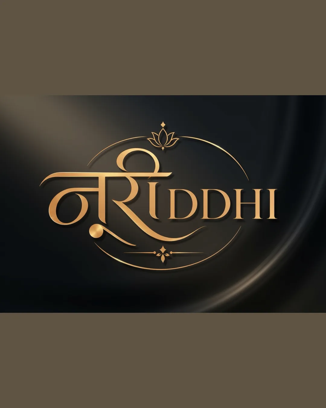
RIDDHI logo review
4.2/5
Logo score
Logo review of

Riddhi

Refined, unique mark effectively communicates luxury and ethnic identity. Minor detailing tweaks will maximize versatility for all brand uses.

Combination Mark Luxury, Ethnic, Ornamental Fashion
4/5
Legibility
4.5/5
Originality
5/5
Misread
4/5
Balance
3.5/5
Scale
Action plan

What to fix first

The most important fixes to handle before polishing the full presentation.

1

Simplify minor lotus and flourished details for micro/print use

Medium priority

Reduces risk of detail loss or clutter on tags, embroidery, or small print.

Impact: Improves Versatility And Maintains Luxury Feel At Small Sizes · Effort: Medium

2

Tune balance of Devanagari and 'RIDDHI' for wider audience clarity

Low priority

Subtle adjustment can ensure both scripts hold equal visual weight.

Impact: Increases Accessibility For Non-Hindi Readers Without Losing Cultural Style · Effort: Low

Detailed review

Logo performance breakdown

4/5

Legibility

Checkmark icon 'RIDDHI' is very clear and readable
Checkmark icon Indian script is recognizable and decorative

Warning icon Intricate Devanagari might reduce instant recognition for non-native readers

4.5/5

Originality

Checkmark icon Unique fusion of Devanagari script and English
Checkmark icon Ornate gold treatment stands out in luxury ethnic space

Warning icon Style draws on typical luxury ethnic tropes

4.5/5

Color harmony

Checkmark icon Gold palette denotes premium, pairs well with black background

Warning icon Metallic effect depends on color and printing quality

Gold
#C6A16E

Black
#18171C

Your palette is close. Refine the color roles and combinations before updating the logo.

Build brand colors
4/5

Balance alignment

Checkmark icon Centered, visually harmonious composition
Checkmark icon Lotus and curves balance each side

Warning icon Slight complexity could distract in simple applications

logo 200x250 pixels scalability test alignment grid overlay
3.5/5

Scalability

Checkmark icon Main elements hold shape at reasonable sizes
Checkmark icon Thick strokes boost visibility

Warning icon Fine details in flourishes and lotus may get lost at small sizes

logo 200x250 pixels scalability test

200x250 px

logo 100x125 pixels scalability test

100×125 px

logo 50x62 pixels scalability test

50×62 px

5/5

Misinterpretations

Checkmark icon No confusion or unfortunate shapes detected

4/5

Logo structure & brief match

Checkmark icon Devanagari and English integrate fluidly
Checkmark icon Flourishes echo curves in both scripts

Warning icon Visual hierarchy slightly favors script over English text

Checkmark icon Luxury Ethnic Wear Brand: Elegantly blends ethnic motifs and high-end cues; fits high-fashion Indian/western fusion context

Try your own review

Wondering how your logo performs?

Get a clear logo score, key risks, and priority fix ideas before your client or audience sees it.

Review my logo