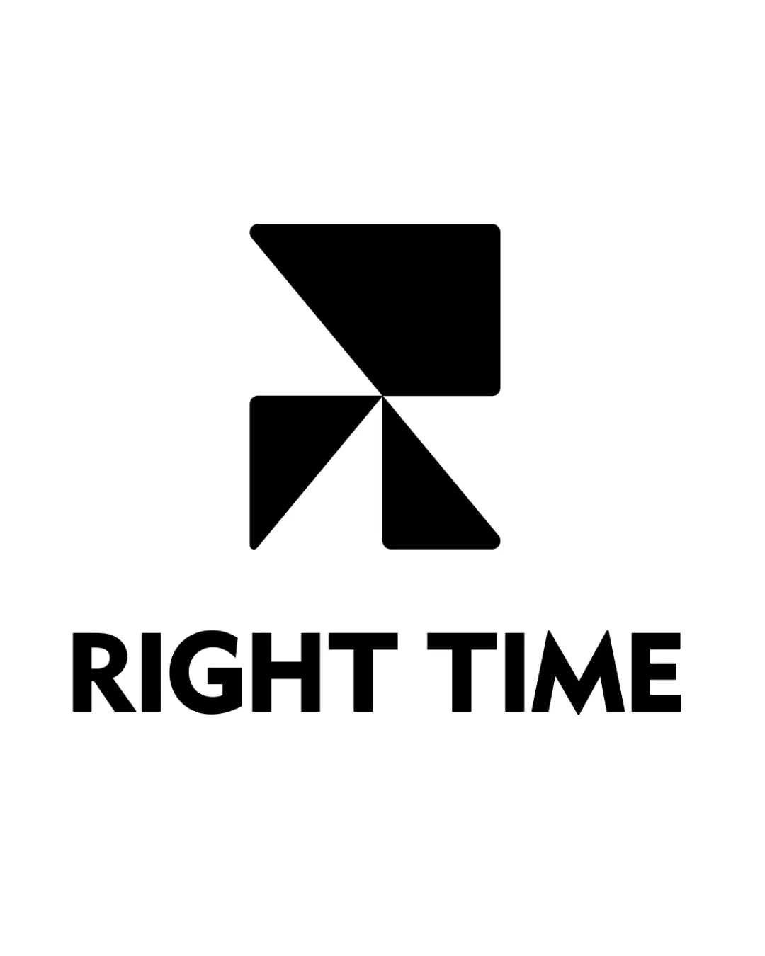
RIGHT TIME logo review
4.3/5
Logo score
Logo review of

Right Time

A distinctive and professional geometric brand mark that clearly communicates connection and direction. Refined, scalable, and well-aligned with the brief, with only very minor polish recommended for optimal balance.

Combination Mark Geometric Minimalism Consulting
5/5
Legibility
4/5
Originality
5/5
Misread
4/5
Balance
4/5
Scale
Action plan

What to fix first

The most important fixes to handle before polishing the full presentation.

1

Explore subtle fine-tuning of the geometric mark's optical balance to reduce any dominance in the top-left shape.

Medium priority

Currently, the visual weight is slightly top-heavy.

Impact: Improves Visual Equilibrium In Professional Contexts. · Effort: Low

2

Test mark performance at very small sizes and optimize negative space to prevent closing.

Low priority

Minor issues may arise in very small applications.

Impact: Ensures Excellent Scalability And Clarity In Micro-uses (favicons, App Icons). · Effort: Low

Detailed review

Logo performance breakdown

5/5

Legibility

Checkmark icon Text is bold, uppercase, and highly readable
Checkmark icon Strong contrast with background

4/5

Originality

Checkmark icon Distinctive geometric approach to an 'R' letterform
Checkmark icon Abstract convergence motif stands out

Warning icon Geometric R-based marks are not rare; some similarity with generic abstract logos

4/5

Balance alignment

Checkmark icon Strong vertical and horizontal alignment between mark and wordmark
Checkmark icon Geometric mark sits well above centered text

Warning icon Slight optical weight imbalance in the top-left due to larger form

logo 200x250 pixels scalability test alignment grid overlay
4/5

Scalability

Checkmark icon Simple, bold forms scale well for print and digital use
Checkmark icon Minimal fine detail ensures clarity at small sizes

Warning icon Some thinner negative space may close slightly at very small sizes

logo 200x250 pixels scalability test

200x250 px

logo 100x125 pixels scalability test

100×125 px

logo 50x62 pixels scalability test

50×62 px

5/5

Misinterpretations

Checkmark icon No unintended or confusing secondary readings

5/5

Logo structure & brief match

Checkmark icon Mark and wordmark share a bold, modern tone
Checkmark icon Visual weight and proportions are harmonious

Checkmark icon Connection, Direction, Reaching The Right Solution At The Right Time: The logo’s converging forms and central negative space clearly evoke these values.

Checkmark icon Central Point As Connection Hub: Mark visually establishes a nexus and convergence, aligning to this idea.

Try your own review

Wondering how your logo performs?

Get a clear logo score, key risks, and priority fix ideas before your client or audience sees it.

Review my logo