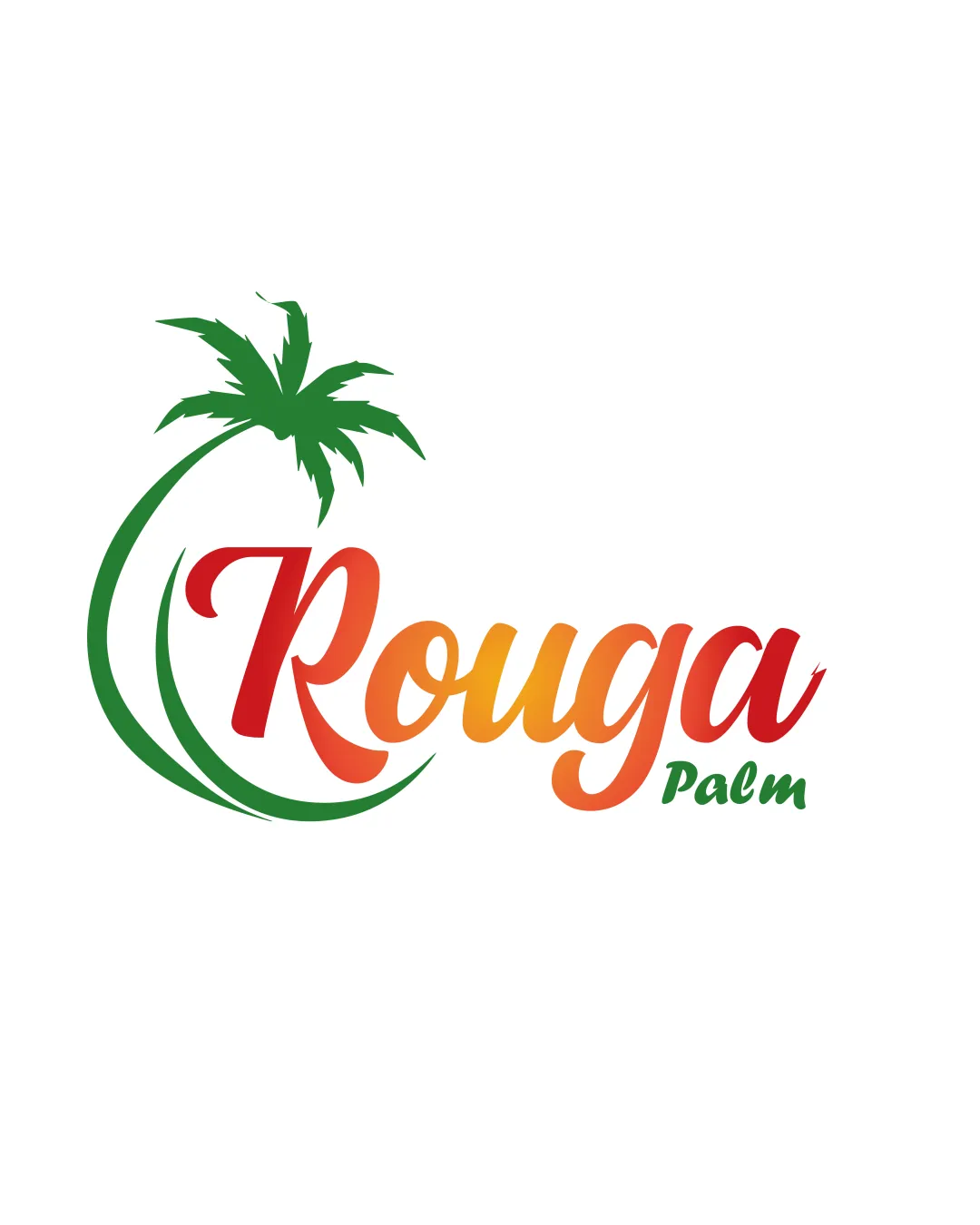
Rouga Palm logo review
3.3/5
Logo score
Logo review of

Rouga Palm

A readable, relevant logo with a pleasant palette and clear industry cues, but currently feels generic. Needs subtitle refinement and a more ownable symbol to stand out professionally.

Combination Mark Modern Tropical, Script Wordmark With Illustrative Element Food/agriculture
3.5/5
Legibility
3/5
Originality
4/5
Misread
3.5/5
Balance
3/5
Scale
Action plan

What to fix first

The most important fixes to handle before polishing the full presentation.

1

Increase the size or contrast of the 'Palm' text to improve readability at small sizes.

High priority

The 'Palm' subtitle is too small/light and risks being lost in print or digital use.

Impact: Ensures Better Usability And Brand Clarity Across Applications. · Effort: Low

2

Explore ways to make the palm tree mark more distinctive or unique to 'Rouga'.

Medium priority

The palm mark is visually ordinary and could be developed for stronger brand differentiation.

Impact: Boosts Logo Memorability And Reduces Risk Of Generic Appearance. · Effort: Medium

Detailed review

Logo performance breakdown

3.5/5

Legibility

Checkmark icon 'Rouga' is readable with large, distinct script.

Warning icon 'Palm' may be less legible due to small size and lighter color contrast.

3/5

Originality

Checkmark icon Palm integration with script is visually connected.

Warning icon Palm-tree mark and arc are common in tropical/agriculture branding, lacking distinctiveness.

4/5

Color harmony

Checkmark icon Warm gradient evokes ripeness; green suits agriculture.

Warning icon Strong palette but not deeply original.

Red
#E53E25

Orange
#F7B733

Green
#3EB04B

Your palette is close. Refine the color roles and combinations before updating the logo.

Build brand colors
3.5/5

Balance alignment

Checkmark icon Good flow from palm graphic to wordmark; visual weight is well distributed.

Warning icon 'Palm' feels slightly detached due to placement and scale.

logo 200x250 pixels scalability test alignment grid overlay
3/5

Scalability

Checkmark icon Overall shape is simple, with recognizable elements.

Warning icon Small 'Palm' text and palm-tree detail may be lost at reduced sizes.

logo 200x250 pixels scalability test

200x250 px

logo 100x125 pixels scalability test

100×125 px

logo 50x62 pixels scalability test

50×62 px

4/5

Misinterpretations

Checkmark icon No awkward negative spaces; tropical meaning is clear.

3.5/5

Logo structure & brief match

Checkmark icon Mark and wordmark are thematically harmonious.

Warning icon Integration could be more seamless; color/placement of 'Palm' feels like an afterthought.

Checkmark icon Industry Relevance: Palm tree and colors fit a tropical/agricultural context.

Try your own review

Wondering how your logo performs?

Get a clear logo score, key risks, and priority fix ideas before your client or audience sees it.

Review my logo