View review
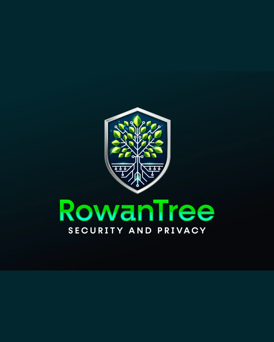
Logo score
Logo review of
Rowantree, Security And Privacy
Review the detailed scores below to see what is working and what should be refined first.
Objective AI feedback. Your creative decision.
Legibility
Originality
Misread
Balance
Scale
Detailed review
Logo performance breakdown
Legibility
 Bold, clear typeface Good contrast against background
 Subheading could be slightly larger for better readability
Originality
Creative integration of tree and tech elements Unique representation for the industry
Shield symbol is somewhat common in security logos
Color harmony
Harmonious color usage that reinforces brand identity
Balance alignment
Well-balanced between symbol and text Centered alignment works well

Scalability
Simple enough for small formats Can be used in both digital and print media
Details in the tree symbol could be lost in very small sizes
200x250 px
100×125 px
50×62 px
Misinterpretations
Clear representation with no misleading elements
Try your own review
Review my logo
Wondering how your logo performs?
Get a clear logo score, key risks, and priority fix ideas before your client or audience sees it.
Keep exploring