 View review
Logo score
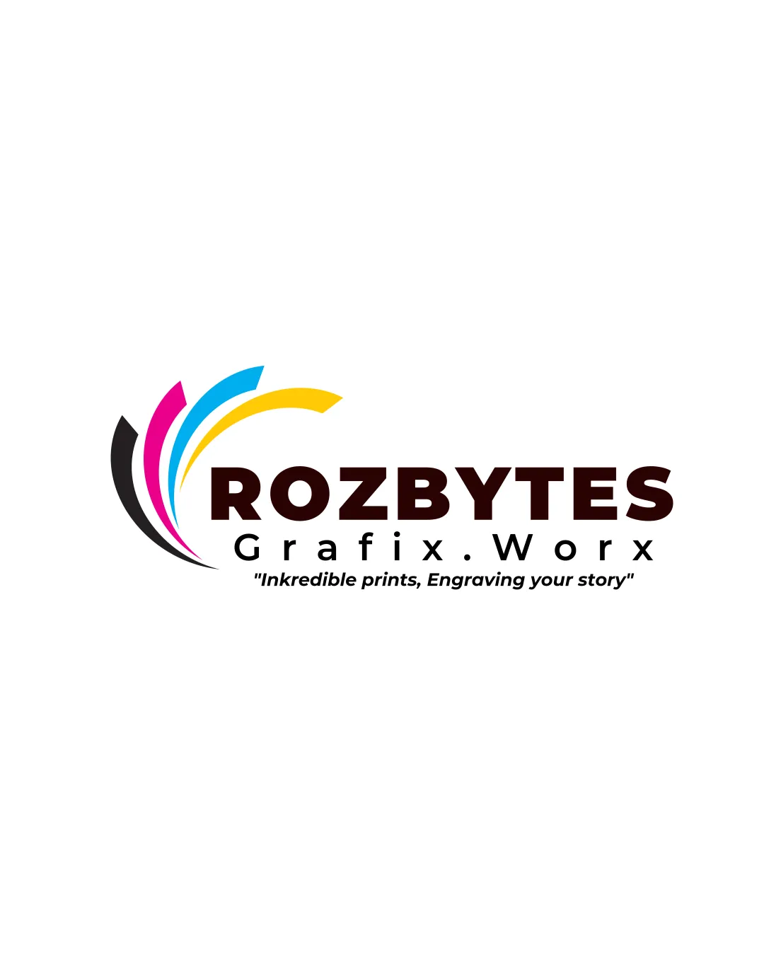
Logo review ofRozbytes Grafix Worx 'inkredible Prints, Engraving..
Review the detailed scores below to see what is working and what should be refined first.
Legibility
Originality
Balance
Scale
Detailed review
Logo performance breakdown
Legibility
 Text is clear and legible.
 The tagline text is smaller and may be harder to read on smaller surfaces.
Originality
Colorful curves are distinct.
The concept of colorful swooshes is fairly common.
Color harmony
Bright colors effectively represent the printing industry.
The use of multiple colors may feel busy to some viewers.
Your palette is close. Explore sharper color combinations with Colorfly.design before updating the logo.
Explore palettesBalance alignment
The elements in the logo are well balanced.

Scalability
The logo can be scaled down effectively.
The thin tagline may pose issues when minimized.
200x250 px
100×125 px
50×62 px
Try your own review
Review my logo
Wondering how your logo performs?
Get a clear logo score, key risks, and priority fix ideas before your client or audience sees it.
Keep exploring