Legibility
- The abstract style significantly reduces legibility.
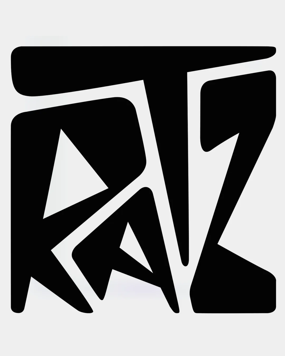
Review the detailed scores below to see what is working and what should be refined first.

Inspect spacing with the guide. Optical balance may differ from geometric centering.
Does the shape still work without color?
Find the surfaces where your logo stays clear.
A 3px blur softens fine details so you can check whether the overall shape stays recognizable. If key gaps close or elements merge, the logo may rely too heavily on detail.
Get a clear logo score, key risks, and priority fix ideas before your client or audience sees it.
More credits needed
Add credits to continue without losing your work.
Then $7/month. Cancel anytime.



