View review
Sadekh Digital Et Graphique Services De Vente & Cr..
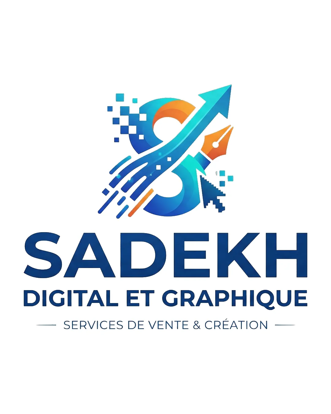
Highly effective, modern agency logo with clear, relevant symbolism and strong professional execution.
What to fix first
The most important fixes to handle before polishing the full presentation.
Refine mark for ultra-small version or favicon by simplifying pixel and stroke detail.
Medium priorityCurrent detail may blur or be lost below 32px; a simplified icon would ensure consistent brand presence.
Impact: Improves Mark Clarity And Recognizability At Very Small Sizes Across Digital Devices. · Effort: Medium
Slightly rebalance vertical space between the mark and wordmark for improved balance on responsive layouts.
Low priorityCurrently, the mark is visually heavier above the text, which can be tuned for stronger composition.
Impact: Enhances Visual Harmony And Professional Feel In Tightly-spaced Headers Or Banners. · Effort: Low
Logo performance breakdown
Legibility
Primary and secondary text is very clear and readable at a range of sizes
Originality
Combines commonly used digital symbols in an integrated, unique way for the agency context
Arrow and pen nib motifs are familiar in the digital agency sector
Color harmony
Modern blue/orange palette fits digital and creative markets well
Gradient and flat-use compatibility
Blue
#0084FF
LightBlue
#00C1E6
Orange
#FFA030
Navy
#284178
White
#FFFFFF
Balance alignment
Strong vertical and horizontal alignment between mark and wordmark
Hierarchical separation with tagline is clear
Graphic above text feels slightly proportionally heavier; minor adjustment could better balance mark-to-text ratio
Scalability
Distinct shape maintains integrity at typical sizes
Wordmark remains clear when reduced
Mark may lose finer pixel and pen details at very small sizes; consider a simplified variant for favicon use
200x250 px
100×125 px
50×62 px
Misinterpretations
Elements are unambiguous and thematically appropriate
Logo structure & brief match
Mark and wordmark feel closely related stylistically and conceptually
Industry Alignment: Digital motifs, pen, arrow, and pixel visuals suit digital, design, and branding businesses targeting entrepreneurs and SMEs.
Personality Fit: Modern colors, upward arrow, and clear typography communicate professionalism, premium positioning, and dynamism.
Digital Use: Full lockup and mark-alone options are both suitable for website, app, and social media needs.
Wondering how your logo performs?
Get a clear logo score, key risks, and priority fix ideas before your client or audience sees it.