 View review
Logo score
Logo review ofSara M Hussein
Review the detailed scores below to see what is working and what should be refined first.
Legibility
Originality
Misread
Balance
Scale
Detailed review
Logo performance breakdown
Legibility
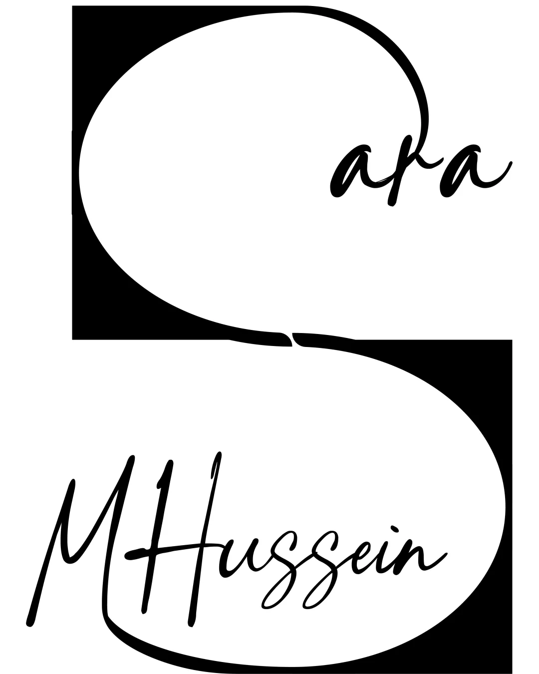
 Handwritten script is stylish and adds character Text is mostly readable at medium to large sizes
 Capital M and H are overly stylized, making 'MHussein' difficult to instantly recognize Fine lines in script may become illegible at small scales or on busy backgrounds
Originality
Creative integration of a monogram S with the handwritten style Negative space usage to form a distinctive emblem
Handwritten script as a wordmark is a common trend in personal branding Large S in abstract form is familiar in initial-based logos
Color harmony
Balanced black and white scheme, strong contrast No overuse of color
Black
#000000
White
#FFFFFF
Balance alignment
Central composition of large S visually connects both names Rectangles provide structural anchors
Uneven weight: the lower name (MHussein) dominates the visual hierarchy over 'Sara' Large sweeping S disrupts text balance and makes alignment feel off-kilter Spacing between elements is inconsistent

Scalability
Minimalist black and white palette ensures basic adaptability to simple applications
Delicate script and thin curves will not reproduce well in small formats like favicons, social media avatars, or embroidery Complexity of the large S shape and layered placement will lose clarity at reduced sizes Filled black rectangles add visual weight, making it less flexible for overlays or branding items like packaging or business cards
200x250 px
100×125 px
50×62 px
Misinterpretations
No obvious inappropriate shapes or accidental imagery
Symbol & text fit
S sweeping curve echoes the handwritten aesthetic of the names
Size disparity between the S monogram and script causes tension
S shape overshadows the names rather than subtly supporting them
Try your own review
Review my logo
Wondering how your logo performs?
Get a clear logo score, key risks, and priority fix ideas before your client or audience sees it.
Keep exploring